HOME | DD
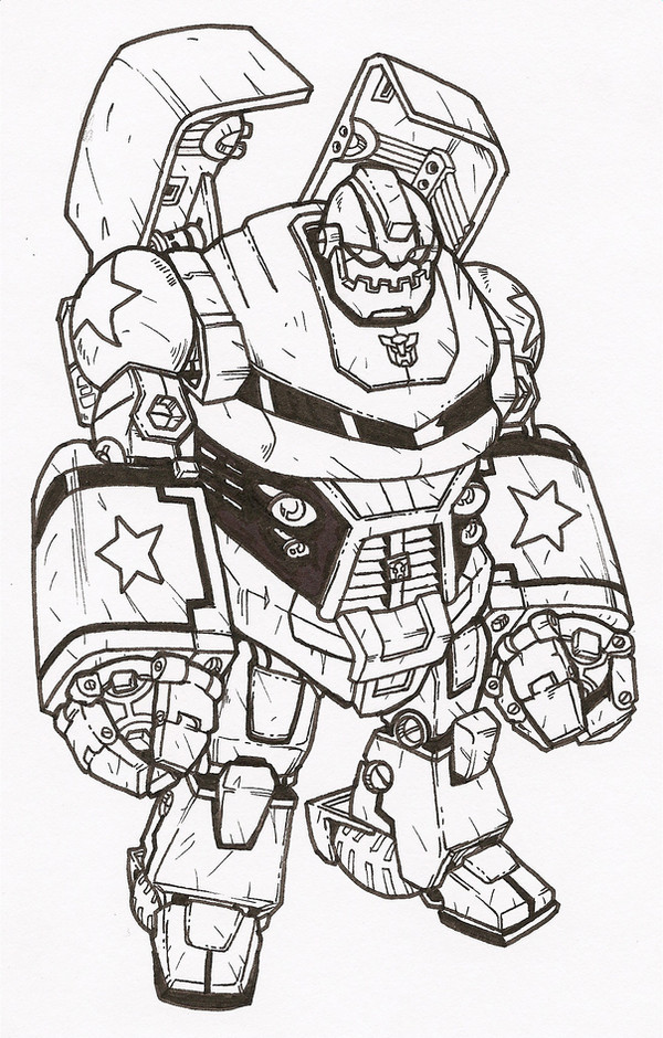
 secowankenobi — tf:animated bulkhead
Published: 2008-02-11 17:34:36 +0000 UTC; Views: 4981; Favourites: 125; Downloads: 117
Redirect to original
Description
bulkhead from transformers animated cartoon (Smile)")
Related content


Comments: 16


He looks more realistic, and not so rounded in appearance.
👍: 0 ⏩: 0


wow I love it, the design looks better when not so exaggerated!
👍: 0 ⏩: 0

this makes him look soooo much cooler than how he's drawn in the cartoon.
👍: 0 ⏩: 1

I 100% agree with you vincymon, he looks so screwed up in the cartoon.
👍: 0 ⏩: 1
they made them look tOO FLEXIBLE!! bumblebee is drawn normal, ratchet is drawn ok, prowl looks normal, even the DECEPTICONs look normal, but they messed up on prime and bulkhead.
👍: 0 ⏩: 2

personally I like em in Animated
👍: 0 ⏩: 0
Yeah I know. Megatron looks awesome but Optimus has a skinny body. The other thing I thinks looks ugly on Prime and Ratchet is their chins. Primes chin is too big and ratchet has a butt chin. Other than that, everyone else looks fine.
👍: 0 ⏩: 1
yeah, another thing is they way optimus' arms always seem to move out of the hinges, like he's WEARING the goddam robot, instead of BEING the robot.
👍: 0 ⏩: 0

Beyond Awesome line art.
Im loving the details on the knicks from like battle.
Shadings Amazing too dude!
👍: 0 ⏩: 0

Loved the line art so i thought i would do some colours for you on this one hope you like it [link]
👍: 0 ⏩: 1


Wow, that's nice! Haven't seen the cartoon, but I do love robots XD
👍: 0 ⏩: 0