HOME | DD
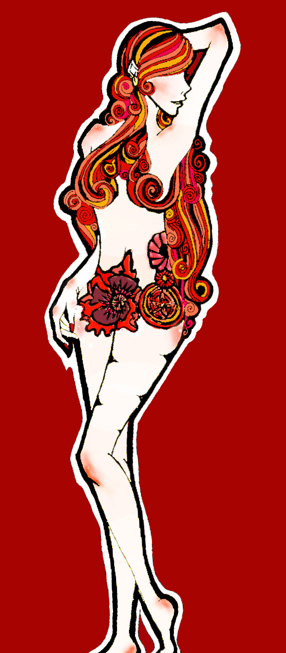
 SecretCake — Red for real this time
Published: 2007-10-18 03:51:55 +0000 UTC; Views: 1373; Favourites: 39; Downloads: 12
Redirect to original
Description
Lalala took a hella long timeShould be writing paper
Or at least studying for test
but lalalala
la.
---red
with poppy flower
and raspberry
and a random red flower
Thanks for all the help guys : )
Related content


Comments: 61

LOL huzzah for self promotion did you vote up?
👍: 0 ⏩: 1


No THAT is creative! Very unique picture, for sure. I really love it, I'm not even sure what about it speaks to me so much, but wow... 
 (Wink)")
👍: 0 ⏩: 1
 (Smile)")

i really really like this. her hair and all the colors in it are absolutely adorable!! and i like how her hair wraps around the body. lastly i love the pose-its so natural
the only bad thing i can say is that the elbow looks odd

👍: 0 ⏩: 1
thanks a lot!!
And I know what you mean it's kind of pointy and weirdly shaped haha
👍: 0 ⏩: 1
lol np
and i have done that before haha
so no worries!
👍: 0 ⏩: 0

very kool. i love how the hair swirls and the red really makes her *pop*
👍: 0 ⏩: 1
thank you!!!!!
I'm glad she *pop*s
👍: 0 ⏩: 1


i like it, but i wont fav it, cause, the only thing i think it off, is the line art that seem somewhat crude.
But its well thought the drawing.
Mayby a bit blur in it, would do the trick, but some parts arent completely painted, some minor mistakes.
are u lazy?lol cause it seems like it.
Other wise, its a nice composition.
👍: 0 ⏩: 1
hahaha yes well i am lazy
But also I overall suck at photoshop
and the lineart is a bit crude because I don't have a scanner so I actually took a picture and it was weirdly positioned and I rotated canvas annd it turned kind of weird and I didn't know how to make it smoother without, like you said, blurring, because it would blur out the detail
And thank you so so so much for the comment!
👍: 0 ⏩: 0

the colors are beautiful and this is so well drawn
")
👍: 0 ⏩: 1


This very artistic, I love it you did a great job ;D
👍: 0 ⏩: 1

I love her hair it stands out so much against her skin, but I don't really like the colour you've chosen for the background, it kinda distracts me. But otherwise a really great drawing.
👍: 0 ⏩: 1
oy everyone is saying that it should be changed and I changed it once to a darker colour. I understand why it could be distracting it's just like RED but I suck at drawing back grounds so any suggestions to what I should change it to? Thank you so much for the comment!
👍: 0 ⏩: 1
I think a softer red would look good. I like how you've got the plain colour as the background because once you have the right colour it is very good at drawing your attention to the main focus of the picture.
👍: 0 ⏩: 0

hehe (: I'm glad the 60's were a magical time. Not that I'm old enough to know though
")
👍: 0 ⏩: 0

beautiful! I dont have much to say really... other than beautiful ^^
👍: 0 ⏩: 1
thank you (: and thanks for the fave
👍: 0 ⏩: 1

Wow, very artistic. I like it.
Some tips: It was already mentionned, but the background is hurting the eyes. To quickly darken it you just have to use the magic wand tool to select the background and use a darker color to color it all (choose the color, then press alt+backspace or apple+backspace if you're on mac.) That alone will really help.
You might also want to shade the body a little more. Her armpit, abdomen, breasts and face/neck could benefit from some more shading.
I'll stop here for now, but if you want some more advanced techniques, I'll provide some for you, but since you seem to begin in photoshop, the tutorials are your best choice for now.
👍: 0 ⏩: 1
haha wow I've actually already changed the background you should've seen it before it was extremely blinding.
Actually if you have any more tips about more advanced techniques it would be awesome because the tutorials are helpful but actual communication is more helpful haha (that is if you have time of course I don't want to trouble you)
👍: 0 ⏩: 0

Hmm first thing that jumps out at me is the hair. And it looks really good, but the lines are really jagged and sometimes fade away, which makes it seem amateurish in my opinion. (Not saying I'm a pro or anything, far from it, I just know what makes a piece of work 'amateur.'
Other lines are jagged too.
👍: 0 ⏩: 1
thank you yea I know what you mean with the lines this piece was done traditionally and inked with a pen and I don't have a scanner so I actually took a picture with a camera so some of the lines got bleached out then I cleaned up the lineart in photoshop by dodging the lighter parts, which made it kind of jagged too I'm learning how to line things digitally in photoshop with the tutorials on Deviantart so I'm hoping the future ones come out better but thank you so so much for the critique
👍: 0 ⏩: 0

I like the way you did the hair, and the skin coloring is nice too, but I my opinion, the background color is way to vivid, hurts your eyes a bit when looking at the deviation, a darker red would fit better, I think...
👍: 0 ⏩: 1
Thank you so much for the comment and especially for the critique
Yup I changed it haha yea it was a bit eye burning I hope this is better
👍: 0 ⏩: 1
You're welcome, I think that now it looks better
👍: 0 ⏩: 1

Very pretty! I love
the red presented her.
Good work! <3
👍: 0 ⏩: 1

(: Thank you.
yea the feet were cut off because it was scanned weird so she looked like she was about to fall over and so I rotated the canvas a bit in photoshop but it looked weird so I cut the feet off a bit I'll keep that in mind next time thank you so much.
👍: 0 ⏩: 1

")
| Next =>