HOME | DD
 Seeeks — Invitation

#alluring #autumn #bullying #fall #ghoststory #kidnapper #mystery #recess #school #shadows #supernatural #woman
Published: 2018-04-18 18:44:36 +0000 UTC; Views: 449; Favourites: 16; Downloads: 0
Redirect to original
Description
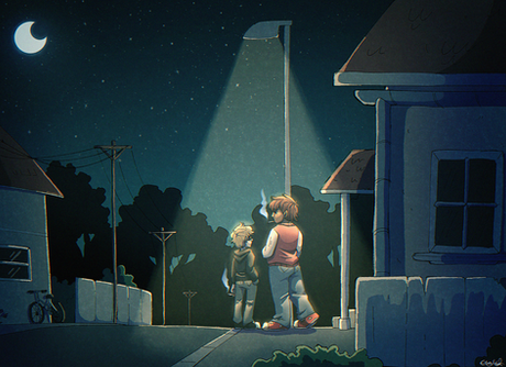
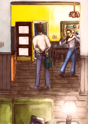
This is a remake from something I made in the early 2000s. The back story is that the blond boy gets regularly bullied in school, so when a mysterious woman offers to take him away, he's more than happy to take up the offer. His friend has a feeling there is something fishy about her, so he pleads him not to go. It ends in a scuffle, and while they're at it, the woman disappears, along with her car, yet neither one heard the sound of an engine.I spent at least three days working on this, and initially made and erased several sketches before I was happy with the dynamics. It looks like they're dancing but the friend is trying to pull him away, while trying to avoid looking at the woman. I imagined this took place in the 80s, hence the clothing.
Related content
Comments: 14

Like an episode from Twilight Zone. I see that you are experimenting with dynamic action on paintings. You are not quite there, but surely on the way. You probably had no models, so painting scuffle was especially challenging.
👍: 0 ⏩: 1

Yes, this doesn't use any fundamentals of gesture drawing. The pose is static because both boys apply an equal force in opposite directions, reaching an equilibrium. They don't seem to be straining enough, either. It's more like a dance.
👍: 0 ⏩: 0

Interesting idea. I like how you drew the poses: not just their dynamic positions, but also how you show weight and physics, the way the bodies lean as the boys pull on each other. And I really love the background. It reminds me of autumn!
👍: 0 ⏩: 1

Thank you - I went through like 10 stages of sketching before I found body dynamics I was satisfied with.
👍: 0 ⏩: 1

I like the composition, and the acting of the characters. The background is really really well done: it gives a sense of depth to the scene, the colours are perfect and I love how they reflects on the woman, she is in line with the environment. I love how the trees are a bit blurred compared to the foreground elements, it helps making the picture more realistic.
The anatomy of the boys is good, but I think that the light is a bit off. You used white, while the light in the scene is more warm, more yellow-orange, which also should influence the the white shirt and the socks. Also, in some parts the light is a bit misplaced, like the shoes. In fact, the boy's feet are in the shade. The sole of the black boy's shoe should be a bit darker near the ground, and also the boys' shadows should be darker at the beginning and clearer the more they are away from the bodyes. In this way the characters will blend better in the setting.
Anyway, these are details, I think that you already did a very good work keep it up!
👍: 0 ⏩: 1

Wow, this is probably the most useful criticism I've ever had on anything. I'll try to keep it in mind in the future, even if I wouldn't go fixing this particular picture. I've always struggled with shadows. I find them fascinating in real life but I'm bad at drawing them. Like I said to someone else earlier, one of the major problems was that I didn't establish a light source in the beginning and I only had a vague idea about where it might be coming from, so some of the highlights don't match, and then there's that color thing.
👍: 0 ⏩: 1

I'm flattered I'm glad you found that helpful!
By the way, even if you didn't have a clear idea of where the light source was, there aren't too many mistakes! Like I said, the woman and the background are fine; there are some highlights misplacements on the boys, but aside from that, the low light (I'm not sure if it's the proper english term ) is quite right.
You have to consider that since the scene in outside, you have natural light, that is diffuse. Which means that the shadows are almost never as sharp as they are under a direct light source
👍: 0 ⏩: 1

I think some people handle highlights and shadows so that they establish a light source, then make a layer that has all the highlights, and another layer that has all the shadows, and use different blend modes for them. I don't think I could ever get them right that way, so I find it better to define the shadow color separately for each different colored area.
👍: 0 ⏩: 0

That's a very creative story. Nice art right there!
👍: 0 ⏩: 1

Thanks. I was better at making stories in the past, but not as good with drawing, so it makes sense to recycle stories from the past and redo the artwork.
👍: 0 ⏩: 0

I think that you did a really good job with this picture! Some comments on stuff to improve upon and how: I enjoy the lighting of the lady because it has similar lighting to the background, and through reading the description I can see that she acts more like a ghost than a person. However, was your intent to make her more similar in color to the background to symbolize that she was invisible? If not, I would suggest making the lighting on the two boys a little more similar to the soft yellow light done on the woman because it looks to me that there is a brighter, whiter light on them rather than the woman, but that doesn't make sense because they are even further from the light source than the woman. Perhaps they would have dimmer lighting if you prefer the whiter light? I honestly think it is your decision on that one. I also feel like you did a different style on the lady's face to the friend's. He seems more blurry while the lady looks like her face was drawn out like a sketch. Also, his friend's hand looks kinda blurry, along with the blond's shoes. I think that aside from that, looks really good! You have a really good painting style! Hopefully my critique is helpful!
👍: 0 ⏩: 1

Thanks for taking the time to analyze this. I couldn't decide where I was going for with the lighting, and it shows. One problem is I didn't make a solid decision on which direction the light was coming from until later. It seems like there might be a secondary light source in direction of the viewer, that would explain the highlight on the friend's forehead, but there are no other highlights that would suggest that. I also realized later that the forest should cast shadows, even though the leaves are illuminated because light passes through them, but the tree trunks should be darker on the shadow side.
As for the woman, she was one of the last things I painted. I used a screen filter to make the shadows rather than painting on top, because I was getting tired, hence the different look. Her body is also slightly transparent, so you can see the edge of the sidewalk through her hips. That wasn't intentional, but it would make sense given that she's a ghost. Still, it would've been useful to start with opaque base colors for the characters, even if I used semi-transparent brushes on top.
Now that you pointed out about the friend's hand, yes, that is awfully blurry! It wouldn't even take all that much work to add some shadows and highlights.
👍: 0 ⏩: 1

I'm glad that my feedback was helpful!
👍: 0 ⏩: 0


