HOME | DD
 Selunia — Pyromania

Published: 2012-06-20 20:52:57 +0000 UTC; Views: 7540; Favourites: 53; Downloads: 0
Redirect to original
Description
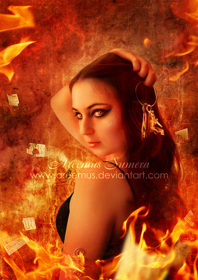
PLEASE READ THE POEM BEFORE CRITIQUE OR FEEDBACKI receive a lot of feedback from which I'm sure nobody knows or cares what this picture is about!
")
-----
Inspired by Pyromania I want to see a light show in ochre and dancers
two thousand degrees in heat: I want to watch them
all traipse across my bedroom floor with their
encore in grey.
Blistered fingers flicking cigarette lighters
to see an orange pirouette turn for me,
my parents worry that I smell of smoke but
they don't know the reality.
Well.
The truth is that you can find me weaving
kerosene trails around the moon and Saturn's rings,
telling acorns and oak leaves to enjoy
our favourite disease -
So I flick the lighter once again and speak
to the blackened walls and singed floors:
'don't fear the kiss of the flame,
don't let them douse the burns by ~Anatopist
I think this Poem is awesome! All the words used to describe Pyromania build up a Picture in my head that I tried to bring to life in my work. So I kept to the poem as much as possible.
I hope it turned out well
 (Smile)")
Made for the "Fun Fun Fun Challenge!!!" at
[link]
---
Stock used
Models & Background
Model by ~lilbittydemon-stock
[link] Room Background by ~NapleGray
[link] & [link] Fire dancers by `faestock
[link] burned texture by *Meltys
Flames & Brushes
[link] Fire pics by ~cikeno
[link] & [link] Flame packs by *MD-Arts
[link] Leaves brushes by *FrostBo
Celestial
[link] burning Moon by ~HugleBunnys
[link] Exploding planet by ~Mouse-eater
[link] Saturn rings by ~saturnstock
[link] Galaxy brushes by ~Sunira
Related content


Comments: 49


Technique
Impact
Hi!
This is my last critique for a.deviantart.net/avatars/f/e/f… " alt=" " title="FeedbackFrenzy"/> week so bear with me
e.deviantart.net/emoticons/b/b… " width="15" height="16" alt="

My first impression when I saw this piece was that you are bold and I am not.I dont have courage todo pieces with fire, they seem so hard to execute.Different layers, the background must be black, always use overlay as blend mode(if I remember corectly e.deviantart.net/emoticons/s/s… " width="15" height="15" alt="

So what can I say?
Also another impression(yes, I have a lot of those e.deviantart.net/emoticons/let… " width="15" height="15" alt="
")
So if you wanted to create the emotion, the feeling of insanity well then you did it.
Should I start on things I didnt find really fitting?I am sure you are tired hearing about the fire?e.deviantart.net/emoticons/s/s… " width="15" height="15" alt="
But I can tell you my overall feeling after seeing your pieces.I see an amazing talented person that works hard to create pieces made after her soul.I wish you will find the inspiration to continue.
Cheers!e.deviantart.net/emoticons/r/r… " width="15" height="15" alt="

👍: 0 ⏩: 1

Thank you for your critique
I got the feeling no one really read the Poem I try to visualize with this piece ^^
I think the poem is really awesome, That's why I tried to include everything of it to my work.
It was very hard and yes I know the dancers and also the leaves look a bit odd. But if you read the Poem you'll understand
I'm glad you like my work and that I achieved that everyone understands the Overall meaning of it.
Thank you for encouraging me
👍: 0 ⏩: 0

Technique
Hello, here from a.deviantart.net/avatars/f/e/f… " alt=" " title="FeedbackFrenzy"/> !
First off, I'm gonna state with what's GREAT about this piece. You included a lot of elements and textures that make this piece very dynamic, and you kept to one color scheme and just about all the same lighting. The effects with the lighter in her hand look real and stunning. It definitely goes with the motion of the picture, which you also mimicked with with circular "swoosh" of fire around the planets. I immediately can envision and feel a hot windstorm swirling from this piece. This picture also emanates a feeling of chaos, insanity, and, as the title suggests, pyromania. I think you definitely got your point across with this piece.
On a more critical note, there are just a couple of small things that stand out to me, and they're really minor. The dancers in the fire don't seem consistent with the rest of the picture. Their shading is inaccurate, and their edges are almost more defined than that of your main subject, which pulls the eye away from the feature pyromaniac. A slight blur, a thing orange or red overlay, some yellow-orange light on the parts in the fire, and some slightly darker shading around the arms of the girl on the left would probably do the trick. Also, the fire that the dancers are in doesn't quite have the same motion as the fire in the rest of picture. The "windstorm" effect is kind of lost there. A slight curve or swirl would make the motion in the picture more fluid and consistent. On an artistic note, some darker shading with more contrast on the subject might make the piece more dark, foreboding, and dynamic. More fire in the background, rather than just around the dancers, may also add to that same effect.
Overall, there really wasn't very much to critique in this picture. I was very impressed by the artistic vision and general "WOW!" factor. It looks like it's straight out of a dream! It was genuinely difficult to critique besides the inconsistent lighting on the dancers. Congratulations on a job VERY well-done!
👍: 0 ⏩: 1
Thank you for your hint about the dancers.
And I really much like your windstorm idea, if I should do this piece over again sometime I would really like to try this out and see how it works on the flow of the piece.
Thank you
👍: 0 ⏩: 1
No problem.
👍: 0 ⏩: 0

Overall
Vision
Originality
Technique
Impact
Hi e.deviantart.net/emoticons/w/w… " width="25" height="20" alt="

Joh, there's a lot going on here hey. I gonna strip this picture appart bit by bit to do this critique, so bare with me. Firstly I like the concept, and I can see where you were trying to go with this. I also think the main model you chose for this was a very good choice and over all you chose very good stock to work with.
First mistake I can see is your contrast is too high. I gives the image a grainy feel, like when you take a hitty picture with a shitty camera, and it makes everything harder to blend. So initially you should've lower the sturation on this image (you can always add mroe color later on) I would say lower it by half way.
Then your flames. Firstly I think you should take out the faestock models form the fire, I think it makes the image to busy, but that's just me.
Then when working with fire, I still struggle my ass of. But I have learned that you must make lots of layers of fire, set them all to different blending modes and opacities and erase different sections on all of them, that makes the fire seem more natural.
Also with the lighting on the main model, try painting selected areas for highlights with a yellow soft brush and then setting the blending mode to either overlay or softline, change the opacity and make as many of these as is neccesary to get the correct lighting effect.
Please note that all the opinions expressed in this critique are my own, there for take from it what you want and leave the rest behind. I do hope that it was somewhat helpfull!!
Regards
Leana
👍: 0 ⏩: 1
Thanks for taking your time to critique on this piece.
The hints about the fire are really good, actualy I already worked with different layers of flame in another piece and I think it's a good idea.
One thing I have to say is that if you read the poem and know this piece is supposed to visualize the poem, the dancers really have to be there. I agree that they look a bit off compared to the rest, but I really wanted to stick to the poem.
I'm not sure if this saturation trick would work, since the grains are already there on the model stock. As someone else said there is a 'quality clash' in the stocks I selected. But the expression of the model was just awesome ^^
I will try it though the next time I have this problem with a stock.
👍: 0 ⏩: 0

Impact
Let me start this critique by saying that I love your work and it really means a lot to me when you like something of mine and this is nothing personal and not meant as offensive. But, unfortunately, you've fallen victim to me on a critiquing spree. Or maybe that's a good thing. e.deviantart.net/emoticons/b/b… " width="15" height="15" alt="
")
-Amorete.deviantart.net/emoticons/h/h… " width="15" height="13" alt="

👍: 0 ⏩: 1
Thank you for taking the time to write this critique
No I'm not offended, I'm happy about every feedback and hints I recieve.
I know about this 'quality clash'. I must admit that it's very difficult for me to find the right stocks. Maybe it's because for me it's more important to realise the idea I have in mind.
So it's a hard decision: Use a stock that fits my idea 100% or use a different one that's not Perfect but high quality.
But maybe you are right and I should be more picky in the future to improve my level of art.
Thank you again for this helpfull critique
👍: 0 ⏩: 1
👍: 0 ⏩: 0

This is crazy! I love it!!
Thanks a lot for using the stock!
👍: 0 ⏩: 1

Sehr schön
👍: 0 ⏩: 1


Hello!!! I'm from #FeedbackFrenzy !!!
First of all, I'll have you know that I don't know anything about photomanipulation, so I can't really tell you what you've done wrong or how you could improve it, but I'll give you my imrpession! ^^
Well, I like the colors. Red and black are a wonderful combination that catches the eye.
The woman's glee is... somehow upsetting. I'm not sure if that' what you're aiming at or not. It shows the maddness of pyromancy, her happiness at looking at the flame burn and her utter attachment to it. I like the way the flame reflects in her eyes. Scary. However, it also looks slightly funny... Probably because of the position of her tongue... If her toungue wan't visible, I suspect she might look... hmmm more serious probably, but also less mad. I'm not sure if that would be a good thing for the photo or not. It depends on what you want.
As for the dancing women, who I suppose reflect her passion for the flame, while they do play a part in the balance of the picture, I'm not sure if they actualy improve it... They seem a little out of place. Dancing passion is related to sex, flame passion... is about flame. Maybe it'd be better if their size was bigger, and they were half-transparent or something. Then we would think they exist in her mind, as if she could see and feel flames inside her.
The same goes for the burning planets, actually, although I'm not sure what they symbolize, other than balancing the pic maybe. Or that her entire world is in flames. Again, I suspect the picture would be better without them.
As for the flame coming out of the lighter... That's awesome!!!!!!!! And in my opinion the photomanipulation is rather well-done at that part of the picture, if I didn't know how lighters work I'd expect it to be real! It feels as if she's not simply holding a lighter, but a wick to turn the universe ablaze!!! YEAH!!!
About contrast: it's not too prominent. I'm not sure whether it would be better for the lighter to be the only source of light, and to have greater contrasts, or if she has already set the room on fire, wo the light is pretty well done as it currently is.
Anyway, my opinion is this: the dancing figures and the plantes/suns don't really add to the picture as they are. The rest of it is a wonderful piece of art!!!
👍: 0 ⏩: 1
Thank you for your feedback
Maybe you would like to read the poem to? I think it makes it easier to understand why the dancers and the planets are there if you know that this piece was created to visualise this poem.
👍: 0 ⏩: 1
Ooooh. I didn't notice the poem. Sorry D:
I read and now it makes perfect sense!!
👍: 0 ⏩: 1


First of all...you picked the best girl with lighter stock ever. That expression just defines this whole piece, and combined with the red colors it helps push the sense of 'FLAMES EVERYWHERE' as much as having the actual fire.
While I like the idea of trying to follow the poem, I think it's leading you to have a lot of disparate elements. Looking over this piece, my eye doesn't really flow from place to place smoothly. I notice a bunch of bright spots that stand out from the darker ones and can be like, oh look a planet and some girls that are burning, but your central stock is pretty focused inwardly. You could try having the flames actually coming out of the lighter be what's burning up the world and dancer, but honestly you might also be better off with fewer elements just so you can focus on having really well blended elements and also one consistent source of light.
That said, though, I think you did a good job of adding the fire to the different scenes and knowing how much of it was appropriate to have in each place. Nice work there.
👍: 0 ⏩: 1
Thank you for your critique
I think I often have the problem that I let myself get carried away while working on a piece like this instead of focusing on my main object ^^
Usualy I finish the main part first and maybe I should have adjusted it a bit after I added all this little details, so it doesn't get lost in them.
Well that's what I understand you mean with focused inwardly right?
👍: 0 ⏩: 1
No problem!
Haha, that is true too 
👍: 0 ⏩: 1

That is some EXTREMELY cool work! I love it! Kudos! A very, very thorough and well-conceived manipulation.
👍: 0 ⏩: 1


 (Wink)")


Hey! Awesome work! Could you please write one or two sentences why you interpret the poem this way? Thank you and Good luck!
👍: 0 ⏩: 1
Sorry I forgot this. Added it to the description.
Thank you
👍: 0 ⏩: 1
Yes Flames again ^^
Did you read the poem? It's awesome
👍: 0 ⏩: 1

I've tried
👍: 0 ⏩: 0