HOME | DD
 sephirot — Daily Dev Comp - Serenity
Published: 2001-01-21 01:07:29 +0000 UTC; Views: 877; Favourites: 3; Downloads: 266
Redirect to original
Description
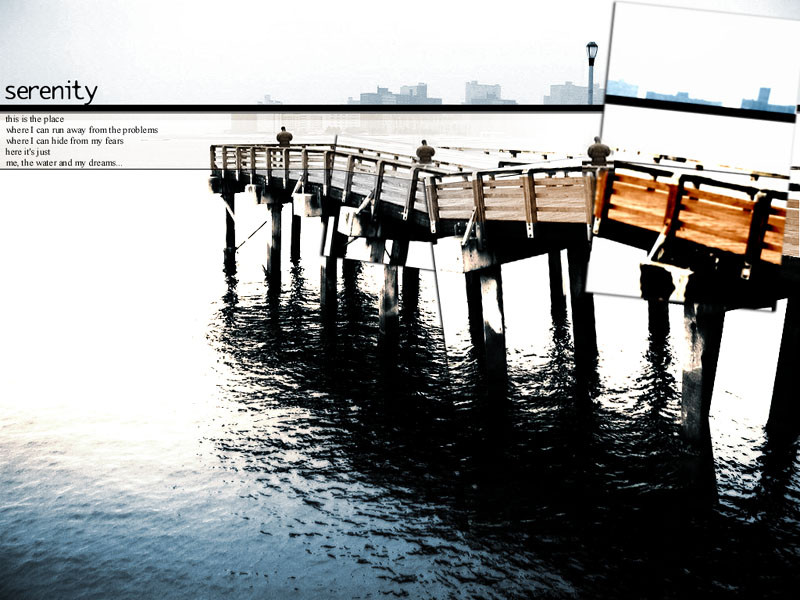
My contribution in the 10K Daily Dev Comp. Hope you like it! Comments are always welcome ;]>> Preview: 800x600 (low quality) >> Zip: 1024x768 (high quality)
Related content


Comments: 14

psyfect: yeah it was intentional, cool that you got it
t-journeyman: I like to hear anyone opinions, thanks for yours!
👍: 0 ⏩: 0

Good technique, good use of color. Just not my style, but nice effort.
👍: 0 ⏩: 0

The thing I like about this is how the color in the dock fades away, it really portrays the escape from reality very well. whether it was intentional or not (and I'm sure it was :]) your point came across nicely. good job.
👍: 0 ⏩: 0

I like how you transformed the dock. I like it very much.
Ah ! And good luck !
👍: 0 ⏩: 0
seas: thanks!! one of the nicests comments that I've ever had!
projectserberus: thank you!
itirep: I know what you mean , thanks
👍: 0 ⏩: 0

i really like this now...like i said,the other version wasn't bad...it just seemed a little empty...now this is really nice...
👍: 0 ⏩: 0


oh and if you dont win the comp.....well screw them then. this rocks anyhow
👍: 0 ⏩: 0
hehe sorry it really rocks. i just looked at the orig now
the colours are really just that....sirene
i liked the one you had before more
itirep just didnt look enough...the "street" with the lantern was a real good touch
👍: 0 ⏩: 0
Well this is the best I could do without screwing with the concept that I gave to the image.
I want you to know that this isn't one of my 'eye catching' pics, just a calm a serene one. I did this when my gf was sleeping in the bed at my side.
Enjoy!
👍: 0 ⏩: 0
I didn't modify the pic THAT much 'cause I wanted it as clean as possible, to express what the title say: serenity.
But now I look at it and I know that something must be added or modified... don't know what yet... tonight I'll be releasing a "serenity b" version
Thanks for the comments.
👍: 0 ⏩: 0
cant really figure out what you changed..ahh...sorry. cant find the orig pic...but the colours are just amazing.
👍: 0 ⏩: 0
i like the prose...but you didnt add anything to the pic itself-and the box messed up the skiline-made it look-i dont know...messed up...try to do a little more with it maybe?it's not bad...it's just not much...
👍: 0 ⏩: 0