HOME | DD
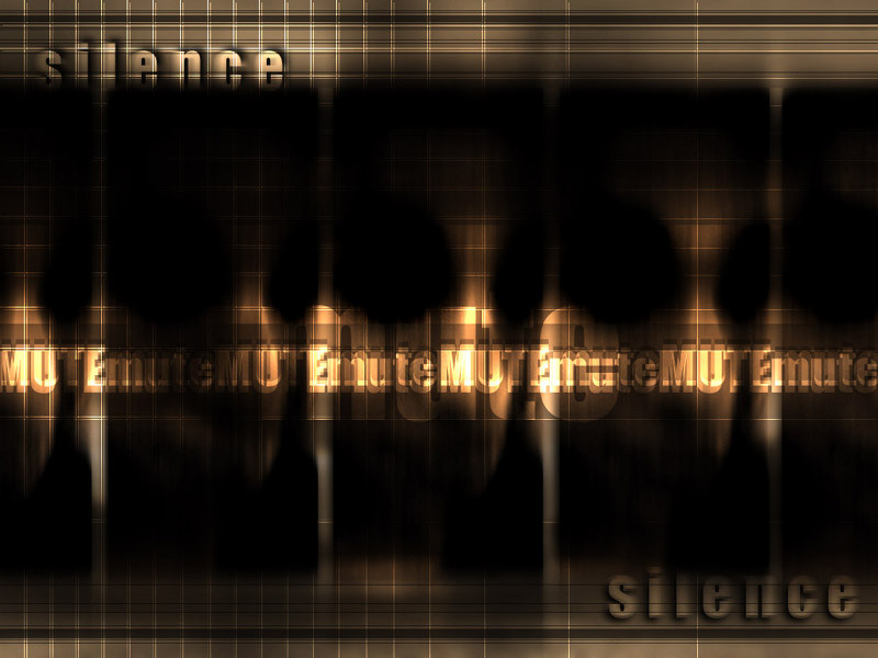
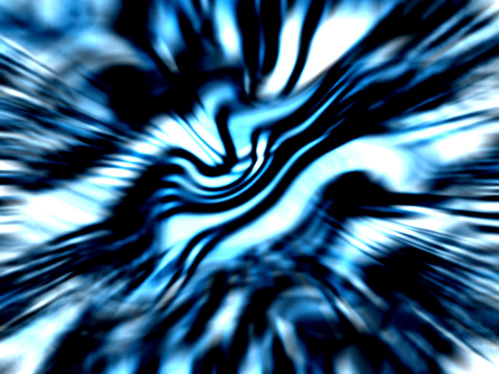
 sephirot — mute
Published: 2000-08-25 19:20:29 +0000 UTC; Views: 1547; Favourites: 4; Downloads: 273
Redirect to original
Description
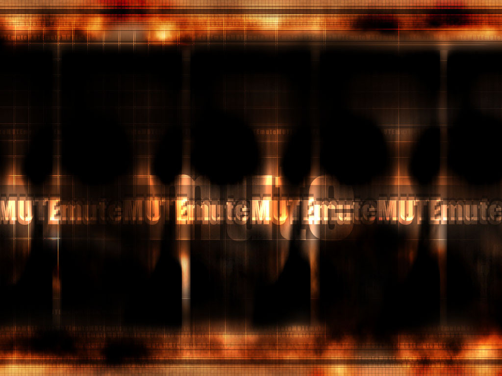
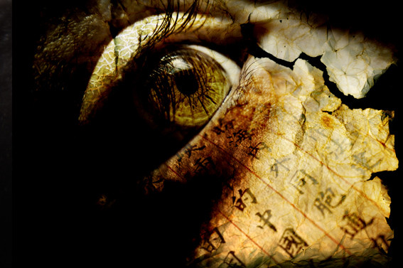
One of my old WP's that I'm posting here, please leave some comments ;] >> 800*600 preview, 1024*768 in zipRelated content


Comments: 11

I like mentions of the word silent but the "mute" parts need work . . . the font makes it look too noisy.
👍: 0 ⏩: 0


very dark.
-----
NetGuru
~Helping people love life through caring~
+ Favorite Topic: Caring & Friendship
+ Favorite Story: [link]
+ Favorites Devpack: [link]
👍: 0 ⏩: 0

This is really cool dude, I think it's awesome. Good job!
-Reo-
👍: 0 ⏩: 0

Thanks jark, I'm really proud that you like my "silent" art ;]... Koasati thanks for comment and for you and everybody *I'll take of this "silence" thing* =]
👍: 0 ⏩: 0

I've always liked this one, but I look forward to the remix. I have to agree on the 'silence' thing.
👍: 0 ⏩: 0

I really like this one. Other than the "silence" at the top and bottom, this is a splendid deviation. the mood conveyed is great and quite effective. Excellent job I say!
--[ jark ]--
👍: 0 ⏩: 0
Thanks to all you guys, that's the kind of comments that I really like... THANKS! =]... Optyk I'm thinking in make a new version of this WP of mine (it is from last year) and the first thing I saw that I have to took off is the "silence" words, thanks for remind me ;]... Good point kidd, I think that you're right and digi to in his point of view, I think in the dark parts as the silence, and the words as a voice trying to reach freedom... or something like this ;]
👍: 0 ⏩: 0

nice. take out the two 'silence' words on the top and bottom, they look out of place in my opinion.
o p t y k
👍: 0 ⏩: 0

kidd has a point about the black...but i look at it a little different. the shadow/waves of black almost coincide the "silence", it's almost like a "hush" rolling in
👍: 0 ⏩: 0

Its very nice, and I see and really like the idea your going for, but it seems there is a little too much black space. maybe add a really subtle texture or image overlay so its still looks very deep and black, but there is something there... i think it will draw more interest into the bright parts and give a better depth perception in the wp.
👍: 0 ⏩: 0