HOME | DD
 seriouslytwisted — PullMyHeartStrings
Published: 2003-11-06 10:16:18 +0000 UTC; Views: 1722; Favourites: 23; Downloads: 305
Redirect to original
Description
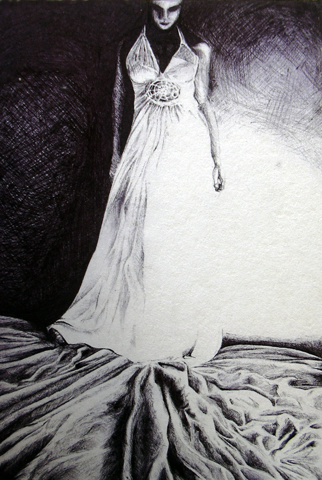
A ballpoint drawing for my portfolio.Referenced from a photograph by
SOLD
Related content


Comments: 44


love the work on the material.The fact that it is ballpoint makes it all the more impressive
👍: 0 ⏩: 0

Woah! look at those creases...too amazing...great concept!
👍: 0 ⏩: 0

wow! i thought it's digital art! this one is really really good. it's just like a photograph. the concept is cool too. there's this dark and emotional feel in this work. nice!

👍: 0 ⏩: 1

Thank you, though a lot of credit has to go to the photographer... I just tried doing it justice and juicing it up with my own interpretation.
👍: 0 ⏩: 0

Beautiful picture. I really enjoy your style its so lovely.
There is a lot of emotion coming from your subjects.
Do you like drawing with pen? I love it!! hehe
You make a great illustrator, keep it up.
👍: 0 ⏩: 0

The dress looks great, especially the top! Looooove the dramatic contrast ")
👍: 0 ⏩: 0


ballpoint drawings are so incredibly difficult I love this and how the strong light coming in washes out her dress awesome
👍: 0 ⏩: 0


But I Waited
So many times
I wanted to cross your path
Smell the breeze that surrounds
Feel you in my heart
Touch you
To make it real
Follow you
And show you how I feel
But I waited
Anxiously
Holding my self together
Cautiously
I wanted to hold the moment
And make it together
But, I was slow, yes I was slow
Guess I was hoping forever
I saw you coming
And I saw you going
Never did you pass me by
But I waited
Anxiously
Hoping on my dreams
Rhapsody
You never did
You never could
If you did
Then we would
Acquaintance we remain
Holding thoughts we sustain
Living blithe you pretend
Dieing insane again and again
But I waited
Anxiously
Saving my love my -
Ecstasy
Now If I pass you
Fragile If I try to
Shatter the paths you take
Cry If I do
So many times
I wanted to cross your path
But I waited......
(c) AaSH 2000
---------------------------------------- --
Just my way of expressing how I relate to this sketch of yours.
👍: 0 ⏩: 0

your shading is perfect.. i thought it was just a manipulated picture at first.. wow..
the wrinkles at the bottom look so real
👍: 0 ⏩: 0

That is really great. You have a talent - no doubt.
👍: 0 ⏩: 0

black biros are the best! there is only ONE black biro i use, a Bic Medium one (not much biro work in my gallery... a couple in scraps).
anyway to comment:
great eyes, good cross-hatching on the wall to create that glow, and brilliant textures on the material of her dress and the cloth on the floor.
👍: 0 ⏩: 1
Thanks! Bics are wonderful things.
👍: 0 ⏩: 0

wow this piece is spectacular. I completely thought it was painted.
👍: 0 ⏩: 0

Thispiece is so eerie! So surreal! and with a ballpoint fer cryin outloud....mind-blowing!
personally this is me fave out of the WHOLE lot.....love the way how you go about using the negative space.......
nicely done........
the way the figure has it's head bowed down, t'seems submissive in a way, easily manipulated, as a puppet would do as the puppet master pulls at the strings......
yours.......
Deep......real deep........
well if i'm way off, nevermind.....
i just get the vibes........i do not question!
be lookin forward to more of yer work in future!


👍: 0 ⏩: 0

impressive. I like the textures/shading and you have a very cool sketching tecnique. you are talented
👍: 0 ⏩: 0

great textural work, very impressive piece, especially considering the limitations of the medium.
👍: 0 ⏩: 0

ballpoint ?!
whats that
very impressive
👍: 0 ⏩: 0

from ~critiqueme
alright, let me first start by saying that i have a better eye for art than i do a hand...i can find ways of improving the best works but don't ask me to draw you something good because i can't do it...with that little disclaimer out of the way...
you've done a very good job here, especially with the folds in the fabric at the bottom...fabric folds can be some of the hardest things to do (i know they are for me anyway) and you've done it quite well...except you do run into some problems in the bottom righthand corner...though youve kept with the picture fairly well, and i may be wrong about this, it looks like once you got to the right side you realized it was a lost cause and freestyled the folds a little more...
for freestyling folds (if that's what you did) you still did an outstanding job, but, back to the point, the bottom righthand corner folds look unnatural...whereas the folds should, for the most part, be radiating out from the figure, the folds there almost have a life of their own...but hey you could do what i would do and write it off as making a statement...dark in the upperleft, bright in the upper right, order in the lowerleft, chaos in the lowerright...whether intentional or not, it works well...
another thing (and i promise to end this quickly) is i definitely like how bold the contrast is and the large amount of negative space is true to the original...in spite of this though the original picture has a lot more contrast than your drawing ended up having...not that there's anything wrong with that of course, but because of this, you could consider adding a miniscule amount (i would leave it up to you to define "miniscule" (Wink)")
all in all, outstanding work...definitely a good one for your portfolio...
👍: 0 ⏩: 0

your portfolio would soooo rock!
its so good that it feels unreal

👍: 0 ⏩: 0

This is brilliant; the shadows and lighting are fantastic... makes it quite sinister. You have great technique, especially being able to pull of the lighting on the folds in the material so well. Excellent picture.
👍: 0 ⏩: 0

Wow! Dark! Brooding! Intense Values! This is your work at its finest! Just love it.
I love working in ballpoint pen. There is something thrilling about it, so permanent and daring. Plus it's a very unique feel on paper.
Like I said, just love it.
👍: 0 ⏩: 0


that looks nice and he light is amazing, challenging and very unusual! great !
👍: 0 ⏩: 0

Really beautiful, the face is great, almost like static.
👍: 0 ⏩: 0

reem don't tell me that you've done this with the pallpoint. can't even imagine these details with a pallpoint pen. very good.
👍: 0 ⏩: 0

wow thats really good! great drapery. but if the light source is that bright shouldnt some of the floor drapery be all white like some of the dress?
👍: 0 ⏩: 1
You see the grey areas at the bottom? They're supposed to be white. Stupid camera. Though I kind of went overboard on the shading there and didn't leave as many stark highlights as I intended to. Thanks for the comment, I really appreciate it
👍: 0 ⏩: 1
yeah, i have that problem too. sometimes fixing that on psp7 works good. and saves you from being mad at camra.
👍: 0 ⏩: 0


wooooooooow. it's hard to keep from making mistakes when using a ballpoint pen, so props to you. this is insanely good and insanely gorgeous. mmmmm.
👍: 0 ⏩: 0

Ballpoint drawings always interest me; it's just so permanent. You did a great job with this, the hatching really adds to it. Also, the blank space contributes to the picture well and creates tension.
Great work.

👍: 0 ⏩: 0

fucken hell,.....ive not seen somthing this good in some time..
absolutly amazing job.
the face, the dressing, the shading, the lighting,m the detail,
van damn ur good
faveing this
blx :
👍: 0 ⏩: 0

That tap-ioca doesnt know shit! this is superb Reem!
Great level of skill developed and put to use.
You know me, I love cross hatching and youve done a very sweet job in this pic  (Smile)")
put it on your folio. show it as often as possible and keep creating!!
👍: 0 ⏩: 0

you're good, but I think you should check ~e-lie I think he has an even finer shading than you and maybe you could ask him for some hints.
👍: 0 ⏩: 1
I know it seems silly to blame one's equipment, and I only take myself half seriously when I say that, but the paper was too rough to allow for much tone variations, I think I could only manage about five, which in hindsight has somewhat worked to my advantage because I did want a high contrast piece. Plus I was working with a single ballpoint I had found/stolen from a classroom which was forever threatening to stop working at any point. It's not a medium I work with often.. I really just learn as I go along. Thanks for directing me to his gallery, he's got really impressive skills.
👍: 0 ⏩: 0

Great shading for ballpoint ... this would look great as a photo, you should find someone to model for that
👍: 0 ⏩: 1
Actually this was done using a B&W photo from :devpullmyheartstring:'s gallery, she's letting me use some of her photos as references for my folio.
👍: 0 ⏩: 1
nice ... gotta look at that
👍: 0 ⏩: 0


quite impressive shading in the folds.. loving that textured wall to the right of her, beautiful.
👍: 0 ⏩: 0