HOME | DD

Setik01 — Setik01_11042009

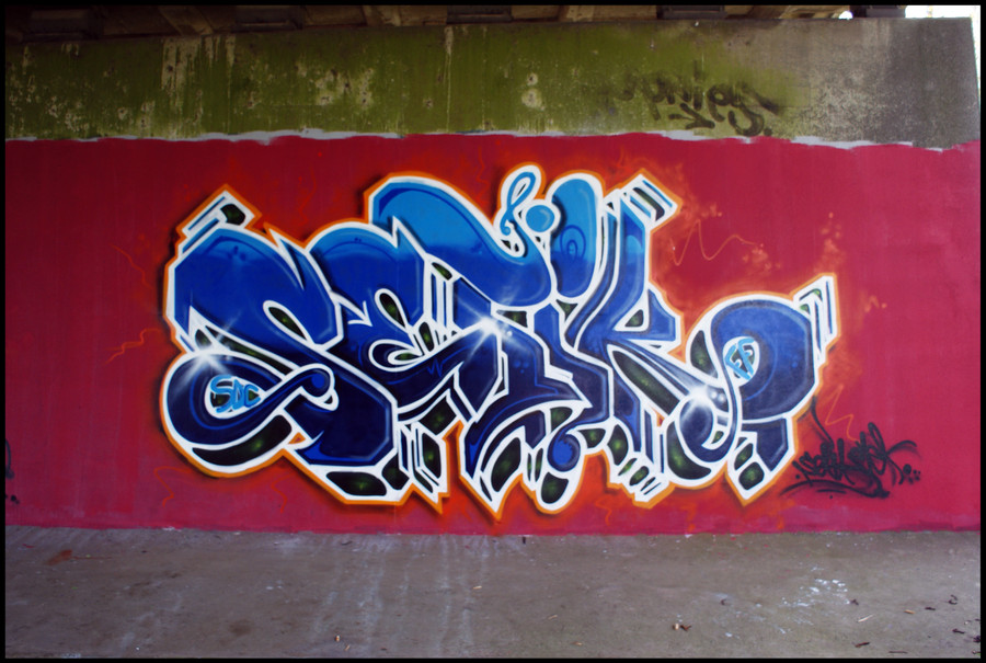
Published: 2009-04-11 16:25:43 +0000 UTC; Views: 1060; Favourites: 34; Downloads: 38
Redirect to original
Description Setik01
FF
SDC

Amsterdam
11-04-2009

with;
Rasa, Boks
Related content
Comments: 19

AndrizzleArt [2009-06-07 17:04:18 +0000 UTC]

Vet man Ik vind dat duidelijke witte juist wel relaxed, springt er lekker uit. Maar ben niet thuis in de graffiti wereld.

👍: 0 ⏩: 1

Setik01 In reply to AndrizzleArt [2009-06-07 17:42:23 +0000 UTC]

bedankt, snap goed wat je bedoelt over witte schetsen

👍: 0 ⏩: 0

nuk1 [2009-04-21 15:39:07 +0000 UTC]

nice one bro

👍: 0 ⏩: 1

Setik01 In reply to nuk1 [2009-04-21 18:16:25 +0000 UTC]

thank you!

👍: 0 ⏩: 0

anybodyLUZA [2009-04-15 15:28:07 +0000 UTC]

nice, almost a different style after 100000 of nearly same looking "setik"s^^

👍: 0 ⏩: 1

Setik01 In reply to anybodyLUZA [2009-04-15 20:29:59 +0000 UTC]

ah well, it takes time to evolve your style
and i have plenty of time ^_^

thnx

👍: 0 ⏩: 0

cibazoll [2009-04-14 16:23:55 +0000 UTC]

i like this one

👍: 0 ⏩: 1

Setik01 In reply to cibazoll [2009-04-14 20:08:08 +0000 UTC]

thank you

👍: 0 ⏩: 0

Viper818 [2009-04-12 21:50:30 +0000 UTC]

Sick bro !

👍: 0 ⏩: 1

Setik01 In reply to Viper818 [2009-04-12 22:04:26 +0000 UTC]

thanx!

👍: 0 ⏩: 0

GriinFX [2009-04-12 03:37:05 +0000 UTC]

digging the new K, T, and S squiggles.

👍: 0 ⏩: 1

Setik01 In reply to GriinFX [2009-04-12 09:18:55 +0000 UTC]

thank you

👍: 0 ⏩: 0

Rabbit713 [2009-04-11 19:52:27 +0000 UTC]

Nice bro

👍: 0 ⏩: 1

Setik01 In reply to Rabbit713 [2009-04-11 20:01:46 +0000 UTC]

thank you.!

👍: 0 ⏩: 0

D-REC [2009-04-11 18:51:16 +0000 UTC]

very nice

👍: 0 ⏩: 1

Setik01 In reply to D-REC [2009-04-11 19:37:50 +0000 UTC]

thanx!

👍: 0 ⏩: 1

D-REC In reply to Setik01 [2009-04-11 19:58:19 +0000 UTC]

no problem

👍: 0 ⏩: 0

dariotjuh [2009-04-11 17:06:03 +0000 UTC]

Die filling is dope, maar ik hou niet zo van zulke dikke witte lijnen bij een 3D

👍: 0 ⏩: 1

Setik01 In reply to dariotjuh [2009-04-11 17:08:10 +0000 UTC]

oke dankje

ik doe dat altijd om het duidelijk te accentueren, dat het goed te zien is wat 3d is en wat letter is......

👍: 0 ⏩: 0