HOME | DD
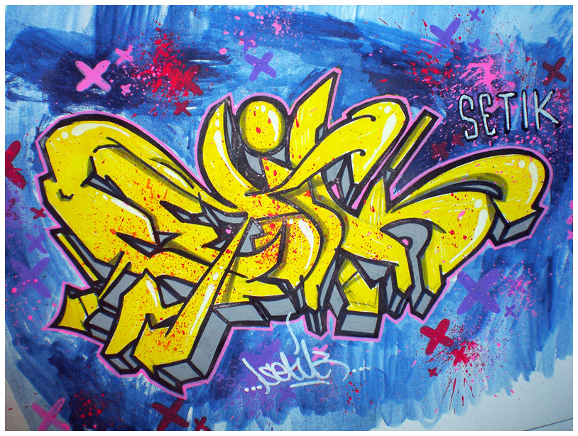
 Setik01 — Setik01_17022009

Published: 2009-02-17 19:46:10 +0000 UTC; Views: 1621; Favourites: 30; Downloads: 33
Redirect to original
Description
Setik01SDC
KP
Sketch
17-02-2009
Related content


Comments: 31

Lovin' the grey and that blue for the 3D really brings to life, great work
👍: 0 ⏩: 1


another experiment of colours, another great one...
👍: 0 ⏩: 1

")

nice. some extensions kind of look awkward though.
👍: 0 ⏩: 1
no problem. my OCD just kicked in when i saw the arrow coming out of the "E" disgracing the "S". also the arrow coming out of the "K." other than that, everything's great.
👍: 0 ⏩: 0


 (Wink)")

This is awesome! Looks like your deviating slightly from your usual color scheme!
👍: 0 ⏩: 1


Awesome sketch, man!  (Smile)")
BTW, what kind of markers do you use for coloring?
👍: 0 ⏩: 1

nice colours, letters dont have much flow as a whole though
👍: 0 ⏩: 1

i know
they are a little 'stiff' haha
but oke
")
👍: 0 ⏩: 0


Despite the fact that almost every "Setik" graffiti are based on the same shapes, you can get them all look unique in some way
👍: 0 ⏩: 1
thanx man
yeah the shape of the whole piece is mostly the same but i tried some new letters here
👍: 0 ⏩: 1
I agree with Utao, you could make new words if you wanted that would be great
👍: 0 ⏩: 0
nah
i did that
but i just want 1 word
i like that the most..
you can see the development you make in years, it's not about what you do in like 1 week or so
👍: 0 ⏩: 0