HOME | DD
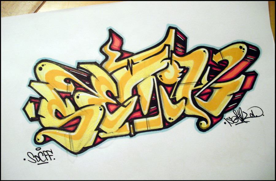
 Setik01 — Setik01_28012010
Published: 2010-01-28 18:01:56 +0000 UTC; Views: 2577; Favourites: 61; Downloads: 52
Redirect to original
Description
Setik01SDC
FF
Sketch
28-01-2010
MY WEBSITE
[link]
Related content


Comments: 41


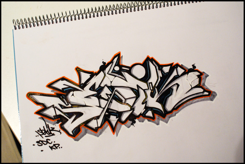
Ja ik ben het wel met iedereen eens alleen vind ik de K minder! Hij is in verhouding met de andere letters net iets te klein/dun. Die pijl erdoorheen maakt die K net een andere letter ofzo. Toch het geheel is vet! Volgende schets weer verbeterd
 - :P")
👍: 0 ⏩: 1

snap wel wat je bedoelt, ik wilde iets hebben om de rechter bovenkant van de piece op te vullen want ik dacht dat het dan beter in balans was, dat komt door die grote pijl boven de E.
volgende sketch zal inderdaad wel weer verbeterd zijn
thanx voor je comment.
 (Wink) - ;)")
👍: 0 ⏩: 0

Dope! And - aside from the others - I LOVE THAT "T"  - :D")
👍: 0 ⏩: 1

thats sooo crazy, i tried to do the word mass yesterday but it looked toyish
 - :(")
👍: 0 ⏩: 1


Good job! I just love this K! I belive that U could do better T
👍: 0 ⏩: 1
thanx
yeah the T needs some improvement,
and about the S, I try to make it look more agressive, so I still need to work on it
but thank you for your comment
👍: 0 ⏩: 1
 (Smile) - :)")
I know that U will change it and do it better so I will wait for sure!
Big up!
👍: 0 ⏩: 0


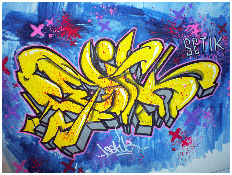
mad props on the style bro, way to switch it up.
totally dig'n the color contrast
👍: 0 ⏩: 1
no problemo
btw the 't' looks sick as fuck, it flows well with the 'i'.
jus sayin.
👍: 0 ⏩: 1
thank you, I think the T is ok, but I want a better one ...
👍: 0 ⏩: 0

no offence, in this sketch i really don't like the 'T'.
But how i know you, i'm sure you'll redo it, in another improved sketch
.
👍: 0 ⏩: 1
i know, other people told me the same.
It's just a new idea, 5 sketches later it will look totally different
thnx for the comment
👍: 0 ⏩: 1
yeah, it's true
man, you are a great artist (for me : the best  - =P")
don't stop!!!
oh, i almost forgot to tell you: i've featured your last wall in my magazine (no.2) . Sunday it will come up !
see you here !
.
👍: 0 ⏩: 1
thanx, i'll check it out,
will it be on your DA account?
👍: 0 ⏩: 1
