HOME | DD
 sewer-pancake — phenomena

Published: 2010-06-23 14:19:49 +0000 UTC; Views: 1211; Favourites: 52; Downloads: 0
Redirect to original
Description
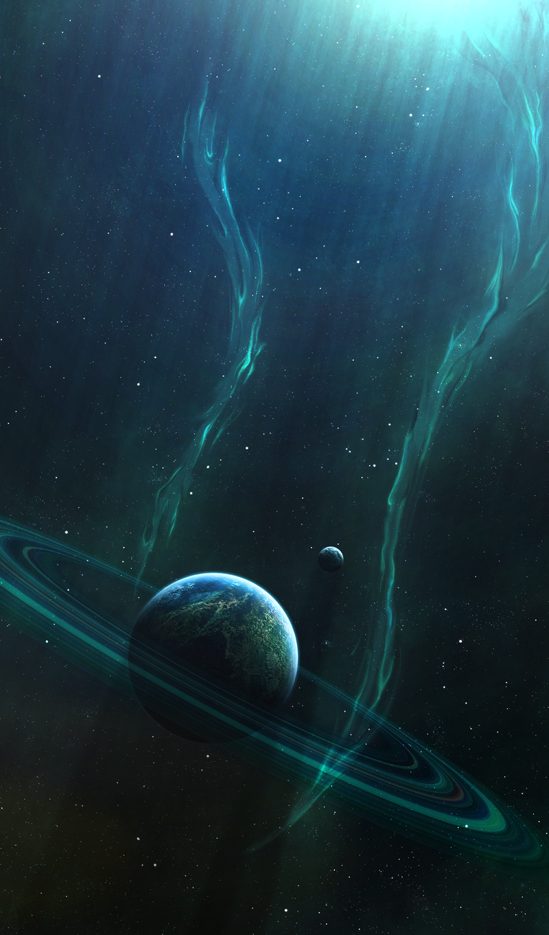
i dont know if i like this one (yet), but i just wanted to try this [link] tut by =qaz2008 . thanks for the awesome and easy tut!")
i used every stock that i uploaded yesterday, though subtle as they may be.
 (Wink)")
photoshop cs3 & 3-4 hours (maybe)
neb-apo as always, and the mixed media stock [link]
Related content


Comments: 29


Incredible the combination of light and shadows, brillant! Love the colors.
👍: 0 ⏩: 1

Very nice composition and the flare in the center is beautiful.
👍: 0 ⏩: 1


Very nice piece. First, I'd like to point out on the nice color the space has in this piece. Very nice cool colors. Although, the light source seems a bit too bright for my taste, but I think that is fine.
With that in mind the smaller planet should be affected greatly by this source of light. I see that you have a double light source on that planet and They are very alike in size. I see no shine as great as in the middle source in the top right corner.
Basically the shadow should be smaller for the side exposed to the middle light source.
👍: 0 ⏩: 1

thx for the compliment, and the tips.
the shine in the top right corner is supposed to be a sun outside of the picture. i tried for a semi-equality between the brightness of the light sources, but i do see that i need to lighten them on the side of the nebula more. and thanks again.
👍: 0 ⏩: 0

This is just stunning...very impressive lighting effects and details on the foreground planet...BRAVO!!!
Very Best Regards,
Eric
👍: 0 ⏩: 1
You're most welcome, my friend!!!
Very Best Regards,
Eric
👍: 0 ⏩: 0

Well I Like It,
Or Maybe It's Because I Just Loooooove Space Art lol
👍: 0 ⏩: 1

deviantart watermark is pissing me off :/ and because it supposed to look very cool in this place nebula is good good good goooooood. only thing to improve is the biggest planet (terrain), low quality/definition.
👍: 0 ⏩: 1
i know... i have a knack for making the most interesting part right where the watermark goes. 
thank you for the compliment, and i may try to improve the texture, this was mainly just a test of the tut.
👍: 0 ⏩: 1
to make it good looking you must play with big res. image 2000x1000, texture for so big planet must be 10000x5000, or bigger ")
👍: 0 ⏩: 1
my images are pretty big to begin with, but on this one i used two different ones and played with layer settings.
it maybe the combination of the two that makes it all wonky.
the main texture layer is 4960x5820, and the less noticeable overlay is 6000x6000.
i may start with removing the overlay one, and see if that helps it.  (Smile)")
👍: 0 ⏩: 1
i take that back... the main texture is 10000x8000...
👍: 0 ⏩: 0


Very nice pic, it actually set the mood.. wow great and realistic large planet. You're welcome

👍: 0 ⏩: 1
i wasnt sure of how well i did with it, cuz ive never done a planet like that before, but im glad i tried it.
👍: 0 ⏩: 1
Well, keep up the good job and you're welcome
👍: 0 ⏩: 1
