HOME | DD
 sfenley1 — trying color

Published: 2010-04-21 02:10:10 +0000 UTC; Views: 49; Favourites: 0; Downloads: 1
Redirect to original
Description
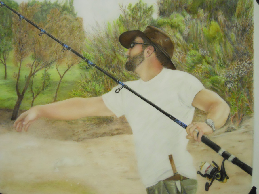
I've been trying out color.. it's hard! I still have a long way to go in learning to see the color and haven't blended this much yetRelated content


Comments: 8

I think you're off to a great start. What are you using?
So far the colors ring true, skin tone is so hard to get - don't be afraid to put greens, reds and yellows - purples. Things you wouldn't normally think are there make your color portraits pop.
I think the body form and proportion are spot on - that 3/4 turn of the face is hard to get but I think you nailed it. I agree witht he glasses comment before - they don't look right. Thought there are wrap around sun glasses - it still rings a bit untrue. You can make necessary adjustments that your reference might not show when it needs it. There are little things that you can get away with because it's a photo that you can't in artwork. Trust your judgement for what looks good over your references.
Can't wait to see it finished!
👍: 0 ⏩: 1

I'm using watercolor pencils, sans water, on Dura-lar, 11x14. The skin seems more yellow on the computer than it does in life, but even in life it's more yellowish than I'd like, so I'm going to play with it more.
I agree on the glasses, when I get closer to that part I'll probably be doing a lot of erasing  (Smile)")
👍: 0 ⏩: 1
I think you're doing great. I was surprised how many weird colors I put into my skin tones when I did my first people portrait - red, olive, purple. But with pastel you have that luxury to just keep adding colors and blending that you don't really have with colored pencil. Practice on a scrap sheet some weird color blends and see what you like best.
👍: 0 ⏩: 1
Thanks! I've got little scraps of paper everywhere with a bunch of color combinations and some of them I actually label so I can remember what colors I used
👍: 0 ⏩: 0

uh, i see you are going into showing everything in yor work realistic way, so far i can tell that this t-shirt and his right arm is very well done for me
yet keep it up! 'pracise makes perfect'
")
👍: 0 ⏩: 1
thanks! I know what you mean about the glasses, just roughed in sketch at this point. I'm not sure why I stick with realistic, I guess I just enjoy it
👍: 0 ⏩: 1
realistic-lover, that`s fine.; >
and no problem, i`m looking forward to the finished version of this piece
 (Wink)")
👍: 0 ⏩: 1