HOME | DD
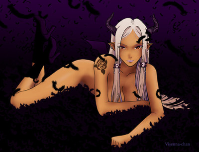
 ShadowForever — Red moonlight

#anime #chick #digital #foreva #forever #hot #manga #shadow
Published: 2014-11-26 18:52:30 +0000 UTC; Views: 6392; Favourites: 278; Downloads: 0
Redirect to original
Description
Now starting work seriously on illustrations. Hope you will like it! (Wink)")
Related content


Comments: 23

Overall
Vision
Originality
Technique
Impact
I like the overall feel of the picture, but I feel that you could of taken advantage of the stage you set a little bit more. Preferably the moonlight (More dramatic lighting to give it that illustrative 'impact').
I'm a little iffy about the character design. I like how simple (Maybe too simple) it is, and how it looks in the blue, eerie environment. But adding even the smallest details, like seams, or making it more reflective can add a lot when defining the material of a costume. However, the hair is beautiful!
Her left hand's thumb is on the wrong side of her hand. Or rather, if it's her pinky finger, it looks way too thick. I like the rest of the anatomy, but maybe focus/practice on drawing your hands and wrist a bit more.
I'm a sucker for backgrounds in front of moonlights; objects in-front of moonlights create a beautiful contrast, in my opinion. Lovely job on that!
The color use is phenomenal; and the color choices are just as great! Everything synergies well which each other, and the small palette gives it that clean effect!
I really like the composition! Using the reanimated-skeletons' eyes to guide the viewer's eyes to focus points is a really nice technique you used!
Overall, it is an outstanding attempt for you to just now start working on more "serious," illustrations!
Keep up the hard work! I hope the best for you!
👍: 0 ⏩: 1

Thank you very much for your Critique! It's very fair. "I'm a little iffy about the character design." - Sometimes, creating a character I make some rly dumb mistakes which are awfuly hard to change in future. The naked girl design, red skin, lack in anatomy, ect. - are the mistakes of expirience.
But I rly lov that you've found my strong parts in this piece aswell! Like "I really like the composition! Using the reanimated-skeletons' eyes to guide the viewer's eyes to focus points" and about contrast too.
After all, it is what it is, - I've "start working on more "serious," illustrations! ".
Thank you!
 (Smile)")
👍: 0 ⏩: 1
No problem at all~!
I love doing everything I can to help people improve~
Hope to see much more from you c:!
👍: 0 ⏩: 0


Technique
I really like this piece. I faved it, and will watch you right after I get done with this.
I love the composition, the color pallet and the energy of the peace. The atmosphere is great and I can almost hear the popping and clattering of the bones.
I would like to see more going on with the body suit (I am assuming that is what she is wearing). Like maybe some black veins running up through the form, or even some glowing blue veins that could throw subtle rim light on the partial skeleton she is holding. (I am not sure who or what your subject is or the story behind her, so I am just thinking out loud.)
I also think that the blue light being so strong in the grass on the right side should throw some bounce light up on the subject's right leg, sort of like you have done with the rim light on the skull in the lower right.
If find my self wondering where the strong light on the side of her hair and face is coming from. The moon is the main light source I am assuming. There also appears to be a lantern atop the tomb in the upper right that couldn't light much if at all of the foreground.
If the moon is the source for the blue light, I feel like the moon should have more of a blue glow about it.
The way the hand is grasping the skull with partial torso, seems unnatural. Doesn't look like it's in the right position to palm the skull (even if she is that strong). The skeleton doesn't seem to lifting itself as I see no legs or arms. If she is doing it by magical means maybe her hand flat with a fait glow, and some of the ragged pieces pointing upward as if the magic is pulling it out of the ground. (again thinking out load)
Lastly I think it would be cool to have even more atmosphere with some fog or mist to catch some of the blue light, and giving you another option to conceal some of the detail on the skeletons further from the veiwer rather than just obscuring them with darkness.
Again I love the piece, and the effect is has.
👍: 0 ⏩: 1
Wow! "I faved it, and will watch you right after" - Thank you!
"would like to see more going on with the body suit " - my true fail in design. In the end I just have'nt a clear idea what should fits to her.
" like the moon should have more of a blue glow about it." - I was trying to make more values on moon, but making moon more blue or greyish, turned the face stay off contrast. Thats why it is so pure white.
" hand is grasping the skull " - One more mistake of my. I did'nt draw the torso of the skull because of composition. If it would be the whole skeleton, it would rebalance the picture to one side too much. So I've just left it like that, probably that magic trick could turn it more realistic and make it more belivible.
Thank you very much for your critique!
👍: 0 ⏩: 1
I just re-looked it over... if it were me, i think i would blue up the moon some more. Make the subject more in silhouette, then have the problem hand with fingers out stretched with a strong magicy glow, and use that glow to light the now silhouetted subject on the audiences side. I would expect this would give more visual interest in the head/moon region also especially if the magic glow was a warm color to contrast the cool moon glow. I mean overall you are kicking ass!! Just thouht i would share how i think i would try to solve the minor issues. Keep going you are awesome.
👍: 0 ⏩: 0


Thank you! I saw yours, amazing too! ;D
👍: 0 ⏩: 0

Hey! I think this is really well done - certainly something I'm uncapable to do! I got a lot to learn yet!
But.. one thing I think is bugging me and I think no one critiqued it and I started wondering whether it was just me or something.
For me her bottom + legs look awkward. It's like there two different bodies to which the legs are attached. The first booty - closer to us - looks smaller than the one farther from us and I think that creates a lot of confusion in my mind. Also the difference in saturation from the two different legs makes them look like they're two worlds apart in distance - enhancing my feeling of "two different bodies". Or something. I'm not sure I'm being clear, if I'm right and everything. Just if it strikes a chord when you look at it again after reading this... then I might acutally be helping you! I hope
Again: I really loved the concept, colors, lighting! Keep up the awesome work!
")
👍: 0 ⏩: 1
Thank you very much!
👍: 0 ⏩: 0

nicely done! reminds me of Terry Goodkind's mord-sith women
👍: 0 ⏩: 1
Thank you man! Yep, a bit!)
👍: 0 ⏩: 0


