HOME | DD
 Shadowgrail — Robin vs Violet

Published: 2008-06-29 12:32:20 +0000 UTC; Views: 3220; Favourites: 39; Downloads: 0
Redirect to original
Description
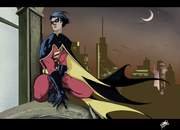
The first page of a 5 page sequential sample I'm including in my portfolio this year .Hope y'all likes !
Related content


Comments: 23

")

WOW. This turned out so great! Panel 1 with the sign just blows me away. It's got such great design and perfectly establishes a realistic setting. Great pacing in the entire page, it has a really nice, quiet, brooding feel. Awesome work!
👍: 0 ⏩: 0

i really love your layout, and use of the strong black-white silhouette shot!! awesome work.
👍: 0 ⏩: 1

thanks ! I really do like to play with shapes and shadows and I'm really happy you noticed those !
👍: 0 ⏩: 0

I love the composition! I'll stole some ideas from you, he he he.
Bests!
👍: 0 ⏩: 1
oh wow you work with mark for AJB ? nice pages man ! thank you !
👍: 0 ⏩: 1
Thank you very, very much! stay in contact! I love your art.
👍: 0 ⏩: 0


hey MLE ! hehe how ya doing ?  (Smile)")
👍: 0 ⏩: 0


Nice work, I'd love to see just the lines on this one, they look so clean.
👍: 0 ⏩: 0

Hey i think it looks pretty good man, i like the style of it too. I would definitely suggest that you put at least an outline of robins head in that second panel (parking lot panel) just to kinda sell the fact that he's observing it. THese are pretty dope though man, i like em. I dont know what they'll say about you offering the full package though. You know sometimes they get all "well, what do you want to do, draw, color, ink, pick one" but i think its pretty dope.
👍: 0 ⏩: 1
I hear ya.. lol it's why I try to do a good job on both pencils and color !
👍: 0 ⏩: 0


The parking lot looks like one of those pixel-towns or something. Not quite dynamic enough.
👍: 0 ⏩: 1
I'm gonna have to add the "link" to panel one with a silluhette of robin's head up thre.. that may just help. thanks !
👍: 0 ⏩: 1
That would help! No problem.
👍: 0 ⏩: 0

1st off, wow! This is amazing!!
But, since it's a sample, I'll give you my thoughts upon looking at it...
The first panel/image (Robin on the roof, on left side of page), that is just awesome, but to me, stopping the image where you do, feels too design driven and leaves lots of dead space on the page, when extending the purple of the building would probably fill out the page and look better, if it continued all the way across, or most the way (I know that causes problems for the last panel though)...
Then the third panel, the close shot of Robin? Maybe it's your style (but we don't have any other context of close face work to see here), but his chin seems to reallyyyy cut in... making me think the grey is supposed to be something superimposed over where the bottom of his face would be, but it's the background color, so I know it's not. I mean it's as if he has no lips or mouth.
The only reason I say anything, is, man, that's amazing work, but those two things take me out of it...
But that's me
But wow, you've got skills!
👍: 0 ⏩: 0
