HOME | DD
 ShadowHawk137 — Xenith

Published: 2014-04-30 03:13:22 +0000 UTC; Views: 90; Favourites: 0; Downloads: 0
Redirect to original
Description
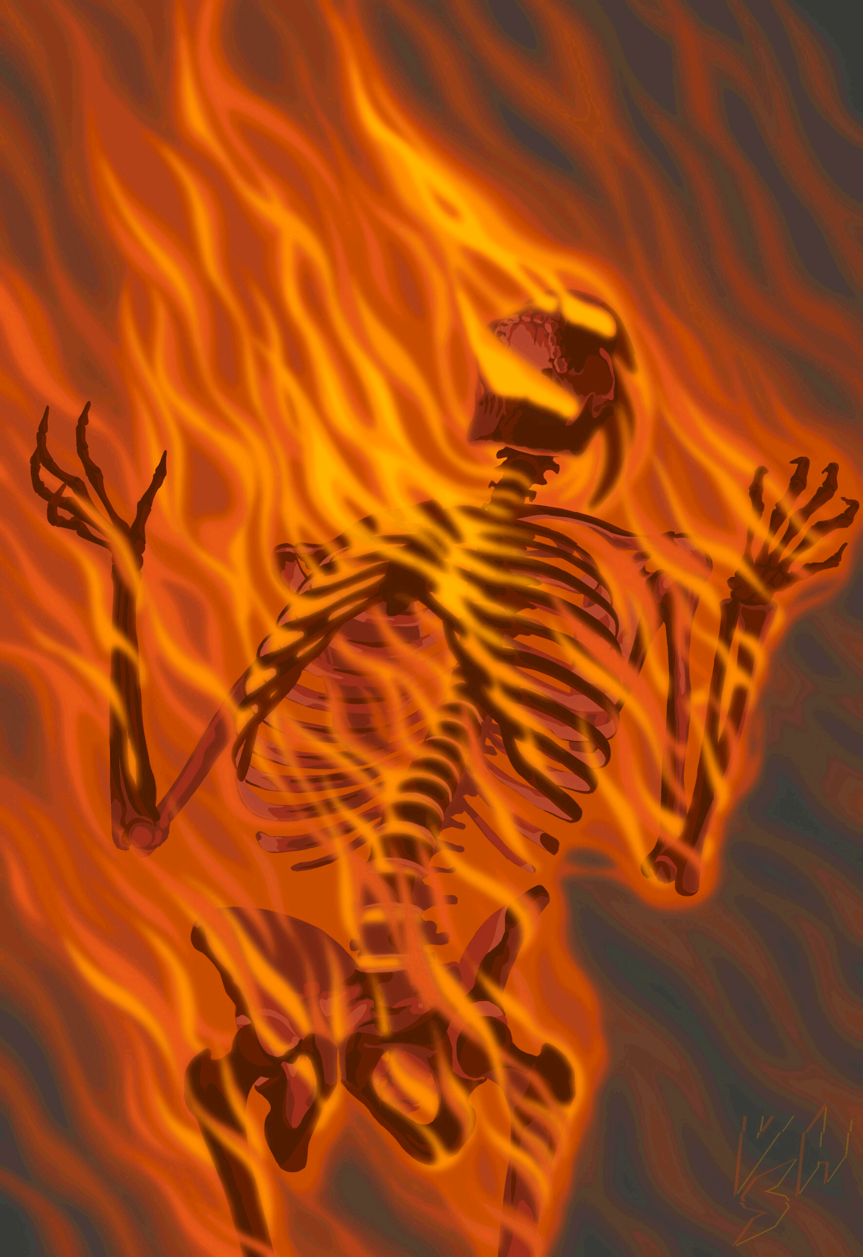
Xenith, a half man, half machine attempt at creating a perfect cyborg. He lives in a futuristic version of the world in which the United Nations has banded together to seize control of all countries, creating the United Nations of Earth. In that world, Xenith stands as the pinnacle of human evolution, a science experiment and a soldier. But Xenith has a mind of his own. He is a character in one of the numerous stories I write in my spare time.This was another early attempt at inking, and this one was an action shot, something I don't normally do, so it was an experiment with depth.
Done with mechanical pencil, multiliner, markers, and some hasty Photoshop.
Related content


Comments: 3

Well this looks cool! I love the pants and the boots and his smirk ^_^ Very nice character design! The depth looks pretty god to me, but just on his right leg, the one moving backwards, perhaps the pants around the knee could have been a bit tighter? But I shouldn't really be giving advice, because depth and action isn't my style :/ But it looks awesome anyway! I can tell by looking at this picture that you've improved in the area of drawing faces.
👍: 0 ⏩: 1

I'm not happy with how this one came out. His face is all derpy, the lines are all jagged, his coloring is awful, and his hair looks exactly like Robin from the Teen Titans TV show. And now that I think about it, Xenith's personality is actually pretty dull. I have to rework him quite a bit in his story, but I'm pretty pleased with his design here. I just wasn't able to draw him well enough. If I ever do a "Draw This Again" meme, it'll be for this one, I'm sure of it. Don't worry about it! Any critique is good. You don't have to be an expert at something to know it looks wrong, but knowing more about it can help you explain why it looks wrong and how to fix it. Did you take a look a Kurosuki? I'd love to here what you think of her!
👍: 0 ⏩: 1
Well if you don't like this one, treat it as motivation to keep trying and to improve your skills. That's what I do if I draw something crappy. I think his colouring looks fine ^_^ Well a back story is important too (that's the thing I forget about with my OCs -__-)
You should be pleased with his design ")
I haven't yet, but I'd be glad to take a look at Kurosuki! I'm happy you've asked me to look at her

👍: 0 ⏩: 0