HOME | DD
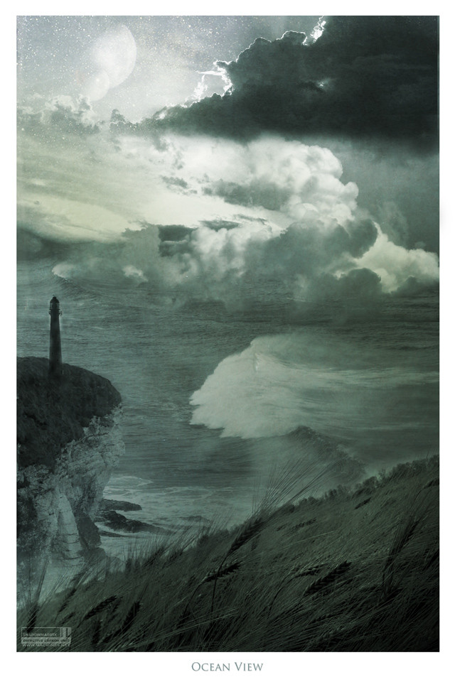
 shadowmageix — Ocean View
Published: 2004-07-01 15:03:41 +0000 UTC; Views: 3357; Favourites: 101; Downloads: 763
Redirect to original
Description
3 hours too many layers, computer frying etc.I recognise that not everyone wants devprints' uber quality and scary prices, so this product is available in cheaper, normal poster quality here: [link]
Related content


Comments: 125

This is sosoosososos beautiful. Wonderful. xxxx
👍: 0 ⏩: 0

I'd hate to be the guy out in the ocean in that type of weather. Excellent piece.
👍: 0 ⏩: 0


 (Wink)")


that's beautiful  (Smile)")
")
👍: 0 ⏩: 0

i leve the sea-colour wash over the whole thing. the texture / brushed overlay realy goes well with the textures of the clouds and the water, in different ways. they give nice, diverse impressions. i find your symbol in the corner annoying but that's the way it goes.
one thing: i think that it looks like the cliff edge; where the grass meets the chalk(?) looks like the edge of the water, and the cliff edge might be a reflection. its hard to explain. but i still love it.
👍: 0 ⏩: 1

yeah, it's not always pleasant having to "stamp" your work, but if you don't you might as well write "please rip off my work" in your deviation description, sadly.
👍: 0 ⏩: 1
only when you're as good/popular as you. people like me don't really need to
👍: 0 ⏩: 0

the monochrome kind of gets to me... but what i do like is the movement in it... the wind is very much present... i especially like how you can't tell where the sea ends and the clouds begin...
👍: 0 ⏩: 0

yup. prolly sometime this weekend or monday.
👍: 0 ⏩: 1

C'est Trés beau!! le rendu des nuages est super 
---------------------------------------- ------------------------

👍: 0 ⏩: 0


beautiful amazing, i'm such a sucker for beach pictures :+fav
👍: 0 ⏩: 0


Beatyfull......
The land is great, especially the tower, the wave is great to as are the shape of the clounds. Nice job on the passe water - clouds and clouds-space, but i would love to know how u made this. For instance did u made the picte of the land urself, did u made the pic of the water urself or was that one whole pic?
Where did u get the clouds pic or did u do them urself and how did u made the clouds this way?
This pic is sooo good :
👍: 0 ⏩: 1
I'm not gonna reveal my secrets
thanks for the +fav
")
👍: 0 ⏩: 1
neh ? ok i can live with that just keep up the good work
👍: 0 ⏩: 0


the detail of the scene is wonderful- it reminds of a plate or etching that might be found in an old book. very cool.
👍: 0 ⏩: 1

it's amazing my dear
i love the sea.. very well done
it would be great with you there looking to the sea..

👍: 0 ⏩: 1

Other eerie work to make my dreams weird... o_o
This gets a much deserved
Good work!

👍: 0 ⏩: 1
thank you very much Psy
👍: 0 ⏩: 0

One of the things that typically bug me with photomanipulation is when the elements don't fit together properly: if lighting or perspective is off, if the blending isn't done quite right, so forth. I also generally dont like ones that are too busy or over the top, combining element upon element. None of those are the case here.
This image is quite beautiful - the colors and shades you've used are, to me, serene and extremely fitting to the scene you've built. Technically, I'm very appreciative of the way you got what I'm assuming to be separate elements (the grass, the cliff either with or without lighthouse, the wather, the clouds, and the rest of the sky) to blend together in a natural, almost naturally photographic way - just a bit exaggerated for style. Artistically, I like the composition, the clarity and light on the grass, and the flowing but still detailed background and the way it smoothly transforms from one element to another. I like the way it almost looks like a near-impossibly, highly stylized photograph, converted partially into what almost looks like watercolor, or crepe paper...amongst all the waves and stones and billowing clouds, there's something delicate-seeming to the image, and that picks up on the quality of the foreground grass nicely.
You might be wondering why I'm being so detailed in my praise; well, for one, I really like the image
👍: 0 ⏩: 2
whoa, thank you very, very much.
yeah it's borderline surrealist because of some of the things that are structures you'd never find in reality, the interaction between clouds and water, stars shining -through- clouds etc.
thank you for what must be the best comment I've ever had.
👍: 0 ⏩: 0
Ahh, forgot to check spelling. Dont/don't, wather/water.
👍: 0 ⏩: 0

Hey,great work! +watch - cant wait to look into your gallery
👍: 0 ⏩: 1
milton is my favorite...
👍: 0 ⏩: 1
Im afraid Im not following you - who/what is milton?
👍: 0 ⏩: 1
the guy that wrote "paradise regained"
👍: 0 ⏩: 1
I didnt know that... I got my username from a Fields of The Nephilim Song - I guess that's where they got it from... Thanks for the update
👍: 0 ⏩: 0


thanks for the +fav!
👍: 0 ⏩: 1


thank you very much!
👍: 0 ⏩: 0

This is a really erie peice that I really like. I think you got the blending of stars in the sky perfect in this one and the waves are devestaing. The lighhouse adds a nice touch, which draws more attention to the land. It really looks like a violent storm is on the way, which is shown by the grass blowing and the huuuuge waves. I love.
👍: 0 ⏩: 1
cool, I'm glad you liked it
👍: 0 ⏩: 0


| Next =>