HOME | DD
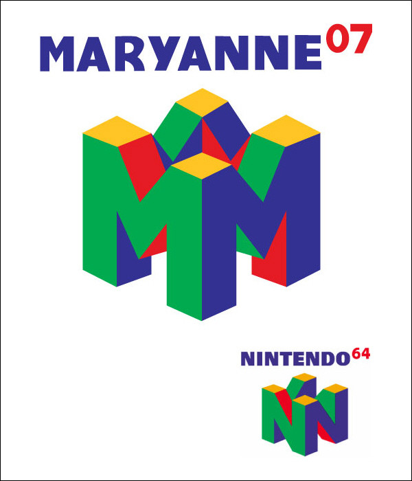
 ShadowMehMeh — NINTENDO64 Logo Rip-Off

Published: 2006-10-01 02:35:30 +0000 UTC; Views: 917; Favourites: 1; Downloads: 0
Redirect to original
Description
This is my first vector piece which, because it was an assignment for school, was a rip-off of an existing logo. The assignment was to grab an existing logo and incorporating our name into it and pulling out the original name. I wasn't sure what logo my name would fit into until I came across "Game Cube" and that was 8 characters long... but that seemed too hard to render in vector (and I'm only an amateur at it) so I just picked out the Nintendo64 logo instead and here it is!The yellow parallelograms at the top aren't lined up right... fail.
Related content
Comments: 2

hi !
it's funny I did the same
i didn't do it with vectors...
i just send you the link if you wanna see it
cheers !!!
[link]
👍: 0 ⏩: 1

Yours looks more proportional.
The top of my logo is a little off.
Vectors are a little hard to get used to. =/
👍: 0 ⏩: 0


