HOME | DD
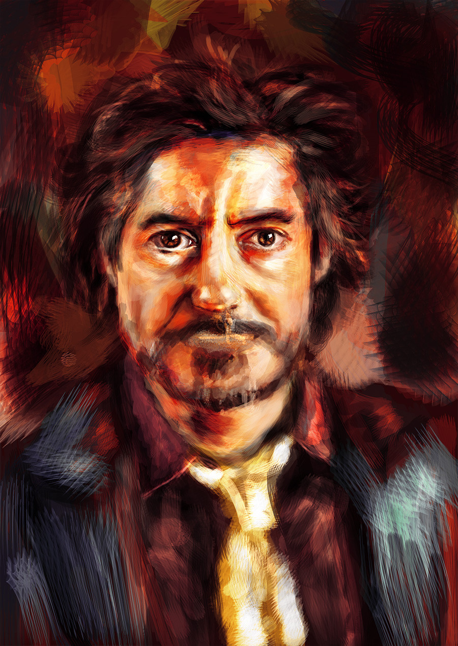
 Shadowsprint — RDJR WIP
Published: 2013-09-27 22:06:34 +0000 UTC; Views: 53; Favourites: 2; Downloads: 0
Redirect to original
Description
WIP of Robert Downey Jr. piece experimenting with my custom scratchy brush :3Related content


Comments: 6

Why did you chose such a warm color pallete? And instead of the smooth style why did you choose a heavy-brush stroke style? I noticed you mentioned it in the comments but that doesn't explain why. Just confirmed it was intentional.
I wish you'd have used a little more color contrast to make the image pop a little more. there seems to be the odd green splash off to the side which also serves as a distraction.
I think the contrasts are pretty solid but the value contrast on the tie is a little overwhelming Its distracting
--
All in all I'd say you have a large wealth of skill/talent with the creation but the raw composition seems a little lacking. Were you working from a photograph?
👍: 0 ⏩: 1

Replied on finished piece
 (Smile)")
👍: 0 ⏩: 0
Beautiful. It looks exactly like him. I saw you responded in my thumbshare to someone else with the finished one so I'll look at that later.
👍: 0 ⏩: 1
Oh thank you very much! :3
👍: 0 ⏩: 0

")