HOME | DD
 ShadowSweeper — Blaze

Published: 2005-06-15 00:04:33 +0000 UTC; Views: 292; Favourites: 8; Downloads: 13
Redirect to original
Description
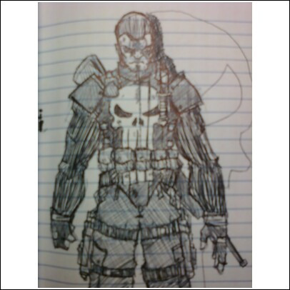
Well this is Blaze, elemental mage, basking in his powerful element of air. If you can't realize it, he's basically on a forest clearing cliff landscape looking down to the barely populated nature. I'm not really positive on his staff, so I gave him a nice and simple one....ta da?=Note=
Ya, I'm not a really good artist and I dont have any special computer software or anything. So this is just raw drawing that I want to upload. I'm also like totally new to deviantART and all help is appreciated. The little "Blaze" in the corner would be my signature since if you haven't realized yet...I've 'concealed' my name (long story).
|+|+|IMPORTANT|+|+|
Blaze is coprighted by me [Blaze (c) me] so if I find his name somewhere where it shouldn't be, I will hunt you down, monitor your every move and make you life living hell
 (Smile)") I hope you like my sketch.
I hope you like my sketch.
Related content


Comments: 8

Don't feel bad. 
Spilt milk.
Has anyone ever read that book?
Very good.
^^
👍: 0 ⏩: 0

Blaze is rather chunky in that picture... But it's better then I could do. And, as that one person said *prods person*it does look correct because of the robes. Well, anyway, it's pretty good.
You said there was something about the staff... Hmmm... *searches staff* Hehe... Kidding dahlin', kidding.
PS: This is Fang! That's right. I'm stalking you. Not really.
👍: 0 ⏩: 2
Yeah. It may be just that I... stink, though.
Anyway, back to the topic...
Is the "defiency" where the staff begins to meet his robe?
👍: 0 ⏩: 0

Oh hey Fang. Well I'm glad that you can admit I'm a decent artist
I guess if people dont see the defiency with the staff I"ll be just happy
")
👍: 0 ⏩: 0

ShadowSweeper,
To my observations, the body appears thick because he is wearing robes. If you observe anyone wearing robes of that manner [like, say, a priest, for instance], it's apparent that the robes make them appear thicker because they don't hang as close to the body as a normal T-shirt would. So, in that respect, the robes are believable. I apologize, DiortetheSpork, if I appeared to be attacking your position - I just wanted to note my observation.
As for the rest of the picture - it's a little bit difficult to discern certain details in the picture, because the lineart is too light. I am aware that you don't have a "special computer program" - neither do I, but the problem can be ammended by using an inking pen [even a ballpoint pen would suffice, or a Sharpie Marker]. That way, the drawing would be easier to understand. For instance, I can't tell if the curved lines around him are supposed to be rocks, or clouds. I would suggest inking them, and also using a pencil to shade the picture in. That way, the texture would be more obvious, and it would be more comprehensible.
I have two more comments - the far-green trees, and the staff. As objects fade away into the distance, they tend to appear smaller due to perspective. However, it might just be the exclusion of ink, but the trees on the mountains seem to appear as big as the ones just below the cliff. Lastly, the staff - I would suggest drawing the staff out beforehand on another peice of paper to get an idea as to how it would look. If you look at the greatest artists, they don't do anything on one take - it goes through dozens of conceptual stages, and each time, they refine the components so that what doesn't work is siphoned [sic] off, and what does work is amplified. So, if you were to draw the staff again, you might add some details that you hadn't thought of before, and and a few of the mistakes [in this case, the lack of detail] can be taken out.
I understand that you might have drawn the picture at a very small size, so you couldn't fit any more detail in. If such is ever the case, I would advise shrinking the picture down on the computer - it minimalizes the errors and problems, and it's employed by comic book and manga companies across the world [comic book artists draw on paper that's approximately 11 by 18 inches, if I recall, and it's shrunk down to 8.5 by 11 inches. Manga artists go from 11 by 18 inches down to as little as 3 by 5 inches, which gives the pictures a more crisp quality. So, using steps like this, even the simplest of techniques could be used to increase the quality of the picture.
I have one final note [not a comment] to share with you - look at resources, be it the actual sight, a photograph, or another person's artwork. In this way, you might notice some details that you might not have thought off, and use it in your pictures to increase the quality. Whenever I do landscape in my pictures, I usually have a graphic novel trade-paperback nearby so that I can see how other artists do what I try to do, and use that as inspiration. An example of my work that I can give you for this is at the following [link] . In this case, I used a comic book adaptation of the original Alien movie to get the sunrise effect [for the purposes of making it look... different... I made it an eye instead], while I used a Thor comic from 1986 [it might have been as early as 1984...] for the clouds.
So, in conclusion - keep practicing, and keep an open mind to the world around you - any little bit can help you learn to draw better pictures in the future!
Best/Dan
👍: 0 ⏩: 1
O.o
*long pause*
...Thanks?
I've never seen such a long comment in my life, but since it was filled with a good amount of positive attitude you are welcome any time in my gallery
Again, well thanks for the advice, but I'm just sketchy artist with an active imagination
Umm again thanks for the concideration, I really do appreciate the thought you put into the comment, and those clouds/rocks are trees ")
Oh and Aneriv's a pretty good friend of mine (diortethespork), so she wont mind!
Thanks again,
-SS
👍: 0 ⏩: 0

Nice. The body is a bit too thick for my liking, but I still like it
👍: 0 ⏩: 0