HOME | DD
 shanelong — Velvet Revolver
Published: 2004-07-03 23:13:49 +0000 UTC; Views: 4059; Favourites: 18; Downloads: 241
Redirect to original
Description
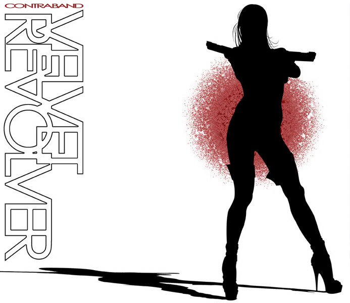
My bro picked up the Velvet revolver CD today, i thoguht the album art was exactly my style, like, if i were to design one for them, that would have been what it was...err..comfusing...anyways....So i did my own version! Didnt liek the origanol font/logo they used, So i made my own, vectored my own chick, gave her guns too, the red splotch thing was PAIN IN THE ASS, if anyone knows how to do it liek they did it lemme know, mine didnt work too well.
But overall i like it. maybe ill print it out and make a mock up jewle case for my portfolio...hrrmmm
Oh here's their version: [link]
Related content


Comments: 27

Nice. I like the fact your logo has more detail. I especially like the hair and boot outlines. Makes it look more realistic
 (Smile)")
👍: 0 ⏩: 0

amazing ^^
Velvet Revolver
the original is great but this.. is awesome!

👍: 0 ⏩: 0

The title redesign is sweet, but the red splodge, knowing what the album cover looks like, resembles a sponge.
👍: 0 ⏩: 0

Whoa, this one is way better then the original one.
👍: 0 ⏩: 0

I love the album artwork for the Velvet Revolver CD. I do like your version a hell of a lot better though. The font you used is a lot more dynamic than what was actually used. I just think your version is better all around. Great job!
👍: 0 ⏩: 1

tahnks, i like mine better too, except for the damn red spot, i cant get it right, ah well.
👍: 0 ⏩: 0

very, very nice artwork. they´re just amazing!
👍: 0 ⏩: 2

way to go, talk about BAM!! lol *shakes head* I do like what you did though, and I appreciate droppin' the link to see what the other cover looks like also.
Interesting experiment.
👍: 0 ⏩: 2

lke their version better, sorry!
theres just has this bit of coolness to it, but your pick of the chick could be cool if you did an insert, and did a series of chicks n guns in different poses,
the font used for the logo is just way too skinny.
👍: 0 ⏩: 0

hot shit man, i wanna see u vector some porno! for reals....
👍: 0 ⏩: 0

yeah me too, i dig what i did with the logo too, its unreadable at first buts kinda eye catching so it will amke the viewer want to figure out what it says, and turned to the side seems to be pretty easy to read...but yeah, thanks jas!
👍: 0 ⏩: 0

I like this man! It's very creative. Simple yet I know you worked hard on it. I kinda can't get down with the red spot behind her but seeing as how I haven't seen the original ciover that was the source of influence, I won't really hold that against you.
Good stuff man.
PEACE!
👍: 0 ⏩: 1
i linked up the cover at the bottom of my deviation if you wanna see it. thanks for the comments bro
👍: 0 ⏩: 1
*slaps forehead*
Me am retard.
Now that I've seen both, I pretty much stick to my original comment.
Cool shit.
PEACE!
👍: 0 ⏩: 0

cool i like the type logo you did, i dunno about the red part, maybe you could just do it with a bunch of circles? or maybe just make what you have already a little darker, it looks too fuzzy
👍: 0 ⏩: 1
well on the front of the cd it looks like a spraypaint spatter, so what i tried to do was a circular gradiant and run it through some filters to make it look "sprayed" around the edges, i almost think the gradient looks better as a design, but makes it look a little to "asian". Know what i meen? with the whole red sun thing.
👍: 0 ⏩: 1
yea i understand what you're saying
👍: 0 ⏩: 0

