HOME | DD
 shaoron — Yin and Yang v2

Published: 2006-04-17 16:46:47 +0000 UTC; Views: 936; Favourites: 23; Downloads: 130
Redirect to original
Description
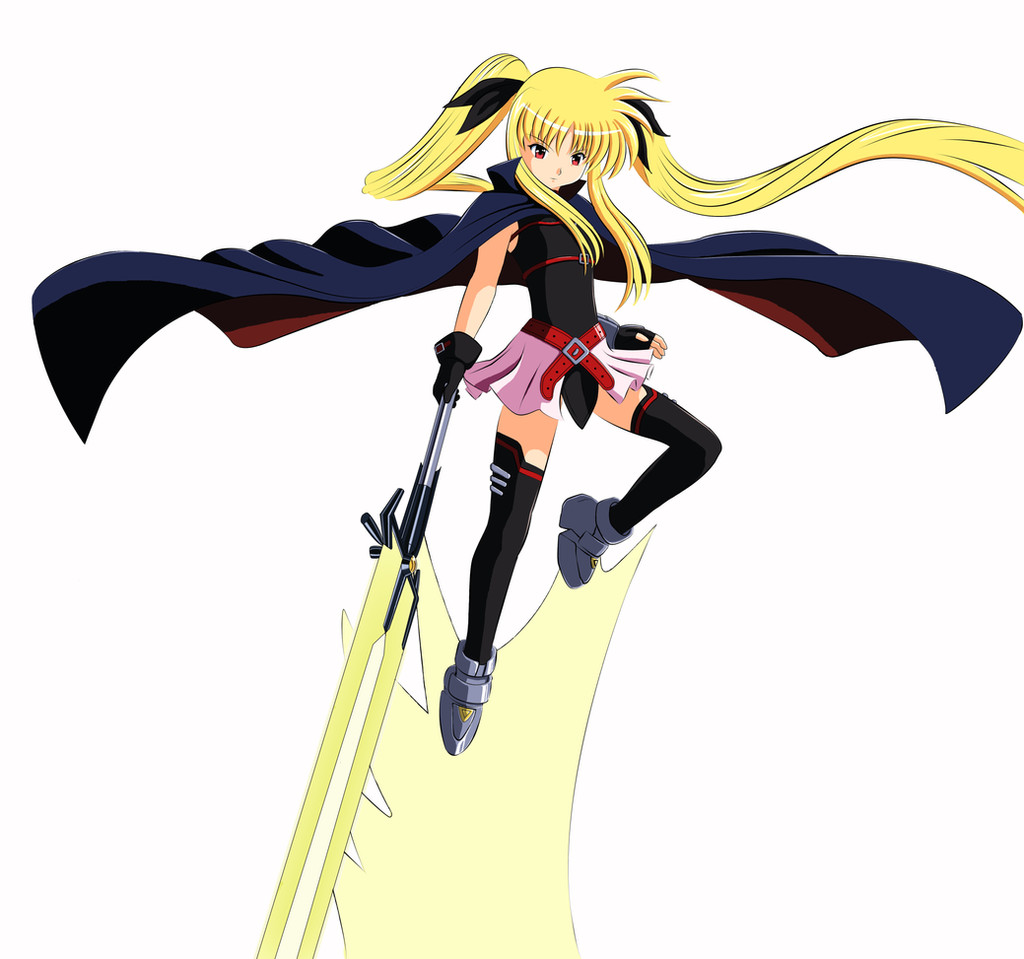
i was hoping to update the otehr one.. but i ended up sending this one is as a comparison for the other one.check this one as well: [link]
and tell me which is better.
Related content


Comments: 6

ya,i think version 1 goes better with the current states of Asuna being dipicted. since in one, she looks like the freakin terminator while the other has her jumping up to save someone. though in a way, the way its shown in this version, it could go with being the opposite personalites or err, ya my head hurts now.
👍: 0 ⏩: 0


Because you're doing a Yin and Yang theme, I think this one is more fitting. There cannot be light without darkness, and there cannot be darkness without light. I like how you put the light character on the dark and vice-versa, since the real Yin and Yang have dots of the opposing element/color (shade if you want to be technical). The glow is a pretty simple technique, but it can be used to do some great things. I would personally choose a different color for the light character, the yellow on black sort of looks a bit... I'm not sure what word I'm looking for. The purple on white looks really good, though.
An idea popped into my mind, maybe you could have a drop shadow on the "evil" character instead, to show darkness or shadow instead of a dark color as a glow effect. I like the purple glow on the white, so I sort of have mixed feelings about my suggestion. You could always try it out and see what it looks like, though.
On another note, it's a shame the wallpaper isn't big enough to separate the character's glow effects. The overlap looks a bit sloppy, maybe if you chose a light blue for the "good" character, it would blend better than using contrasting colors. Though, now that I think about it, you probably chose contrasting colors on purpose to represent the difference, since white and black contrast, you made the glows contrast... Hmm, if that's what you were going for, then you did a good job, but the overlap still does look a bit strange, imho.
Overall, it's a simple and clean wallpaper, and I like it. Good job.
 (Smile)")
👍: 0 ⏩: 1

i could actually make the chars slightly smaller to make the glow fit.
yellow on black? off, i guess.
what color do you suggest then?
👍: 0 ⏩: 1
For the glow over the black, I would suggest just messing around with really pale colors. You could probably keep it yellow and just either mess around with how light the yellow is or how hard/soft the glow is. The yellow that you currently have is really thick (it looks practically solid for a bit and then tapers off into transparency) and since it isn't very pale it stands out almost blaringly in front of the black. If you tweak the settings on the glow so it's softer, it might look better since it will blend with what's behind it more. Again, you could try to go for a paler yellow, possibly a pale blue.
There is no rule I know of to follow, you just have to go with what you think looks right. If you like it the way it is and don't want to change it, by all means, keep it that way. Art is supposed to be an expression of oneself, after all. Changing it to fit my tastes or someone else's is generally not what art is about (unless it's commissions). So in the end, do what you like and think is best.
👍: 0 ⏩: 1
[imitates Yoda]: hrmmm... interesting...
thanks for the comments
")
👍: 0 ⏩: 0