HOME | DD
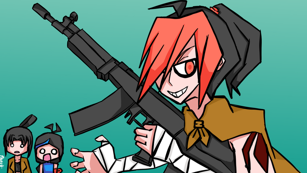
 SharpshooterPamu — Freedom Fighter
Published: 2018-08-04 10:28:50 +0000 UTC; Views: 863; Favourites: 24; Downloads: 2
Redirect to original
Description
I completely forgot to put up the description for the purpose of this.So, this art is basically for my new desktop wallpaper since my old one had my old art style and is very outdated. It seems to be of higher quality and much more sinister. I also decided to change the icons, but will be doing them once I'm free (School is coming on August 7th, tomorrow if you read this by the time I added the description.)
Now, you may be wondering I didn't use the full-on black in this piece. It's because that people might be having difficulty dealing with the pure blackness, but it seemed like some people appreciate it, such as from ProjectComment . I'll be using the full-on black again soon for the desktop icons!
Related content


Comments: 7

I love the sharp lines in this style!
It looks super nice
👍: 0 ⏩: 0

She's going to liberate all the wallets from their owner's possession!
👍: 0 ⏩: 0

Thanks for the comment on my Pink Mercy piece, i appreciate it.
This really reminds me of the art style used in gorillaz music videos for some reason. I quite like it.
Some things I can suggest for you to try out, is potentially using different thicknesses of lines, for things such as the white bandages(?) on her arms or for showing the flow of his shawl.
The background colour you chose provides a good contrast between you and your characters allowing them to be the dominant figure in the foreground so good work.
One off setting thing for me, though I'm unsure if it's intentional. Is the Main characters head shape, it seems to be really elongated, almost like an oval, or the hair just has a lot of volume.
So that might be something to consider, when thinking about what you might like to experiment with in the future.
I think what you've done in terms of using the darker and lighter greys instead of pure black, allows you to provide depth to the piece, even if only using 1 different grey-value.
Sure, this could be achieved using the pure black too, and pairing it with a dark grey for highlights. I personally like the greys, Perhaps do a comparison and see what one works better in your opinion.
👍: 0 ⏩: 1

You’re welcome for that and thanks for your critique! It’s a “she”, though. Hahahahaha
👍: 0 ⏩: 1
Hahah, that's my bad. It's just a bad habit to say that when I'm unsure. Thanks for letting me know. I fixed that up in my comment.
And no problem, just thought I'd return the favour. Onwards and upwards!
👍: 0 ⏩: 0

hello im sylvie from just to let you know im not the best when helping people but the best i can do
i have no idea why but the edges are very sharp i suggest you to round them abit
and the gun i just dunno it looks werid for me maybe softly shade the gun?
like i said im not the best but i will try my best ^^
-sylvie
👍: 0 ⏩: 0
