HOME | DD
 shaunC — Faeries At Play page 5
Published: 2011-02-01 06:13:37 +0000 UTC; Views: 1198; Favourites: 27; Downloads: 13
Redirect to original
Description
First page: [link]Previous Page: [link]
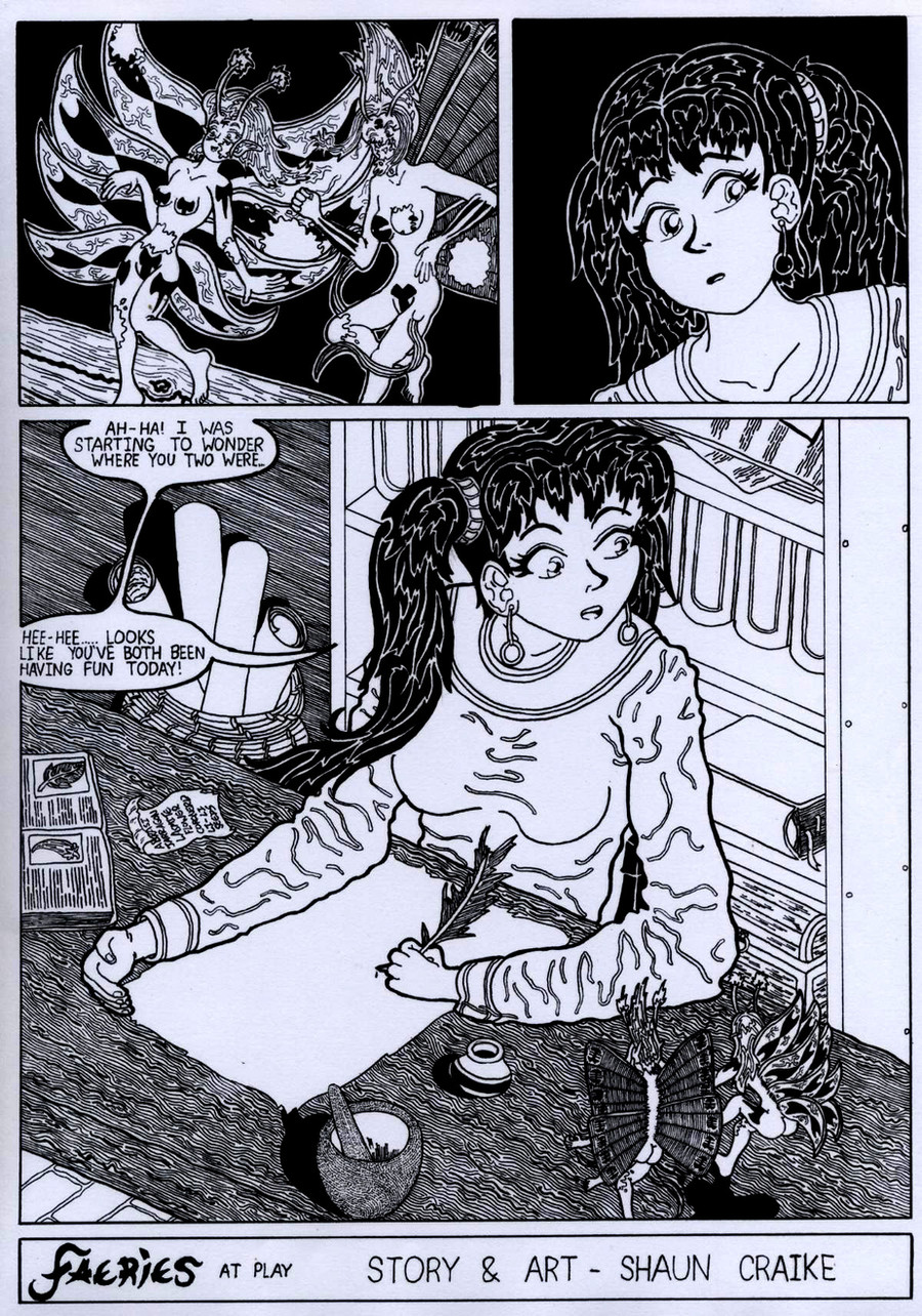
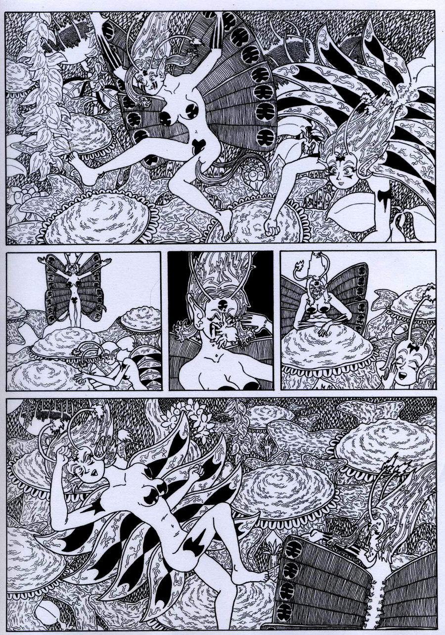
Well, I finally finished my Child Friendly comic/manga, Faeries! At the moment, I am thinking I could've added more details in the last panel, but then again, it does strike my mind that it would've looked more... less. I do admit it's not as good as page four, but...
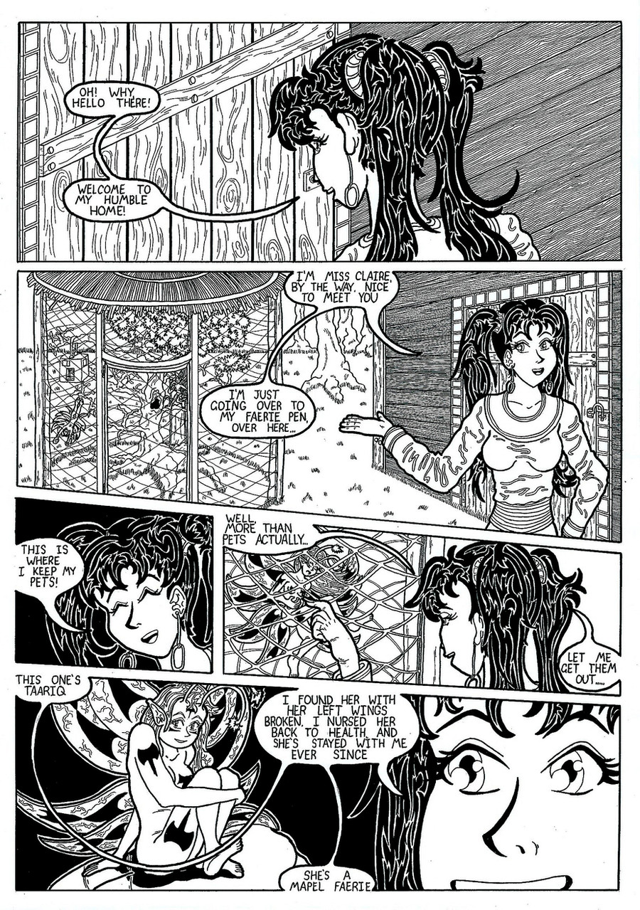
And here, we're introduced to the faeries owner. I don't really have a name settled for her yet, it's between two names, I guess I'll have to flip a coin to decide. She also went through a re-design process, the original looked too much like my other creation, Hiyuka.
There will be more faeries comics/manga in the future, which will explain their world more, one story mainly focused on their owner who explains a lot about their world and their situation. I was going to make it completely silent, but I decided that only the faeries will be silent.
Watch this space, as Faeries will get their own publication soon...
Related content


Comments: 9

its really nice...the artist got a real plenty of time doing this ...its shows in the details...^^
👍: 0 ⏩: 0

")

Cool! 
There will be more adventure with these faeries coming up, when I get around to it of course...

👍: 0 ⏩: 0

I love the owner of the fairies, she looks cute!
But I just wonder if you wanted her to look at the fairies in the last panel...
👍: 0 ⏩: 0


I quite like the detail you put into the larger pannels. I wonder though if you have tried using markers to help shade some of the backgrounds to help your character's stand out from them a bit more? your characters are lovly and well designed, but they seem to blend in to the background just a bit too much.
👍: 0 ⏩: 1
Yeah, I been getting that a bit. I kinda think that marker pens are a bit too thick, but I'll use them more in future comics and see if it stands out better...
👍: 0 ⏩: 1
depends on the marker. if you buy the tria's they have three nibs, but they can be pricey, they cost $60 or so for a small pack,(i'm still pissed i left a free pack i got of those on a train, i only ever got to use them once) however, unlike copics, you can buy refils and nibs for them so you don't have to throw them away. there's also the cheaper end (which i admit to using alot and they are very good) are Touch markers you can get at "Riot" art supplies. they only have two nibs, however they are under $15 each i think, and you only have to buy maybe three grey shades. to be honest, the grey tones they have are more extencive in the range, both warm and dark tones, I think the cooler ones would help your backgrounds, and you'd only need 4 shades min. the trick to useing them and keeping the colours flat, is to render just a few mm withing the line work to allow for the slight bleed some papers have, and apply the colour to an area in one go, as over lapping after the colour has fully dried actully makes the section darker, causeing patches where you tried to join the marker strokes. (i need a new set, I'd show you what i'd mean, but my markers are running low so eveything looks patchy) they are easyier to use than copics, as with them, you have to be dead careful as going over while the colour is still wet (or bleeding is the term i think) automatically darkens the shade, making colour matching a huge pain in the arse. I'd avoid other brands like the faber castell manga markers, they don't bleed or blend well and just look like ordanary texters once applied. these trias and touch markers are what graphic designers use, so they are the best thing to get to use for tonal flat shading.
👍: 0 ⏩: 0
