HOME | DD
 shawkash — Directions

Published: 2005-05-16 17:54:20 +0000 UTC; Views: 1797; Favourites: 10; Downloads: 158
Redirect to original
Description
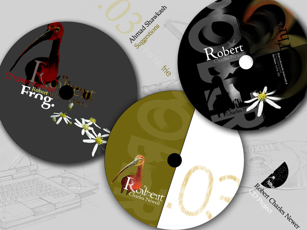
An interface for a CD, done 2004.I made this CD and the logo for a famouse Advertising company in Egypt. If it gain some good feedback here I may submit the rest ps work which I made in this CD...
Logo: is designed by me also
Related content


Comments: 40


i am glad u liked it ya bruno ")

👍: 0 ⏩: 0

Wow that's a lot of colours! I love the texture with all the layering of text and stuff in the back.
👍: 0 ⏩: 1
oh thank you very much!
It passed a time scince I uploaded this, how did you find it
👍: 0 ⏩: 1
There was a link to your profile on my friends page...
👍: 0 ⏩: 1
i see  (Smile)")
👍: 0 ⏩: 0


Nice colors. I love the objects put in there, they add detail.
👍: 0 ⏩: 1

I have to say that I really like thje colors that are in this a lot. It looks really nice. Very pretty.
Illusion
👍: 0 ⏩: 1
Thank you for ur valued comment kendra,
really feel happy seeing u back and commenting
👍: 0 ⏩: 1
Oh, why thank you. I am going to be strongly back at it and that almost no one is going to notice that I was missing their for awhile.
Illusion
👍: 0 ⏩: 1
I want u to be sure that I am awlays trusting u in art and person, and i wish ur new education on that famouse school of photography make u able to do new art, i am sure i will be more proud
👍: 0 ⏩: 0

Hey Ahmad i like this, alot
and thanks for teach me...
you remenber when i say trebuchet is better...
👍: 0 ⏩: 1
Oh how sweet,
Thank you for commenting with active or positive on my work, both are really welcome
👍: 0 ⏩: 1


thank u very much for ur fav
👍: 0 ⏩: 1
Thank you for ur nice words
Acutally it is not a website yet, it is instead just a CD multimedia
👍: 0 ⏩: 0

That really great…. I think that I am going to steal ur idea for my portfolio  (Wink)")
U are really a creative person
👍: 0 ⏩: 0

I think this is a very well thought out pice of work. Just the resolution really is hurting it. It is too fuzzy on here. I would love to see this actually printed out on a nice paper. I bet it would really POP. Over all a well done piece.
👍: 0 ⏩: 0

I like the logo, the colors and the lyout, but I think the arrowes need more work and the pragraph on the lefet need more spaces between lines
👍: 0 ⏩: 1
Thank u.. i will tell u the reply of both notes also..
Arrows shouldn't have more work, because arrows is some symbol which is clear without alot of works regarding their shapes.. Actually it is better to hide as much as possible the arrow in your design if you have to use it.. because arrow is like the red color.. very bold and attractive for eyes.
Leading of verdana is at default.. and to put verdana at its default is a commonthing in screens typography. you may say it is the most normal thing
👍: 0 ⏩: 0
thank you ya special morder ya ebni
👍: 0 ⏩: 1

la shokr 3la wageb ..elnas el 7'ebra fe elfan zy 7drtk lazem elw7d yadrhm we ystfeed men 7'brthm el akeed weselloha ..men 7'elal senen men elkfa7 men agl elfn wa la2gl efn

👍: 0 ⏩: 0

gamda deh
3agbany gedan
eh ya 3am el alwan el 7elwa deh

👍: 0 ⏩: 0

That should be nice IF you had it in better quality. Now it looks very pixely and like 256 colors.
👍: 0 ⏩: 1

wonderful work ya shawkaw, begad amaizing colours , aah we nseet a2olek , this a vatar is much much better , this is cool
👍: 0 ⏩: 0

that looks really cool. the colors are nice and the buttons look cool. nice job
👍: 0 ⏩: 0

to7fa ya shawkash
well dony
but ther's only one thing ,
i dont the the aqua buttons are a good idea here,
why didnt u put something more traditional ? , I think it'll be way much better ..

👍: 0 ⏩: 0
