HOME | DD
 Shawnlabomb — Eileen (Colored)

#eileen #regularshow
Published: 2015-07-24 03:00:28 +0000 UTC; Views: 1614; Favourites: 26; Downloads: 2
Redirect to original
Description
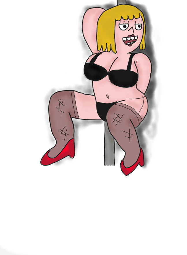
I colored another old drawing. I'm still getting use to this drawing tablet. This didn't turnout exactly the way I planned. It may look alright, but I'm still new to this. And as I look at this, I feel like this isn't good enough. I wanted it to look more like the actual show. I'm not fully satisfied with this drawing, but it's progress.Related content


Comments: 4

Really nice work with the facial expression, and the touch of light blue is very nice.
 (Smile)")
👍: 0 ⏩: 0

So the first thing that really stands out to me is the line work. It's very thick, wobbly, inconsistent, and sloppy. Doing precises line work digitally can be a real pain so I do understand how difficult it can be. When it comes to doing good lifework you have to approach in a few ways. Number one, it needs to be precise and consistent. You need to start thinking of the light source. Lines get thinner the closer they are to the light and thicker as they go to areas that are more in shadow. This is definitely not doing that and the thickness is overall the same on the character
Next is the actual rendering. What I am noticing is a very common practice for people who are new to digital art. It looks like you are laying down a base color and then taking a slightly darker tone for the shadow. One thing you need to realize is that highlights and shadows are effected by the lighting arrangement you set up. It is rarely just a darker tone of whatever base color you chose. That usually only works with cel shaded work and usually the shadow shapes are much more defined. With this since you are using a softer gradation with your shadows, it simply does not work. Also the contrast is severely lacking. It almost seems as though your afraid of getting too dark with your shadows. I can barely tell you even attempted to render shadows. You really need to pump up the contrast to make this character pop and have the more 3 dimensional look you are trying to achieve. On another note, the heavy and sloppy line work also detracts from the rendering.
Next issue I see is your color choice. My big issue with your choice of colors is that her shirt skin tone, and background color are very similar. It almost looks like the same color which makes the whole thing sort of blend together in an unflattering way. This can be remedied by adding color to your shadow areas and perhaps just changing the background color or the color of her shirt. Going back to the shadows and highlights, I am noticing that the lighting arrangement you have does not make sense. Based on the location of the shadows, the light is coming from the left, yet the shadow on her hair is coming from the left as well.
Overall this looks to be an example of the growing pains of learning to paint digitally. I get it, some of my early digital work was nothing short of god awful. Eventually you will learn the more you do it. I think what you have to worry about is landing those core fundamentals because that is what truly makes or breaks an artist, not the tool you use. I recommend practicing with value, doing still life paintings or gray scale value paintings to help you better understand lighting. As far as line work goes, well you have a few options. One thing you could do is to do the line work by hand and scan it into your computer and play around with some of the settings in Photoshop to make it look crisper and edit from there. Also, Adobe illustrator hash a lot of brush settings to help make better line work. The pen tool is also an option. I personally use to always use line work in all of my illustrations but eventually I found it limiting and decided to abandon line all together. It all really depends on what you are hoping to achieve artistically. Anyways, that's about it, I hope this helped in some small way.
👍: 0 ⏩: 0


