HOME | DD
 Shelfcloud — Toss of the feathers
Published: 2012-09-04 19:54:08 +0000 UTC; Views: 3678; Favourites: 102; Downloads: 0
Redirect to original
Description
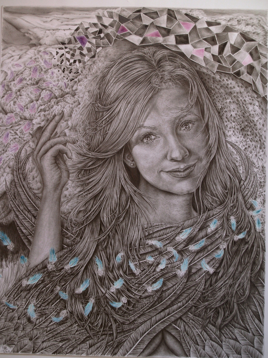
Version 1.2Thanks to and , who pointed out an issue regarding camera-to-screen and screen-to-screen calibration, I've reset my screen and adjusted the picture in +21% contrast +10 gamma + 4 bright. Hopefully you'll get the better version now.
Note:Large view is recommended!
Details of this drawing in progress are found here:
[link]
[link]
Toss of the feathers:
Cara Dillon is an Irish folkloristic singer, inspired by master vocals like Kate Bush. She has sang along with great artists like Mike Oldfield and Paul Bradey. I love her music and her voice reaches me a lot; since I was coming back again from imagination realism to reference pics, this one was tonal spoken very easy. Controversially I don’t like drawing realistic celebs; for me it is not art, but this one I just could not resist a very strong gaze. She had this beautiful weird set of eyes that can be very thinking and/or gazing and caught my artistic interest. “So I thought it fit to take a trip, strange lands to explore” to try a celeb once more. And why not better than a singer I really love and not what the big public loves, like Lady Gaga, Michael Jackson, Beyonce, beïng drawn 1000nds of times! So why with my big mouth himself has drawn 4 celebs then?!? Mike is just a load of sjithope and performs little!!!…
True actually until a certain point. When I had this major shift in my 4th drawing, I thought it was time to get my techniques more leveled. I chose celebs I like for a point to recognize it back. Evaluation afterwards helped me get the hard-time lessons in with a lot more unforgettable impact and realization. The charmed ones were an ambitious project I wanted to finish, but lost interest after the Rose McGowan. Each “charmed-one” would have represented a cornerstone of technique and understanding. Like the Alyssa for proportion and realism, Holly for definition and mind-eye realism, and Rose for learning to trust and anticipate on instinct, understanding and common sense. I have this very clear goal: to really draw what I desire, I mean, REALLY desire to carry out. I did these drawings with a lot of love, but since I got in touch with all kind of art, it felt more or less limited and noobish; Limited in artistic reach and freedom and I definitely repel the technical strength. I was trying to unfold my mind, but I am so irritated with my other current drawing I decided to redo it: waste of the 143 hours, but pfff what’s the point all those hours if you cannot learn from it. I was really into Cara Dillon at that time and I came across this particular photo and got a spontaneous great idea with it!!! The idea morphed and shifted along the progress, giving it new ideas to this result, looking lesser and lesser to the references, which were rapidly no tool anymore. I’ve studied some baseposes, so I’ve “used” them, but didn’t use them as bibles at all.
This image is directly permitted by Mark Lakeman, who is by the way a sublime photographer! I definitely recommend to view his work! Inspired by (how can it be else) shelfclouds, which motion I took on subconsciously one way or another, playing “The lonesome scenes of winter” and get its strongest point when the piano comes in play and Cara starts to sing: “Closeeeeerrr ooeeeehoeeeeh, closeeeerrr”. I glanced through emotional trips and rushes and the feeling builds up very powerful to throw that back in the drawing. Though the detailing was a pain to maintain constantly, I enjoyed it a lot!
The title Toss of the feathers is inspired by the Corrs; another great Irish band. I wanted an angel initially. But not on too large size paper as I want her gaze in the front and not the background deriving that from her. Instead I’ve made a wind motion sweep arcus ring of feathers, surrounding her face and fold wings to make a mysterious ingredient and to circle around the center point of the viewer to suck them right in her eyes. I’m not too fond of angels, cause a lot of people draw them in that particular way that it always go to that manga-ish overdrive fantasy angels with beautiful bodies and a pose like the quickening of Highlander. So why draw an angel then? I just had this crazy idea with that pose it sort of came to me. I wanted to not have that conventional look like you can plain see it’s an angel, but that the wings are part of an artistic ingredient. I wanted to tell with those wings a hidden nakedness conveyed within her fragile friendly expressions, and yet, behold a sense of inviting mystery that invoke a certain pull. The cyclonic movement adds only more and give an indirect perspective of depth. The mosaic like figures have this always irregular consistence and tell own shapes and that they are formed from and disintegrated to the flying feathers. I’ve worked fromout 3 refs, so I’ve changed things from the main reference. I didn’t look at it much, but they were essential to make work a nice realism. But I wanted more, more artistic reach, cause the photo alone wouldn’t be a challenge let alone making the drawing unique. I wanted lightplay too and this is the first time I actually do something with thrown shadows. I also tried to apply main-lightfall, cause I wanted to create a better “rolling depth” than the conventional depth. This drawing is more about feeling and enjoying the mood, motion and expression, rather than to take a fantasy-trip throughout own imagined stories. What I’ve experienced from this drawing is that drawing from the mind has personally proven itself and I’m plucking the ripe fruits from it. Yet I think the 425 hours spent is not effective, despite of the amount of details. For my feeling it is not art, but a good drawing, great at tops. But for that amount of hours, it is in fact quite lousy. I’ll just hope you guys don’t feel it the same way…
Analysis: I’ve gained a lot of experience with it, but I still feel I lack the technical translation strength a lot more. I’ll focus on it more on my next two commissions. The strong points I think are the right eye, the contrast work and the play of the hair, along with the sophisticated detailing; which is, at some point so intense, you’ll need a close up to see the addressed strokes. 1000’nds of strokes were drawn in the hair, which look like whole strands at distance. 1000’nds of strokes went into the feather-shafts too. I’m proud of the intense work, although I have trouble loosing the details at the right places. I’m not too satisfied about the realistic convincing factor and for my sent too much has to come from the background to empower the sitter, thus distracting a little from the sitter. I was fair weak at the mouth too, but couldn’t get my fingers behind that problem. It is in the detailing, but I don’t see how to lose when and where. I’m working on it though. I did the lightfall a lot better, but still too randomized. There is a lot more artistic reach and dynamic to celebrate and most of it is done from out intellectual realism (without refs). Think that is the problem to distinct this drawing really more from less convincing. It is a choice you make: do you stay for the convincing and WOW-factor where everything has to be set on true, or do you expose your intellectual and raw style, as you liberate in your continuation in your drawings: the limits are set by yourself and expresses in different ways. Both ways are respectable, but I’ve come to the awful realization again this is a mediocre, inefficient drawing... However, done with all the love, care and joy I could have with this drawing on which I’ve got a lot of fire from and a lot of fire for. The result is better than most of my previous drawings and I’m making progress; especially the time ripens to imaginations as I get closer to my goal. I just gave it my best shot for all that it is worth.
Special thanks to Mark Lakeman for giving me permission to post this and for being actually a follower and friend at a time when I was down. Also Thanks to my other artladdies and lassies that followed and viewed me with this drawing here and elsewhere.
Time:428 hours
Size: Raisin, 50x70cm, super royal, B2.
Brands: Canson Bristol cover cardboard, Derwent graphic, Pentel, Staedler, Caran d’ Ache.
Class: Manipulative fantasy realism.
Main pencils: 5H, 3H, H, F, 2B, 3B 5B, Black and white colored, 0.3 B mechanic. Light blue, Light green, cyan, teal, jade, poison green, emerald, Petrol green, Light pink, pink, lilac, magenta, purple, blueberry purple, violet.
Related content


Comments: 64


Hi Mike, not sure if you rmb me. Just dropping by to say this drawing is wonderful. I looked at the details, the technique and all the thoughtfulness you have had for this. I must say I really respect how dedicated you are with each of your drawings. These elements from the mini feathers, the bigger feathers that merges with the hair, to the twinkle in the lady's eyes, to the mellow coloured cubic structure and to her fingers, all these flow as an art piece, as one. It is truly exquisite.
👍: 0 ⏩: 1

Thank you very much Aaron. Of course I remember you. How have you been?
Thank you for your kind words and compliments. Much appreciated!
👍: 0 ⏩: 0


Featured: [link] ")

👍: 0 ⏩: 1
Thank you... I feel very honored!  (Smile)")
👍: 0 ⏩: 1
You're very welcome.
👍: 0 ⏩: 1


Impressive, that's what it is! You're getting better with every piece, even if you're a quite harsh critic of yourself (or maybe because of it). I love how you always try to deliver some theme/topic/feeling to the viewer, and that's art by my definition. I was looking at it several times today and I still manage to find some details that I haven't noticed earlier. Is that veins on her hand? You crazy!
Looking forward to see what you bring out next
👍: 0 ⏩: 1
Thank you mate for your kind words! Much appreciated. I'm always trying to push myself out of the limit. Sometimes I succeed, and when I don't I take that knowledge to the next. I always hope I can touch someone with my work, but that is always hope... What I'm curious is how people recognize "the feeling" in it?
Yes, indeed, there are veins on her arm. I gave the hand more the cracking structure as you fold your hand, but yes: there are veins drawn in there. Currently I'm working on a commission. I'm not allowed to share the updates, but I will with the endresult. Right now I have 44 hours in it. And then here and there some loose sketching.
So are you drawing anything currently???
👍: 0 ⏩: 1
Is that a rhetorical question?
The end result will be fine then. Good luck!
I just returned to drawing after a long hiatus. I spent just a tiny amount of time with pencil in my hand over the last three years. But recently I got just the right motivation to pick up the pencil again, so I started doing some sketches. And coming regularly on DA again - there was a huge pile of deviations and journals in my inbox that I just had to delete most of them, otherwise I'd be just browsing DA for a week
👍: 0 ⏩: 1
I'm just curious... Right now I'm not that much online.
👍: 0 ⏩: 0

Stunning work! How this doesn't have a DD is beyond me.
👍: 0 ⏩: 1
Thank you very much
👍: 0 ⏩: 1
Both are incredible pieces of work, don't get me wrong. My favorites reflect, and to some degree are an extension of the vision of my work, and reflect what inspires me to create. For 6 years being on this site I came to the conclusion to favorite only those that really trigger that inspiration, and its mostly landscape photography that does it for me. I am very, very rarely inspired by other artists pieces, while at the same time it never means they aren't stunning pieces of work.
Take care
👍: 0 ⏩: 1
Good motivation! I'm rarely triggered by other artists too; I get them @ random, but when I really like it, I fave it, hence i do have a lot of other works that I've faved. Thank you for your kind words and for your insight!
👍: 0 ⏩: 0
Thank you very much!
👍: 0 ⏩: 1

you have fantastic drawing skills Mike something ive never been able to achieve, i dont think you have to worry about how you took the picture at all
👍: 0 ⏩: 1
Everyone has his strong points. Thank you for your kind words!
👍: 0 ⏩: 1

Beautiful details!
..and this is an insane amount of hours
👍: 0 ⏩: 1
Thank you for your kind words and encouragements!
👍: 0 ⏩: 0

428 fricking hours... that's *counts* 14 days (and a bit) straight ")
👍: 0 ⏩: 1
Yeah...sigh... the detailing and matching the details is the biggest effort. 3 quarter of the drawing is hair and feathers, if not more, so it is a barricade i throw myself before my feet because i want it so
👍: 0 ⏩: 0

I adore the amount of detail you've put into this, it's so fluid and magical
👍: 0 ⏩: 1

I agree with daveboyb91 that it does need more contrast, if the viewers can handle it. I looked at it in GIMP with contrast as a test, and now I'm picking up pieces of my brain because it truly BLEW MY MIND~! 
👍: 0 ⏩: 1
Thank you very much! The problem indicates that it is general, like over the entire drawing? The problem is I cannot address the critic where the problem is applicable for.
👍: 0 ⏩: 1
No problem~!  (Wink)")
👍: 0 ⏩: 1
Ok...then it is a translation problem, because in the reallife I have a strong contrast already. As you've already said you have boosted the contrast up with in this case gimp. If I would draw more contrasted in real life I would get this "electrifying" unnatural balance. I have to say when I took the photo, I had to adjust quite some contrast already. Then I go downstairs to see if it is on my labtop with the same tones, but on my labtop it is more dull and overall darker, like if there is some grey film over it. So I think this is again a long term problem I have: the translation between camera to screen and from screen to screen calibration. I have no option for scanning it; it is too large for that.
Could you do me a favor? Adjust the drawing in gimp as you did and when you think it looks fine and blow it over to my e-mail. If you agree I'll bump you my address. Then I can judge how my screen is off and how it should be in reallife, correcting my post and screen values back.
👍: 0 ⏩: 1
Okay, I could try and send you a pic of the more contrasted version. If the scanner doesn't work, you always have the option of taking a picture of it with your camera or something.
👍: 0 ⏩: 1
Thank you kindly for your efforts!; I'll investigate where the problem is coming from. I know already it is way off from the CPU screen I adjusted to. As I said I've used a camera, because the size of the drawing is too large of a conventional scanner. Hopefully I can tackle the adjustments.
👍: 0 ⏩: 1
You're welcome, and good luck~!
👍: 0 ⏩: 1
Yes I did thank you. There is a difference in about +21 contrast + 7 gamma + 5 bright in the computer downstairs. But with your pic it is overexposed, so I guess I'll average it out...if I find some time that is.
👍: 0 ⏩: 1
Overexposed? I don't understand. But I'm glad I could help somewhat.
👍: 0 ⏩: 1
Think I've resolved it a bit.
👍: 0 ⏩: 1
Hmm.... the details and colors seem to be sharper and more noticeable. The details up close are lovely.
👍: 0 ⏩: 1
Thank you! And thank you for the help
👍: 0 ⏩: 1

only criticism is it needs more contrast. Brighter whites and darker darks. Still very nicely done!
👍: 0 ⏩: 1
Thank you, but I can't address the critic, so could you explain which part? If it is the entire drawing, then I think it is a calibration-post problem; I've got some issues with that.
👍: 0 ⏩: 1
Dont get me wrong it is a superb peice of art you've created and your dedication is incredible but i think the whole piece would benifit from lighter lights and darker darks so maybe just simply sliding the contrast bar up a little bit
👍: 0 ⏩: 1
Thank you, I've adjusted +20 contrast and some brightness...
I've got a labtop which was indeed dark and flat. I've recalibrated my screen and B/W values should be sufficient. Readjusted the photo. This is an older issue, that is why I asked where do you refer your critic to, so I know what is going on. Of course, in extend to the natural look. But someone else said the same thing and said it was the overall of the drawing, which was strange, because the real life work has a lot of contrast, so it is definitely the post...again! Hopefully the version is better and again thanks for your input!
👍: 0 ⏩: 0

Masterpiece!!!!!!!
Stunning detail and lovely facial features. A very dreamy and optimistic artwork that touches the heart! Congrats Mike, on this amazing artwork!!!

👍: 0 ⏩: 1
Well, hearing that from you as masterartist that is considered as a huge compliment!
👍: 0 ⏩: 0

WOW Mike, This came out beautiful. I've also been following this drawing for a couple years now. Her HAIR is spectacular....the thought of hair and feathers overlapping gives me a headache just thinking about how I would pull that off! I also like the subtle touches of color. I hope this drawing brings you joy and inspiration in the future and PLEASE continue to create awesome drawings.
I notice you used a "5B" pencil.......never saw one that dark......are they crumbly and soft?
👍: 0 ⏩: 1
Well Pat, me too. The hardest part was the right side: the wing through the hair, the backhair in shadow of the wing underneath and then the little ones before. It was a real problem but I chewed through it. Cost more than 100 hours on that part and a lot of retouching.
5B is soft yes, I mostly use it for stump pencils; the hard sharp for definition and stump for coloring and stretching. I've used 5B mainly to get to the midlevel darkness flow. I over contrast the details first to protect them, then I color over it and then I retouch the details and lose where I think it is necessary. I use 5B right before hairfolds cross each other and I use a sharp black to push it against the dominant part of the hair. 5B is crumbling when you press really hard. Frankly, I don't use B's for detail definition. To get the darker parts I have used F or 2B razor sharp.
You have 9B pencils. I have a range of 10H - 9B. I use 10H, 6H quite a bit to weavenet and build definitions in "white" sections. My favorite pencils are somewhere between 6H-2B, so I'm a "hard" artist. It is the blame of the detail pitch I want to achieve.
Thank you for your kind comments and hopefully you're motivated to draw more too because of this
👍: 0 ⏩: 0


👍: 0 ⏩: 1
| Next =>