HOME | DD
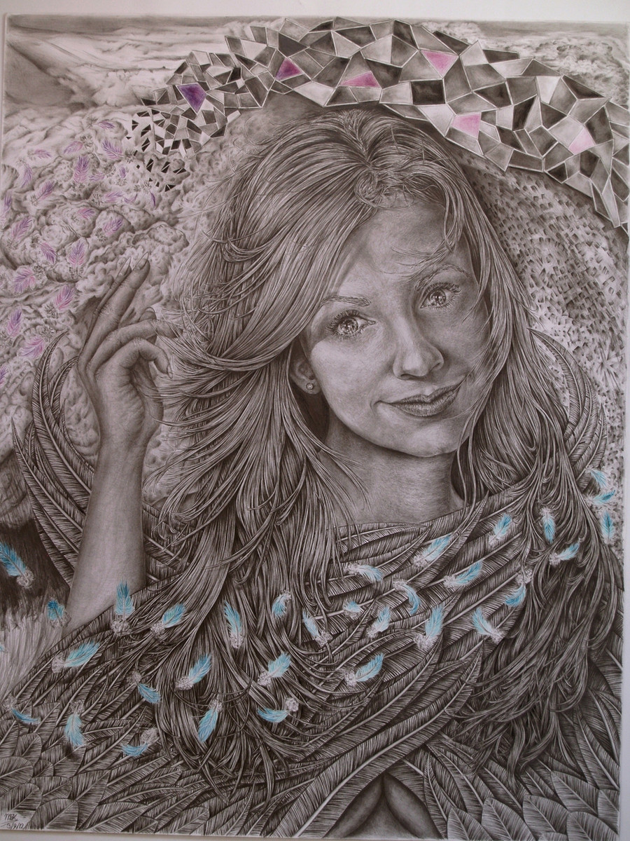
 Shelfcloud — Toss of the feathers
Published: 2012-09-04 19:54:08 +0000 UTC; Views: 3678; Favourites: 102; Downloads: 0
Redirect to original
Description
Version 1.2Thanks to and , who pointed out an issue regarding camera-to-screen and screen-to-screen calibration, I've reset my screen and adjusted the picture in +21% contrast +10 gamma + 4 bright. Hopefully you'll get the better version now.
Note:Large view is recommended!
Details of this drawing in progress are found here:
[link]
[link]
Toss of the feathers:
Cara Dillon is an Irish folkloristic singer, inspired by master vocals like Kate Bush. She has sang along with great artists like Mike Oldfield and Paul Bradey. I love her music and her voice reaches me a lot; since I was coming back again from imagination realism to reference pics, this one was tonal spoken very easy. Controversially I don’t like drawing realistic celebs; for me it is not art, but this one I just could not resist a very strong gaze. She had this beautiful weird set of eyes that can be very thinking and/or gazing and caught my artistic interest. “So I thought it fit to take a trip, strange lands to explore” to try a celeb once more. And why not better than a singer I really love and not what the big public loves, like Lady Gaga, Michael Jackson, Beyonce, beïng drawn 1000nds of times! So why with my big mouth himself has drawn 4 celebs then?!? Mike is just a load of sjithope and performs little!!!…
True actually until a certain point. When I had this major shift in my 4th drawing, I thought it was time to get my techniques more leveled. I chose celebs I like for a point to recognize it back. Evaluation afterwards helped me get the hard-time lessons in with a lot more unforgettable impact and realization. The charmed ones were an ambitious project I wanted to finish, but lost interest after the Rose McGowan. Each “charmed-one” would have represented a cornerstone of technique and understanding. Like the Alyssa for proportion and realism, Holly for definition and mind-eye realism, and Rose for learning to trust and anticipate on instinct, understanding and common sense. I have this very clear goal: to really draw what I desire, I mean, REALLY desire to carry out. I did these drawings with a lot of love, but since I got in touch with all kind of art, it felt more or less limited and noobish; Limited in artistic reach and freedom and I definitely repel the technical strength. I was trying to unfold my mind, but I am so irritated with my other current drawing I decided to redo it: waste of the 143 hours, but pfff what’s the point all those hours if you cannot learn from it. I was really into Cara Dillon at that time and I came across this particular photo and got a spontaneous great idea with it!!! The idea morphed and shifted along the progress, giving it new ideas to this result, looking lesser and lesser to the references, which were rapidly no tool anymore. I’ve studied some baseposes, so I’ve “used” them, but didn’t use them as bibles at all.
This image is directly permitted by Mark Lakeman, who is by the way a sublime photographer! I definitely recommend to view his work! Inspired by (how can it be else) shelfclouds, which motion I took on subconsciously one way or another, playing “The lonesome scenes of winter” and get its strongest point when the piano comes in play and Cara starts to sing: “Closeeeeerrr ooeeeehoeeeeh, closeeeerrr”. I glanced through emotional trips and rushes and the feeling builds up very powerful to throw that back in the drawing. Though the detailing was a pain to maintain constantly, I enjoyed it a lot!
The title Toss of the feathers is inspired by the Corrs; another great Irish band. I wanted an angel initially. But not on too large size paper as I want her gaze in the front and not the background deriving that from her. Instead I’ve made a wind motion sweep arcus ring of feathers, surrounding her face and fold wings to make a mysterious ingredient and to circle around the center point of the viewer to suck them right in her eyes. I’m not too fond of angels, cause a lot of people draw them in that particular way that it always go to that manga-ish overdrive fantasy angels with beautiful bodies and a pose like the quickening of Highlander. So why draw an angel then? I just had this crazy idea with that pose it sort of came to me. I wanted to not have that conventional look like you can plain see it’s an angel, but that the wings are part of an artistic ingredient. I wanted to tell with those wings a hidden nakedness conveyed within her fragile friendly expressions, and yet, behold a sense of inviting mystery that invoke a certain pull. The cyclonic movement adds only more and give an indirect perspective of depth. The mosaic like figures have this always irregular consistence and tell own shapes and that they are formed from and disintegrated to the flying feathers. I’ve worked fromout 3 refs, so I’ve changed things from the main reference. I didn’t look at it much, but they were essential to make work a nice realism. But I wanted more, more artistic reach, cause the photo alone wouldn’t be a challenge let alone making the drawing unique. I wanted lightplay too and this is the first time I actually do something with thrown shadows. I also tried to apply main-lightfall, cause I wanted to create a better “rolling depth” than the conventional depth. This drawing is more about feeling and enjoying the mood, motion and expression, rather than to take a fantasy-trip throughout own imagined stories. What I’ve experienced from this drawing is that drawing from the mind has personally proven itself and I’m plucking the ripe fruits from it. Yet I think the 425 hours spent is not effective, despite of the amount of details. For my feeling it is not art, but a good drawing, great at tops. But for that amount of hours, it is in fact quite lousy. I’ll just hope you guys don’t feel it the same way…
Analysis: I’ve gained a lot of experience with it, but I still feel I lack the technical translation strength a lot more. I’ll focus on it more on my next two commissions. The strong points I think are the right eye, the contrast work and the play of the hair, along with the sophisticated detailing; which is, at some point so intense, you’ll need a close up to see the addressed strokes. 1000’nds of strokes were drawn in the hair, which look like whole strands at distance. 1000’nds of strokes went into the feather-shafts too. I’m proud of the intense work, although I have trouble loosing the details at the right places. I’m not too satisfied about the realistic convincing factor and for my sent too much has to come from the background to empower the sitter, thus distracting a little from the sitter. I was fair weak at the mouth too, but couldn’t get my fingers behind that problem. It is in the detailing, but I don’t see how to lose when and where. I’m working on it though. I did the lightfall a lot better, but still too randomized. There is a lot more artistic reach and dynamic to celebrate and most of it is done from out intellectual realism (without refs). Think that is the problem to distinct this drawing really more from less convincing. It is a choice you make: do you stay for the convincing and WOW-factor where everything has to be set on true, or do you expose your intellectual and raw style, as you liberate in your continuation in your drawings: the limits are set by yourself and expresses in different ways. Both ways are respectable, but I’ve come to the awful realization again this is a mediocre, inefficient drawing... However, done with all the love, care and joy I could have with this drawing on which I’ve got a lot of fire from and a lot of fire for. The result is better than most of my previous drawings and I’m making progress; especially the time ripens to imaginations as I get closer to my goal. I just gave it my best shot for all that it is worth.
Special thanks to Mark Lakeman for giving me permission to post this and for being actually a follower and friend at a time when I was down. Also Thanks to my other artladdies and lassies that followed and viewed me with this drawing here and elsewhere.
Time:428 hours
Size: Raisin, 50x70cm, super royal, B2.
Brands: Canson Bristol cover cardboard, Derwent graphic, Pentel, Staedler, Caran d’ Ache.
Class: Manipulative fantasy realism.
Main pencils: 5H, 3H, H, F, 2B, 3B 5B, Black and white colored, 0.3 B mechanic. Light blue, Light green, cyan, teal, jade, poison green, emerald, Petrol green, Light pink, pink, lilac, magenta, purple, blueberry purple, violet.
Related content


Comments: 64

Thank you and for your wonderful encouragements! The details....yes...I can't help it it is a sickness  (Wink)")
👍: 0 ⏩: 1

You're welcome! Yes in a 
👍: 0 ⏩: 1
Sometimes you speak in riddles like Gandalf the grey
")
👍: 0 ⏩: 1
hehehe ")
👍: 0 ⏩: 1
and sometimes we are misunderstood because of this
👍: 0 ⏩: 1
Yup, sometimes it can be a bit 


👍: 0 ⏩: 1
👍: 0 ⏩: 1

well well Mikey this is a surprise ^^ I be honest in that I didnt think u could complete it this year..
hmm I'm not sure what words come to my head first.. words like "finally" and "at last" and even "are u sure its done" ^^
I guess I feel very greatful for u to have shared with me virtually all the stages.. as I have actually seen this masterpiece drawing unfold..
I have seen the steps taken and the problems u encountered with her hands and to see u come through it is a achievement in itself..
I know the journey has been long and sometimes even torture -like as u try to grind away all ur energy in completing this 400+ hour portrait ^^
I can say all ur efforts have not been in vain.. as this is by far ur greatest piece u have ever done.. even u would have to admit to that urself ^^ I know u are a hard guy to please and only u know deep down what u could have done better at.. but I also know that u are very happy with this piece.
well done Mikey big kudos to u ^^
👍: 0 ⏩: 1
Your first thoughts should be: Wonderful awesome etc... but noooooooo it is "Finally finished?"
I dunno if this is my best...technically yes I think. I learned alot from it, that is true. But then the triumph is short as you see so much better art being posted. At least I can say to myself i give it my best... I always do. Thank you mate for your support throughout the progress and a chatfriend when I needed it  (Smile)")
👍: 0 ⏩: 0

That is absolutely brilliant! Oh my goodness, I can't even begin to explain how incredible this is! I would do anything for even half your talent!

👍: 0 ⏩: 1
