HOME | DD
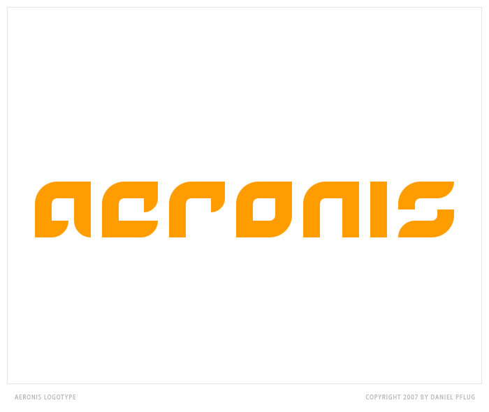
 shftfrm — Logotype AERONIS
by-nc-nd
shftfrm — Logotype AERONIS
by-nc-nd
Published: 2007-01-29 11:21:56 +0000 UTC; Views: 28471; Favourites: 11; Downloads: 0
Redirect to original
Description
Logotype AERONISI use a little bit of my time for designing a Logotype because I've an idea and must try it. Let me know what you think about it. All letters done by me, it's no font.
--------------------------
www.vitreouspulse.com
Copyright © 2007, vitreousPULSE
---
greetings,
synthes
Related content


Comments: 42


What would you say me with your comment?
👍: 0 ⏩: 0

 (Smile)")


thank you so much *Kwaku i'm glad that you like it!
👍: 0 ⏩: 1
it's no font. everything on this is selfmade
👍: 0 ⏩: 1

ok, but did you base your design in a font and then you modify or it is all selfmade?
👍: 0 ⏩: 1


Amazing work. It looks very clean and stylish, I love it! ")
👍: 0 ⏩: 1
I'm glad you like it  (Wink)")
👍: 0 ⏩: 1

Hey mate,
i like it, but i have to say that, i dislike the complelemt of the round and the hard corners.
They dont accord together!
The idea is nice! But try to fix the curves (round corners
greetings
(wir können auch deutsch reden kleiner ")
👍: 0 ⏩: 1
The blurry corners not done by me. I think this was a thing of the saving process. Thanks for your great comment mate
👍: 0 ⏩: 1


Ja gefällt mir. Vor allem die Version mit schwarzer Schrift!
👍: 0 ⏩: 1
Hab es ja nur auf beiden Hintergründen zum präsentieren, damit man sieht wie es auf hellem und dunklem aussieht. Freut mich das es gefällt.
👍: 0 ⏩: 0

