HOME | DD
 Shinybinary — Fresh science word

Published: 2008-08-09 18:07:54 +0000 UTC; Views: 55433; Favourites: 1296; Downloads: 2495
Redirect to original
Description
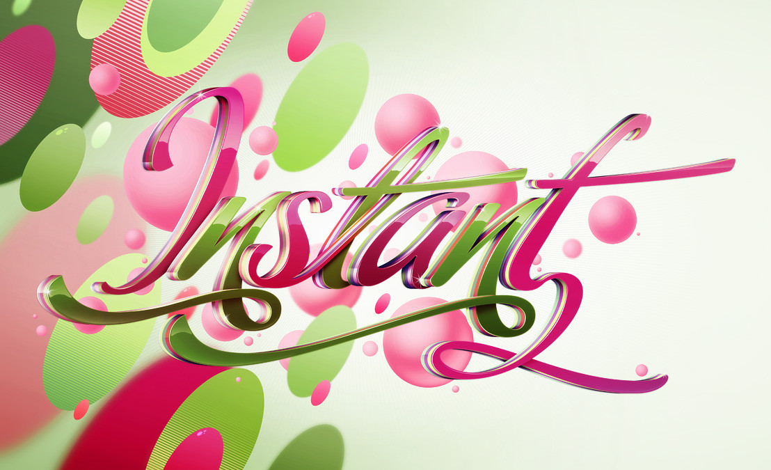
This is for a tutorial in the latest issue of Computer Arts. The font was provided by them and I really quite like it. I was asked to use the text 'Fresh science word' as well, and I still have no idea what it's supposed to mean.PS you can get the font here if you like it like me: [link]
Related content


Comments: 183

Awesome. Killer stuff as always.
👍: 0 ⏩: 0


yea, that rocks.
i really like that texture in the BG and of course your amazing and very detailed work on the font
keep that up nik.
 (Smile)")
👍: 0 ⏩: 0

i lovet the effect! genial

👍: 0 ⏩: 0


i saw this on your website some days ago and was wondering cos i hadnt ever seen it on DA.. nice work man.. looks excellent
👍: 0 ⏩: 0


amazing. would you like sharing the font? 35 bucks is pretty expensive
👍: 0 ⏩: 1

Can't do that really, plus it would be very unfair on the font maker.
👍: 0 ⏩: 1
lol. I understand. nice work btw.
👍: 0 ⏩: 0


Yeh thats well nice
totally gonna go grab the font now.
I really love the textures though
noice one
👍: 0 ⏩: 0


")


looks wicked man. thanks for the font! look forward to reading ur tutorial, they're always great!
👍: 0 ⏩: 1
lmao nvm, font costs $35 llllaaaaaaame
👍: 0 ⏩: 0

wow, that is amazing
well, everything you make for computer arts is cool
")
👍: 0 ⏩: 0


Looks really great, I guess you put much time into tuning the colors. I especially like the image you put over the first word. Good job!
👍: 0 ⏩: 0


<= Prev |