HOME | DD

Shinybinary — Why not

Published: 2010-11-19 12:57:59 +0000 UTC; Views: 14887; Favourites: 396; Downloads: 1122
Redirect to original
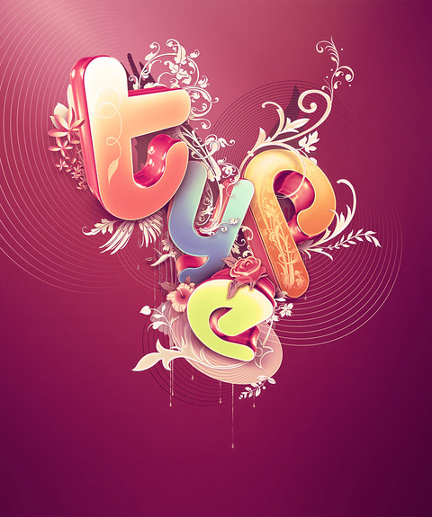
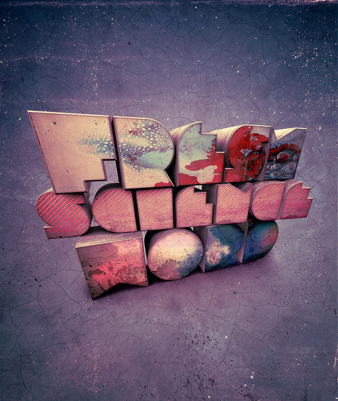
Description Illustration for Vodafone. Only the letters were needed which is why there are no extra or background details.

Still I had fun, although my obsession with pink and green is on the verge of becoming a worrying addiction!

Close up details here:

[link]
Related content
Comments: 82

jameshburnell [2012-04-05 09:15:15 +0000 UTC]

Love the depth of the type, especially the 't'.

👍: 0 ⏩: 0

dronograph [2011-10-02 15:02:08 +0000 UTC]

really nice, great typo!

👍: 0 ⏩: 0

Arider83 [2011-05-15 13:22:46 +0000 UTC]

I love this!

👍: 0 ⏩: 0

MyeditionsROCK [2011-05-01 22:15:48 +0000 UTC]

You can made a tutorial of this but this is AWESOME!!!!! favourites

👍: 0 ⏩: 0

junaidcreative [2011-03-15 12:35:30 +0000 UTC]

like it

👍: 0 ⏩: 0

araujooch [2011-02-19 00:48:12 +0000 UTC]

nice

👍: 0 ⏩: 0

HyperIntake [2011-02-11 13:51:34 +0000 UTC]

You are amazing!

👍: 0 ⏩: 0

ofthespectrum [2011-02-11 03:37:00 +0000 UTC]

My room is pink and green. (: Haha, this is great, love it!

👍: 0 ⏩: 0

chillher [2011-01-27 04:12:16 +0000 UTC]

In love with this one.

👍: 0 ⏩: 0

kevinandre91 [2011-01-07 11:07:41 +0000 UTC]

I love pink and green too! I rarely use it but I think that might change soon... Great work.

👍: 0 ⏩: 0

philipbrunner [2010-12-28 06:03:27 +0000 UTC]

Crazy shit! Love it!

👍: 0 ⏩: 0

csmallcomb [2010-12-16 20:30:49 +0000 UTC]

love the text and the design

👍: 0 ⏩: 0

qishui [2010-12-13 08:18:28 +0000 UTC]

amazing~

👍: 0 ⏩: 0

zabuka-art [2010-11-30 18:23:08 +0000 UTC]

I like the plastic effect , and the combination of colors, my favorite w and o

👍: 0 ⏩: 0

Agouti [2010-11-30 11:37:27 +0000 UTC]

love it!

👍: 0 ⏩: 0

1337Garona1337 [2010-11-29 18:53:33 +0000 UTC]

Greak work! Looks like a lot of time put into this, how much was it?

👍: 0 ⏩: 0

kepeifeng [2010-11-27 05:45:56 +0000 UTC]

wow!!!
love the color and every detail!
your are brilliant!

👍: 0 ⏩: 0

videa [2010-11-26 16:00:12 +0000 UTC]

Great stuff!

👍: 0 ⏩: 0

Cash-89 [2010-11-26 13:23:59 +0000 UTC]

super work! i saw it on behance the first time

👍: 0 ⏩: 0

mercy [2010-11-26 12:54:32 +0000 UTC]

i like a lot!

👍: 0 ⏩: 0

GustavoMM [2010-11-23 20:30:49 +0000 UTC]

Fresh and colorful..

👍: 0 ⏩: 0

crymz [2010-11-23 16:01:58 +0000 UTC]

utterly genius!

👍: 0 ⏩: 0

Lisahy [2010-11-22 22:06:18 +0000 UTC]

WOW

👍: 0 ⏩: 0

perrobravo [2010-11-22 21:14:10 +0000 UTC]

Nice!

👍: 0 ⏩: 0

zedka [2010-11-22 15:31:59 +0000 UTC]

Glad to see you around, another tight job !

👍: 0 ⏩: 0

lilianbourgevin [2010-11-22 08:33:11 +0000 UTC]

Great!!!!
I love it

👍: 0 ⏩: 0

IanRad [2010-11-22 08:05:02 +0000 UTC]

nice

👍: 0 ⏩: 0

laesir [2010-11-22 05:07:04 +0000 UTC]

you're a genious by the way

👍: 0 ⏩: 0

laesir [2010-11-22 04:00:45 +0000 UTC]

amazing, what techique is this?

👍: 0 ⏩: 0

daeran [2010-11-21 13:49:47 +0000 UTC]

awesome!

👍: 0 ⏩: 0

CHIN2OFF [2010-11-21 09:54:05 +0000 UTC]

sweeet!

👍: 0 ⏩: 0

tiggah69 [2010-11-21 04:27:37 +0000 UTC]

amazing!!! i love it.!

👍: 0 ⏩: 0

9lacier [2010-11-21 03:10:03 +0000 UTC]

So shocked every time

👍: 0 ⏩: 0

Ploster [2010-11-20 19:54:13 +0000 UTC]

Rly nice! I dont think you have to worry about the addiction. Your great with it!

👍: 0 ⏩: 0

FelixBurchardt [2010-11-20 17:48:23 +0000 UTC]

I looove people combining 3D progs with Photoshop,
it just looks so suuuper nice.

Awesome details, nice color mood, great work!

👍: 0 ⏩: 0

Pixeled-Art [2010-11-20 17:08:25 +0000 UTC]

I love the feel and depth of the letters, and the details were just beautiful.

👍: 0 ⏩: 0

ShiLo33 [2010-11-20 16:39:11 +0000 UTC]

looks nice , i like the colors and the idea behind every letter .
which software you used in this work ?

👍: 0 ⏩: 1

Shinybinary In reply to ShiLo33 [2010-11-20 21:26:20 +0000 UTC]

Thanks, I used 3DS Max and Photoshop.

👍: 0 ⏩: 0

DuskChant [2010-11-20 13:53:25 +0000 UTC]

Awesome. I especially like the "o".

👍: 0 ⏩: 0

Gizcore [2010-11-20 12:38:33 +0000 UTC]

awesome, very creative

👍: 0 ⏩: 0

Zola85 [2010-11-20 12:04:07 +0000 UTC]

Thought you were a C4D artist, had no idea you moved on to Max.

Great work though, all looks like it could have been made with Mograph too!

👍: 0 ⏩: 1

Shinybinary In reply to Zola85 [2010-11-20 21:08:01 +0000 UTC]

I used C4D very briefly, I never really got on with it though, not enough flexibility.

👍: 0 ⏩: 1

Zola85 In reply to Shinybinary [2010-11-21 13:03:22 +0000 UTC]

Fair enough, I did 2 years of Max at University and it can do everything, I had to migrate to C4D when I bough a mac pro though which was sad, considering getting bootcamp just for max when I save up.

Cinema 4D has caught up an incredible amount though, it's only when things get ultra complex that it starts to struggle.

Keep up the good work Nik!

👍: 0 ⏩: 0

PetiteCookie [2010-11-20 10:23:30 +0000 UTC]

That's epic.

👍: 0 ⏩: 0

aharmon [2010-11-20 05:28:57 +0000 UTC]

looks great Nik, each letter is strong.

👍: 0 ⏩: 0

aintnoevil [2010-11-20 02:40:23 +0000 UTC]

Awesome! love everything! u must have used a hell of time to create all the details so finely and put all of them into pieces

👍: 0 ⏩: 0

belez [2010-11-20 00:20:15 +0000 UTC]

I LOVE THE "T", "Y" AND "O"

congratulations!!!!!!

👍: 0 ⏩: 0

EGYweza [2010-11-19 23:00:18 +0000 UTC]

amazing .. you are my idol, Nik

👍: 0 ⏩: 0

rtn [2010-11-19 22:24:50 +0000 UTC]

i like t o y

👍: 0 ⏩: 0

mpk2 [2010-11-19 20:53:58 +0000 UTC]

Your talents are endless. Very refreshing and original! The detail is immense. Would look AWESOME on a T-Shirt.....consider selling it if you have the rights to!

👍: 0 ⏩: 1


| Next =>