HOME | DD
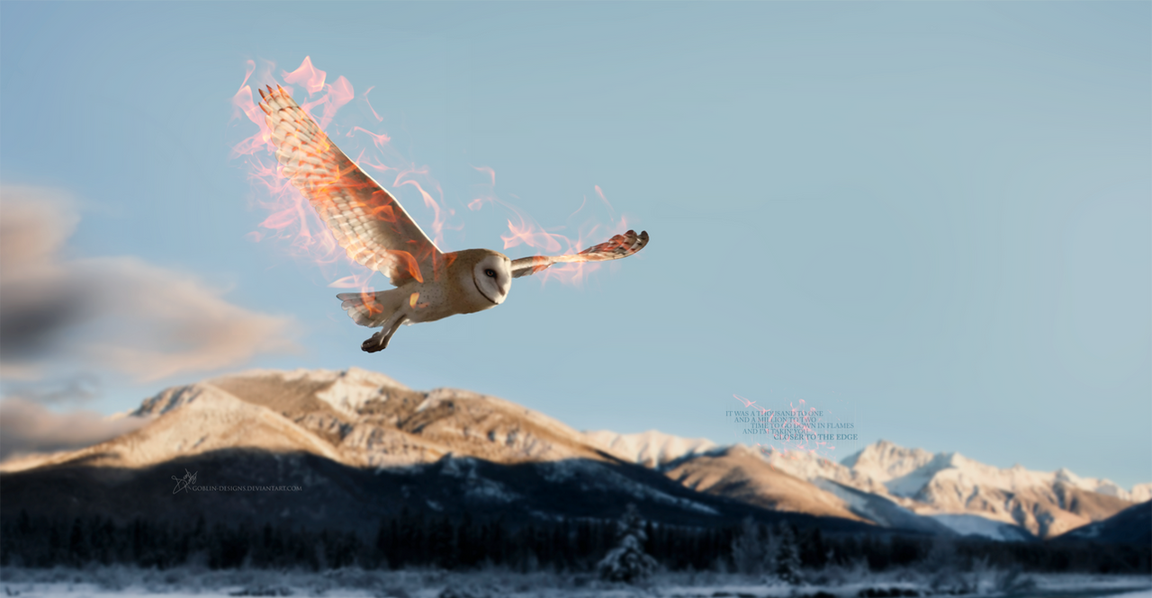
 Shinymane1 — Into The Fire

Published: 2011-11-02 19:41:49 +0000 UTC; Views: 2520; Favourites: 122; Downloads: 20
Redirect to original
Description
I apologize for the lack of art recently, I just haven't been inspired or motivated to draw anything...maybe that's what art block is...
Anyway here's another piece I've redrawn from The Legend Of The Guardians, as I was also unhappy with the previous piece, shown here [link]
Much more pleased with this one. I put a lot more effort into the detailing and the wings, plus I found a sharper reference still to refer from, which helped greatly. Still not sure about the fire though, still need more practice with that.
Info:
Photoshop CS4
Mouse
7 layers
2+ hours
Ref used
I offer Commissions, information is here
 (Smile)") [link]
[link]
Related content


Comments: 34


")

its my fave animated movie these are beautiful
👍: 0 ⏩: 1

I'm glad you like them
👍: 0 ⏩: 1

Yeah I found that difficult when I drew this too
👍: 0 ⏩: 0

is it just me or does the coal bucket combined with the curve of the moon and flames look like a sword?
👍: 0 ⏩: 1
the thumbnail looked one.
👍: 0 ⏩: 0

Looks great! Although i think you need to work on the shape of his face more.
👍: 0 ⏩: 1
It's hard to say, but I think his face is too round. There needs to be a curve, since Barn owls have more of a curve around there face rather then it being around.
[link]
👍: 0 ⏩: 1
Okay, thanks for the critique
👍: 0 ⏩: 1

Gah, I feel bad for not commenting on your work as much as I should be
I really love the improvement from the last version of this! It's all so beautifully drawn and clear, and the colours are amazing ^^ You can really sense the heat coming from the basket(?) A really striking picture, can't wait to see more


👍: 0 ⏩: 1
Aww, don't feel pressured to comment, I don't take it to heart
I'm so glad you like it 
👍: 0 ⏩: 1
But your work deserves it! ^^
Hehe,
👍: 0 ⏩: 1


wow, so much improvement! the lines are so much clearer and it looks more real, like I love the light coming through the feathers, the wings are my fav part! ^^ the background is great too!

👍: 0 ⏩: 1
Thanks! 

👍: 0 ⏩: 1
^^
haha! makes sense!
👍: 0 ⏩: 0

I actually prefer the older one, simply due to the other one has an "action" feel to it. Also the eyes on this one are a tad bit derpy.
👍: 0 ⏩: 1
Well okay, but personally I much more prefer this one.
👍: 0 ⏩: 0
