HOME | DD
 Shipahn — El Coco

#coco #color #gore #horror #super #terror #costarica #elcoco #terrorhorror #cocomonster
Published: 2012-07-18 09:46:48 +0000 UTC; Views: 4414; Favourites: 8; Downloads: 294
Redirect to original
Description
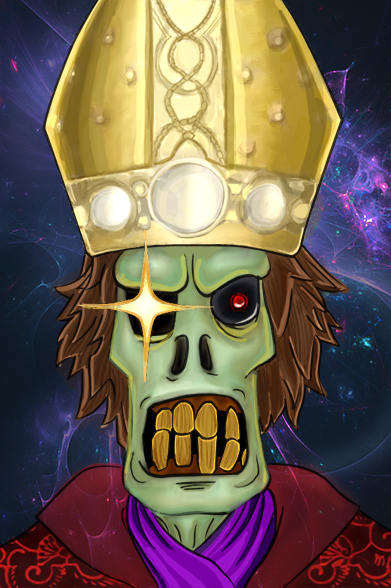
My version of "El Coco"I know the image is dirty (scanned drawing), and have a lack of shadows and light, so is still incomplete, It would be great if U people could give me any advice.
The Coco is a monster who eat kids, is a Hispanic folklore legend, is more or less like the bogeyman.
I dont know in other countries, but where i live, there is a lullaby that says:
Duérmete niño(a) duérmete ya, que viene el Coco y te comerá.
Related content


Comments: 10


I didn't know of this legend, maybe my ex-girlfriend could tell me more about it because I'd like to hear more.
 (Smile)")
👍: 0 ⏩: 0


Que tuanis estaaaa!
El coco es todo vacilon :3 xP
Ud alguna vez vio Martin Mystery? El bogeyman de esa serie se parece bastantillo a este x3
Es creepy como el demonio :3 [link] con gusanera incluida :3
👍: 0 ⏩: 1

^^ Gracias!
Si, creo haber visto un par de caps, extraño un poco los días en cuando nickelodeon aún valía la pena.
Tienes razón, se parecen bastante, y es una gran coincidencia, porque en un principio no iba a ser el Coco, y el niño iba a ser un bebé, pero metí la pata, y la única manera que se me ocurrió de enmendar el dibujo fue convertirlo en el Coco. xD

👍: 0 ⏩: 1
jajajajaja
es que me gusta lo creepy xP
👍: 0 ⏩: 0

Woah that is creepy! I don't really want to give ways to improve because I could never be this good, but what you could do is use lots of different colours in, for instance by adding different shades of green or even yellow to the hair. But this is amazing anyway xx
👍: 0 ⏩: 0

It's really too creepy for me ")
👍: 0 ⏩: 1
You're welcome 
👍: 0 ⏩: 0