HOME | DD
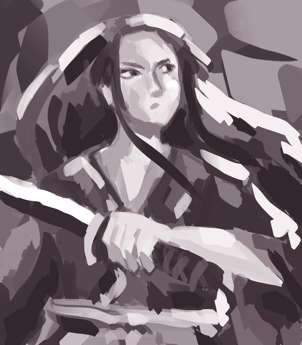
 Shirahakun — Samurai4
Published: 2018-08-10 14:44:38 +0000 UTC; Views: 139; Favourites: 14; Downloads: 0
Redirect to original
Related content


Comments: 9

Hi! I'm from  (Smile)")
This piece caught my eye as it is monochromatic and easy on the eyes, quite pleasant to look at too! I love your brush work and strokes, very vivid and brings life to the drawing. You have a very good understanding of values as well, each and every aspect of this piece is clearly shown so well done!
The expression is well drawn, clearly showing the serious and do-not-mess-with-me mood and I love the flow of the hair , showing mid movement and action!
However, it is on the messy side (I have no idea if you intentionally did that) and details on the character (more specifically the face) could be refined a little more to bring focus to the character
As for the face, the placement of facial structures could be more refined and the mouth is kinda hard to notice (you could make it more prominent by perhaps adding shadow below the lower lip or drawing a thin line to show the mouth)
Not only that, you could make it more striking by colouring one aspect of it (lets say, the shirt) in a more brighter colour (I think red would match this) but tats not really a major problem
This is definitely a great attempt overall!
")
👍: 0 ⏩: 0


ProjectComment here!
I really like what you did with this piece. The way you made a whole drawing that is easily distinguishable and is clear in what it is showing with such wide brush strokes is impressive. It's a unique style but that makes it stand out from the crowd. I also love that you were able to show such a dynamic picture in black and white, which is something I struggle with in my art, since I rely so much on bright colors.
One thing that could use some work is the face. While I like how you made use of shading to make the face look three dimensional, some of the anatomy is a little off. For example, the eyes don't look as realistic as the rest of the drawing, and although I know this is a stylized drawing, it might help to look at reference pictures of the shape of the skull and how human faces look at different angles. Also, the character's facial features use much thinner strokes than the rest of the body, which distracts from the rest of the image. If you were able to illustrate the facial features with strokes as thick as the rest of the drawing, or if you made other parts of the drawing where the lines were thinner, it would help to pull the whole piece together.
Overall, this is a very strong piece of art. The contrast of light and shadow adds so much life to the drawing; you did well giving so much depth and life to it. I hope you have a nice day!
👍: 0 ⏩: 1

hey! Thanks for the review, i didn't expect it to be so positive haha actually there are so many problems in this illu that i was just waiting for someone to tell me what i knew. very goo critique overall , it will help! have a nice day!
👍: 0 ⏩: 0

I can't think of a full review, but the juxtaposition of bright and dark is interesting to look at and the picture seems to have both movement and depth.
👍: 0 ⏩: 1