HOME | DD
 Shiranova — 2015-2016 Redrawdoodles
#headshots #manga #redrawing #new #old #art #redraw
Published: 2016-09-10 05:07:07 +0000 UTC; Views: 903; Favourites: 124; Downloads: 0
Redirect to original
Description
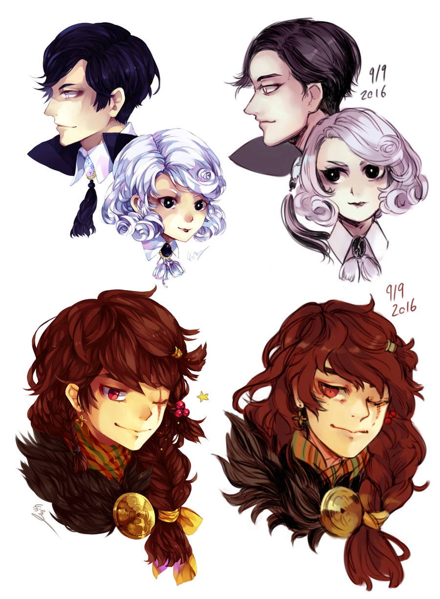
So today at exactly 5 am (it's 7 am now) I wondered what it would look like if I redrawdoodled some old headshots which weren't my worst work back in 2015. Normally when I redraw stuff it's way older than this or has some very obvious drawing mistakes. However, the old headshots didn't look THAT bad to me before (now that I looked closer at them I don't like them as much as before but I think I still did an okay job back then XD) so I asked myself: Would there be any improvement visible if I redraw relatively new, relatively okay looking drawings (which are headshots because that's obviously the only thing I am able to draw lol)?Actually I am not sure if I found the answer to my question. (<- Okay forget that. Now that I look at them in direct comparison there is an obvious improvement. Iamblind.) At first I didn't want to upload those here but I am really curious what you think of those as I am apparentely not able to rate them myself. Please note that the old ones were drawings while the new ones are not more than doodles I drew in about half an hour each (the old one took me several hours to finish).
The positive thing about this is that I had a blast. It was so much fun to draw those ocs again. (Especially the bottom one. I missed this guy.) The past few days were quite stressful and drawing was more of a chore than a fun thing to do for me. I can't remember when I enjoyed drawing that much last time. :'D
Tuoni and Tuonetar - Top
Tuoni's hair looks like it changed a lot (and he's going bald) but it's actually more accurate than the old one. I just didn't know how to draw his hair in this angle back when I did the first one, the hairstyle/his design itself didn't change. And I also got more courageous when it comes to shorter or styled hair. :'D
I decided that it would make more sense to make Tuonetar glance at him than stare at a random point at a random angle. The new composition isn't as smooth as the old one in my opinion but I like their overall expressions better. I didn't intend to make them look that creepy and sleek but they're villains in my story so I can live with that.
Lempo - Bottom
I didn't really change much in the new one. He somehow looks more like a Nordic/Scandinavian god in the 2016 version. I assume it's the hair but I am not sure what made that change. Maybe I am just imagining things. X'D
Related content


Comments: 14


You can really see the improvement
with tuoni and tuonetar I like the 2016 version because I think the looks suit them especially as bad guys ^^.
👍: 0 ⏩: 1

Thank you so much! I would actually like to make a clean version of that redraw. Hahaha~
I somehow have the feeling that many people didn't realize that the right ones are just doodles and not finished drawings. It would definitely be more convining if both version were drawings. orz
👍: 0 ⏩: 1
You are very welcome ^^
I would love to see a clean version of tuoni and tuonetar they seem like very interesting characters <3
I agree with you I don't think they noticed either but the doodles are just that well done at first glance they look like finished drawings.
👍: 0 ⏩: 0

I also think they look more mature but I think the color palette is contributing to this. The colors on the right seem more desaturated and subdued compared to the left. Unless used in a specific and purposeful way, saturated colors usually contribute to that happy, childish feeling. But then again this could be because they're just doodles and you didn't add deep shading/highlights to them.
But in all I see major improvement! Your anatomy is better and the details are more simplistic in a good way! The visual economy and overall appearance of the characters seem easier on the eye as the details don't detract from each other and pull away from the main focus (the face). Not to say that the drawings on the left are not as good, I just have the opinion that less is more. Like with how you think Lempo has more of a Nordic/Scandinavian god appearance I think it's because the small details of his outfit and hairstyle stands out more and contributes to that feeling. IDK I could just be thinking about it too much too lol
Also I think the composition between Tuoni and Tuonetar looks fine! I actually like it a lot better now that she's not staring off into space haha. And the way you have Tuoni's neck-piece curve back towards her completes the composition. The who picture seems like one unit now! :>
Also I hope you will have more chances to draw for fun soon! ;v;b
👍: 0 ⏩: 1
That is very well possible. But you were totally right. It's because they're just doodles. The shading in the new ones would probably look like in my current drawings as my color choices haven't really changed this year. <:
Thank you so much! I am very glad the anatomy is better although they're just headshots. It's at least a beginning hahaha~
I don't know how simple they'de look if they were finished drawings and cannot say for sure whether Lempo's details would still stick out. The color contrast would probably be higher if colored properly and I don't know if that helps the details or does the opposite to them.
(And you can never think too much! I love getting such comments! Thank you so much! <3)
I think I don't like the new composition that much since Tuonetar partially covers Tuoni's neck brooch. But yes I tried to fix the composition a bit by curving the tassel her way. Your comment makes a lot of sense and it actually makes me like the new version a lot more than before. Thank you so much~
Unfortunately I don't think I will with university starting next week. But I'd like to plan my life a bit better and use my time more constructively so that will probably help!
(Sadly I always fall back into old behaviours. I am a real mess. XD)
👍: 0 ⏩: 0

I like the shading style on the left better than the right.
But I love the drawing style on the right more than the left. xDDD
👍: 0 ⏩: 1
The ones on the left are drawings. The ones on the right are doodles. That's why the shading of the right ones is a lot simpler and cannot really be compared to the left ones. I would have put more thought into it if the new ones were drawings as well. <;
And I am very glad to hear that! Because the style remains the same no matter if doodle or drawing. Thanks a lot! >v<
👍: 0 ⏩: 1
I was wondering that. XD Cause the ones on the left were more polished.
But I like how your style has matured though. Unless the characters have matures too with you along the year from 2015-2016. : )
Like I super love how your character on the bottom looks more mature than the 2015's version. He's scrumptious. XD
👍: 0 ⏩: 1
Thank you so much for the sweet words! I am very glad with the change as well and it relieves me that people are agreeing. uvu
Hahaha~ glad you like him! XD
👍: 0 ⏩: 0

I remember when you drew the top left one! I was watching that stream
It looks like everyone's gotten a bit more mature. o vo)/)
")
👍: 0 ⏩: 1
And I remembered you watched this stream when I redrew it. :'D
Haha my art grows with me. But to be honest I am glad it got more mature. Going further away from the classical cutesy. Not sure if all of my watchers approve but I do. XD
👍: 0 ⏩: 1
You're going in nice directions o vo)/)
Keep chirping, shirabirb
👍: 0 ⏩: 1
I am very glad you think so. uvu
//makes birb noises
Same to you! Keep ... doing whatever cat-speechbubbles do! övö/
👍: 0 ⏩: 0