HOME | DD
 shixe — break

Published: 2008-05-21 22:34:14 +0000 UTC; Views: 3076; Favourites: 52; Downloads: 57
Redirect to original
Description
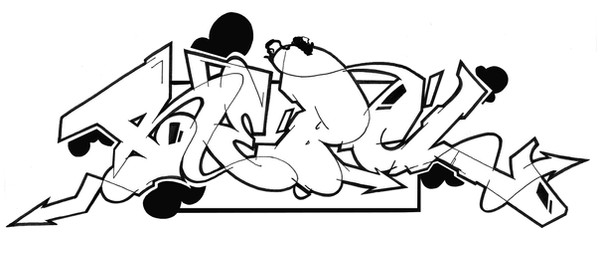
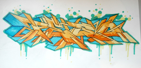
a sketch for a word battle onword: break
tell me what you think and go to vote, when it's posted on markerwars...
Related content


Comments: 44

this thing right here dude...
is just TOO much for me to handle!!
awesome work...nicely done
👍: 0 ⏩: 0


you know its great! ;D
i have to ask you how you make that clear pictures? Do you scan it in your computer or do you take a photo ?
👍: 0 ⏩: 1

yo danke alter..
ich mach meistens fotos..a4 formate werden gescannt..
👍: 0 ⏩: 1
Achso  (Smile)")
👍: 0 ⏩: 1
alles eine frage der kamera und der belichtung...
deine casio ex-z is auf jeden fall gut genug..da gibst bestimmt eine einstellung, die die farben besser rausbringt..ansonsten haben deine bilder viel schatten..ich stell mir immer noch eine extra lampe direkt ans bild, je besser du das blatt ausleuchtest, umso besser kommen auch die farben auf dem foto..wenns nix wird, kannst du auch nochmal mit photoshop oder so nachbessern..(ich schneid meistens noch das bild in die richtige größe ..)
👍: 0 ⏩: 0


Congrats!! you win the battle...BUT THE WARS NOT OVER!!! MWaHaHaHaHaHaHa

👍: 0 ⏩: 0

nice sketch
looks metallic...real bad ass
gl on market wars
👍: 0 ⏩: 0

yo thanks man..the battle started today, so if you wanna see the other boy's break check: [link]
and vote for your favourite..
👍: 0 ⏩: 0
i mainly used copic markers and felt pens..outline is done with fineliner and a black edding marker...
👍: 0 ⏩: 1
i don't know prismas, but i'm fully satisfied with
copics..but they're as fresh as expensive (very)
")
👍: 0 ⏩: 1

prismas are damn good and less espensive. you should check them out. they're rackable too. stay up
👍: 0 ⏩: 1
i'm sure they are, but not available in germany though
👍: 0 ⏩: 1

nice colors can you check out my new sketch and give me tips on filling
👍: 0 ⏩: 0
MFBlank [2008-05-23 02:46:50 +0000 UTC]
wow!
dats amazing man!
nice sketch bro!i like all da colors and effects...
really nice work
i wish u goos luck...
but i think u have this battle won already
")
👍: 0 ⏩: 0


really dope
those letters are hot!
the B is the best i think
keep it up
👍: 0 ⏩: 1
thanks man...hey, the due date is till end of the week..what about another battle between us??
👍: 0 ⏩: 1
i made a sketch for the cinik battle
but another battle is cool
👍: 0 ⏩: 1
yeah, participate in this break battle too...

👍: 0 ⏩: 1
hmm
i dont think ill do that
i have exams this week, i have to study ")
👍: 0 ⏩: 1
what a pitty..
veel geluk bij jouw examen..
👍: 0 ⏩: 1


you're fuckin' crazy! ")
👍: 0 ⏩: 0


I was thinkn about entering the same battle. Got and outline done with no colors. Not sure what direction to go with it... so it sits.
I dig your piece man. a lil more color would have been nice but thats me.
Your letter style is really tight and well put together. Keep it up
👍: 0 ⏩: 0


NIIICE. Those letter haul ass. High five. Awesome colours too.
👍: 0 ⏩: 1


Very very skilled work, good style.
I used to stencil- and practiced drawing for ages to be able to draw like this... never got any good at all though
👍: 0 ⏩: 1
thanks a lot..i'm doing this for about 15 years now...

👍: 0 ⏩: 0