HOME | DD
 shuffl3 —
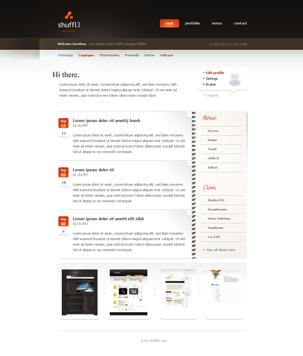
another portfolio
shuffl3 —
another portfolio
Published: 2008-09-28 16:38:56 +0000 UTC; Views: 62602; Favourites: 461; Downloads: 0
Redirect to original
Description
.Related content


Comments: 98


 (Smile) - :)")


gefällt mir richtig gut, sollte auch mal vom minimalismus wegkommen ^^
👍: 0 ⏩: 0

Nice design bro, you only forgot the 'v' in service ")
Overall the colorcombination is cool too 8/10 (believe me that is very high)
👍: 0 ⏩: 0

shuffl3
you're the best
i like your work very much, most of the inGraphix site
")
👍: 0 ⏩: 0


An very nice and clean portfolio layout. I really like it.
👍: 0 ⏩: 0


the header looks great, body needs more work IMHO but good results for 55%
")
👍: 0 ⏩: 0


 (Wink)")


Wow, this looks so nice. Congrats on the much-deserved DD!!
👍: 0 ⏩: 0

One of the best things I have EVER seen.
The browns blend in so nicely with the oranges - yet, the oranges stand out and are clearly visible.
My favorite part is how the rest is white - easy to read.
Very good job!
👍: 0 ⏩: 1
K blending in thing made no sense.
I meant that the orange colors were probably the best choice to go with the browns, since it's basically the same tone, it works very nicely.
👍: 0 ⏩: 0


the "v" is missing in "service"- otherwise i'd say it looks pretty fresh. i like the choice of colors and overall layout and design. well done.

👍: 0 ⏩: 0


Very clean, almost boring. I somehow dislike the left hand "cut" in the navigation bar. It realy breaks the flow. Anyway, still awesome design. It's hard to create a good looking and clean design. Thumbs up!
👍: 0 ⏩: 0

loved it... same question... how much would you take for this nice design...? good work. Please note me a single line. thanks!
👍: 0 ⏩: 0

nice layout! can I ask what default font are you using with this? thanks
👍: 0 ⏩: 0


| Next =>