HOME | DD
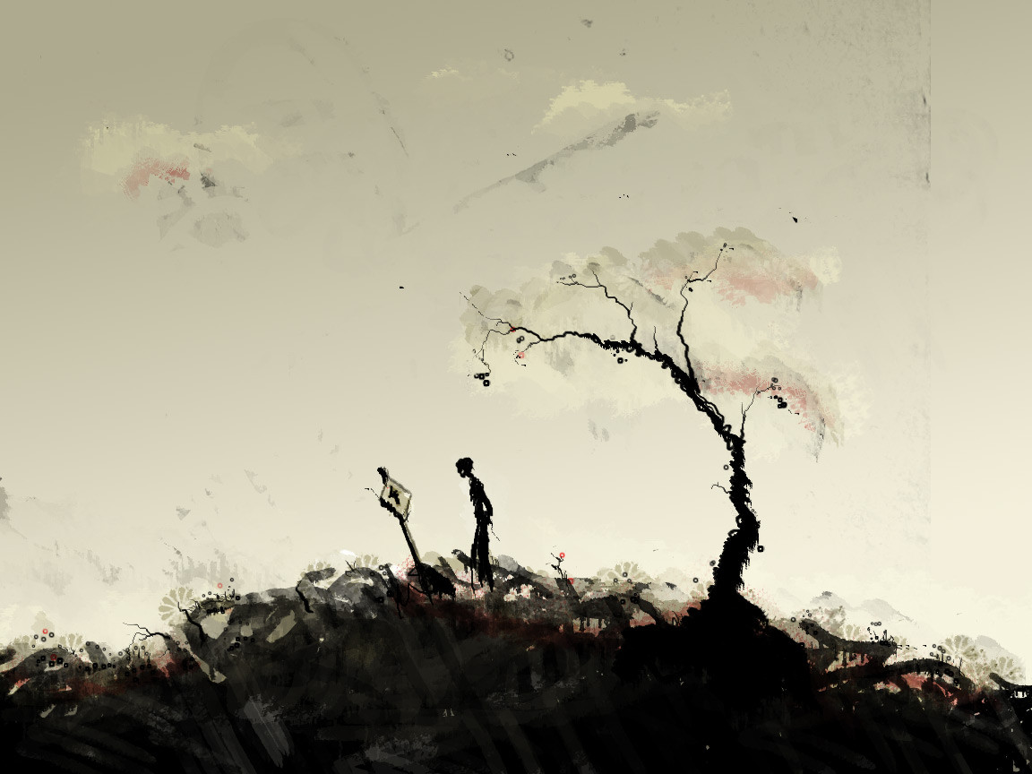
 Si2 — Tree of Life

Published: 2007-07-04 22:52:06 +0000 UTC; Views: 19992; Favourites: 617; Downloads: 0
Redirect to original
Description
Personal illustrationRelated content


Comments: 139

Yes, everything is hand drawn and hand painted and then the individual elements are put together and edited in Photoshop.
👍: 0 ⏩: 1

Oh okay. I love your work. I do a lot of scanning and then work on it in photoshop, but i have a lot of trouble using my actual drawings in the piece without it looking unfinished. I always end up just using my work as a guide which i draw over in the computer, but that causes me to lose that sketched look. Is there a process or technique you use to separate your lines from the paper?
👍: 0 ⏩: 1
Ok, this might be hard to explain but hopefully not.
Once I've scanned in the drawing into Photoshop I will use 'Levels' to adjust the contrast and get rid of all of the bits of 'dust' or whatever you call it so what I am left with is just the black lines of the drawing. Then I double click on the bg layer in the layer menu and press ok. This unlocks the layer that the drawing is on. Then I go to the 'select' menu and use 'colour range'. Once this separate window opens up make sure that the colour you are selecting is white and put the 'fuzziness' up to 200 and press ok. Then press delete, then de-select, then use the 'levels' to darken everything (selecting and deleting all of the white makes the black lines slightly lighter around the edges. Whacking the levels all the way to the right twice will get rid of this) and there you go - your line drawing is separate from the paper.
This is what I use on pretty much every drawing as it allows me to easily work behind the line drawing. I'm sure there are other ways of doing this but I find this to be a very quick way. I have added 'select colour range' to my shortcut menu which helps to speed the process up. I hope this makes sense and I hope this is what you meant. If any of this is confusing and doesn't make sense please let me know.
👍: 0 ⏩: 1
Oh gottcha. That's pretty similar to way I do but should work a little better. Thanks a bunch for explaining it
👍: 0 ⏩: 1
Oh also do you use bristol paper?
👍: 0 ⏩: 1
oh just a kinda of paper i just started using it and it makes for great scans. what kind do you use
👍: 0 ⏩: 1
Ok. I don't use anything special, just Daler Rowney sketchbooks. There's a really good art store in London where they are always half price.
👍: 0 ⏩: 1
oh gottcha that's cool. what kinda pen?
👍: 0 ⏩: 1
For normal outlining I use Staedtler pigment liner - fineliners. Again, in this store they are pretty cheap but I have found them online where you can buy them in larger quantities. I have also been using a brush pen which I use to make a lot of my textures. It's a pen which takes an ink cartridge and has a brush tip for a nib. It's called a Pentel Brush Pen if you are interested.
👍: 0 ⏩: 1
awesome, thanks for answerin all these questions
👍: 0 ⏩: 1

i can see that the splatter is heart shaped very clever and very nice
👍: 0 ⏩: 1
That wasn't intended and I've never noticed it until you mentioned it but now that I've seen it it works kind of well with the theme of the piece. Thanks!
👍: 0 ⏩: 0

hi
Your wonderful image has been featured in my journal:
[link]
Feel free to visit but there is no obligation
👍: 0 ⏩: 1


this is truly amazing. it brings out a feeling in me, one that i cannot put my finger on.
it's magic.
👍: 0 ⏩: 1

I found this while searching for Celtic designs and ideas on google lol well done, I love it.
x
👍: 0 ⏩: 1


i like to think of the blood stains as representing the pollution from the city which would be killing the tree, perhaps thats how you meant it to look. either way, a lovely piece of art. well done. Fav'd!
👍: 0 ⏩: 1
That's not what I had in mind when creating it but I like your idea. I enjoy hearing other people's interpretations as there isn't just one way of seeing something, it's however the individual sees it.
👍: 0 ⏩: 0

I really like your style you have some amazing illustrations
👍: 0 ⏩: 1

Powerfull! I love the colours and the imagination in this drawing! Great concept!
👍: 0 ⏩: 0

Love the blood splatter for the tree leaves. Red, White and Black combination give it a bit of a communist feel, which I really enjoy. Composition is amazing, and the art style in itself is awesome. Great job!
👍: 0 ⏩: 1


very nice done! like the symbolism of he colours and the lineart is awesome
👍: 0 ⏩: 1

 (Wink)")

This really is gorgeous. was scanning through the other comments - you're right, it is a 'simple' image and yet I can see that you've actually put a lot of effort into the detail and composition. It feels almost apocalyptic. hehe. I just wonder where your inspiration for this piece came from? (just interested) Personally, I think the little flying birds just add that extra touch.  (Smile)")
👍: 0 ⏩: 1
Thanks for your comment. The piece was supposed to be an album cover for the band Eluvian, but they ended up wanting something quite different (it turned out to be 'Album cover 3' in my gallery). I did listen to their music a bit when coming up with the idea, but I think a lot of inspiration came from reading the book 'The Wasp Factory' by Iain Banks. That's where the idea for the posts with bird heads impaled on them came from. Then the rest of it just started to come together as I was working on it. The birds flying away from the tree was one of the last things, they seemed to round off the piece nicely and give a kind of cirlce of life sort of feel. Anyway, hope that makes sense, I've rambled for quite a while now.
👍: 0 ⏩: 0


im liking the detail and blood splats, very creepy lol
👍: 0 ⏩: 1


I like this pic very much...Its every detail is just perfect...
how did you do the thin white lines, which look like scratches, at the blood part? I always wanted to know. It gives a so cool atmosphere to the pictures. Like an old movie.
👍: 0 ⏩: 1
| Next =>