HOME | DD
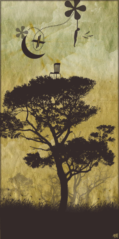
 Si2 — Warm field

Published: 2009-12-05 14:17:43 +0000 UTC; Views: 2416; Favourites: 147; Downloads: 0
Redirect to original
Description
Personal illustration. This is actually an illustration I completed about a year ago and for some reason never put up here.It is available to buy as a print from here:
[link]
Related content


Comments: 21


I can't get enough of this. It's so dynamic yet so calm. Can't really describe it but the composition and colour choices are great. Great I say!
👍: 0 ⏩: 1

once again , i enjoy every single one of your deviation posts (rare and big though >:C) . this one has nice colours and motion feeling . we are lucky with all those personal illustrations of yours , i appreciate them much more than the ones you make for bands , posters etc.
cheers
👍: 0 ⏩: 1

Thank you! I always prefer my own work as I don't have to worry about what any clients think.
👍: 0 ⏩: 0

this makes me feel good - just by looking at it i feel refreshed  (Smile)")
👍: 0 ⏩: 1

i like it better than the monochrome ones
has a nice feeling to it
👍: 0 ⏩: 1

I must shake your hand..top notch earthtones!
This is also a nice change from your dark work..it has a very calm, soothing tone of serenity to it. Texture work is phenomenal, I want to see this piece surrounded and placed into an environment.
👍: 0 ⏩: 1

What program did you use for this? And what kind of affect did you apply to give it a kind of paper faded look? It's really cool and I would love to apply that appearance onto some of my own work
👍: 0 ⏩: 1
Hi, ok, I did this a while ago so can't remember it exactly but will try my best. The program I used was Photoshop. The tree is drawn by hand, the grass painted, the texture of the tree is hand made paper, the texture for the trunk is hand painted and the background is made by scanning in a rug I have. This was scanned in and then various things were done to it. I think I used the levels tool and lighting effects to change it from the dark blue that it started as. To create the faded paper look I scanned in lots of pencil smudges (I then got rid of all of the white so just the black remained), these were then layered up on the rug layer. I then flattened the smudges into one layer, selected that layer and then deleted the space the smudges took up away from the rug layer. It's quick to do but very difficult to explain. Hope that makes some sort of sense.
👍: 0 ⏩: 0

The details
Lovely composition and colour contrast as well.
I love the texture and the overall foliage.

👍: 0 ⏩: 1


