HOME | DD
 Si3art — Colour Contrasts+Harmonies

Published: 2013-08-13 21:10:55 +0000 UTC; Views: 5236; Favourites: 75; Downloads: 63
Redirect to original
Description
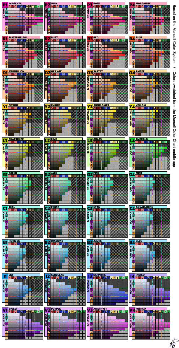
These were made for my college colour theory spring course.
Colours are mixed with 3 primary gouache+ black n' white, each square is 15x15cm, all the shapes cut out and glued in place one by one.
Emm... One contrast square took ~2 hours and harmonie square about ~3 hours to complete. And there is 17 squares. :DD
So yep, you are looking at quite a lot of hours there.

(just that you'd get the lil' hint of how long one effing college work can take. ONLY ONE. D:<)
Also, put my colour wheel at the top~ *le captain obvious*
Maybe it helps a little to understand these contrast/harmonie combos.
A little copy paste descriptions of the contrast and harmonies/ what the eff all these colourful sqaures mean.
 Contrasts
 Simultaneous- The contrast is formed when the boundaries between colors perceptually vibrate.- Basicly this colour combo (orange+grey)- the grey should look blue'ish next to orange when actually it's not.Saturation- The contrast is formed by the light and dark values and their relative saturation.- Basicly one colour is "pure" and the other is the same tone mixed with either black or white.Complementary- The contrast is formed by the color wheel or perceptual opposites.Cool vs Warm- The contrast is formed of hues considered 'warm' or 'cool.'- (As everybody knows?) warm colours are everything that consist yellow and cold colours consist blue.Proportion- The contrast is formed by assigning proportional field sizes in relation to the visual weight of a color.Light and Dark- The contrast is formed by the light and dark values. This could be a monochromatic composition.- One colour is mixed with black and other with white.Hue- The contrast is formed by different hues. The greater the distance between hues on a color wheel, the greater the contrast.- Or in other words, this contrast works best if you use the opposite pure colours (not mixed with white or black). The colours should start to "vibrate" and leave a "third" colour boarder, the colours should "scream" right at ya. Not very pleasing for the eyes...HarmoniesTriad- If you position a equilateral triangle on the colour wheel, you get the three colour harmonie tones. Tetrad- Same thing, if you position an equal sided square on the colour wheel- the four colours of the tips of the square form the harmonie.Analogus- Consists of one sector on the colour wheel. (like from yellow to red and everything that's between them)Chromatic+Achromatic- Basicly random colours + grey tones.Shades- Most of the colours are dull and mixed with black.Family- There are two colours a "mother" and a "father" tone and their mixes are the "children"= family. x)Monochromatic- One pure colour is mixed with black and white.Complementary- As mentioned before, this is the opposite colours of the colour wheel.Pastel- All the tones are mixed with white.Related- All the tones are mixed with same primary colour. We called this one "a glass of Vodka" x'DDD
------------------------------------------------------------------------
Related content


Comments: 9

Wow, I really like this! 
Ah, yes, college... Some assignments are the art equivalent of writing a 10 page paper. ;_;
👍: 0 ⏩: 0


")