HOME | DD
 siby — filters tutorial

Published: 2007-02-18 23:59:56 +0000 UTC; Views: 10210; Favourites: 87; Downloads: 788
Redirect to original
Description
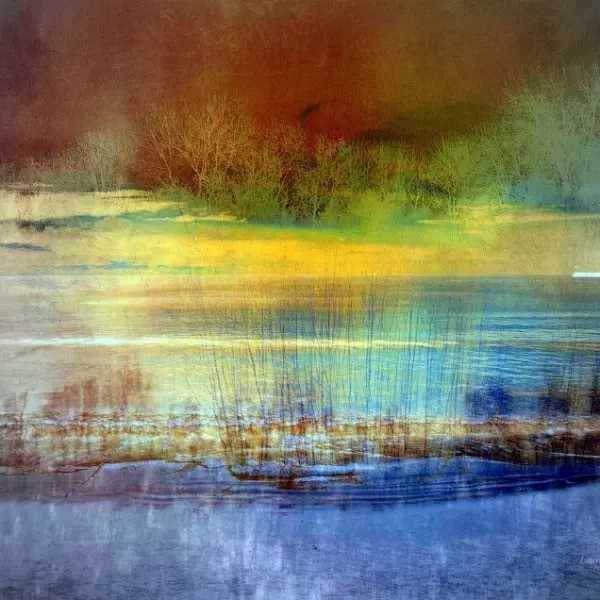
photomanpiulation with filters.try my another tutorials:
[link]
[link]
Related content


Comments: 36


where is plastic wrap you speak of? :S im new to ps....
👍: 0 ⏩: 1

Filters > Artistic > Plastic wrap
👍: 0 ⏩: 0

Hello
Your Tutorial is being featured on my News Article right here [link]
Thank you so much for sharing


👍: 0 ⏩: 1

 (Wink)")

")
👍: 0 ⏩: 0

Nem rossz, nem rossz. Én is imádok a layerek+filterek témában kontárkodni, de a motion blur még sosem jutott eszembe. Kreatívos.. kipróbáljuk!^^ Ja és fav!
👍: 0 ⏩: 1

Good-looking layout, with the white font on black, and the way you arranged the pics, especially the big one. The font is kinda hard to read, though, the lines sort of bleed into each other, making e.g. letters like f-i-l-t hard to distinguish. Do you have a non-bold version of the same font? Now I don't have the same filters, but the tutorial looks interesting enough for those who have Photoshop.
👍: 0 ⏩: 1
hm..somebody has already said this inreadable fons...thinking on changing but im afraid maybe i dont have no-bold fonts. and now i dont have time. but i want to clear it
👍: 0 ⏩: 1
And what about using some generic font with thinner lines, e.g. Arial - or do you think that would be too plain?
👍: 0 ⏩: 1
you could see better..but that doesnt fits to this style...btw if i wont have better font i will change
👍: 0 ⏩: 0

Another good job!  (Smile)")
👍: 0 ⏩: 1
hm...i will try to find a better techno font. if i find
👍: 0 ⏩: 0

Nagyon ügyes/hasznos kis tutorial! Tetszik ahogyan megcsináltad!
👍: 0 ⏩: 2
kösz tesó. rajzoljá már valamit
👍: 0 ⏩: 1

igyekszem
👍: 0 ⏩: 1
ő hát...de most még rajzokkal is égessem itt magam! mondtam, már nemtudok rajzolni")
👍: 0 ⏩: 1
én HISZEK neked ")


👍: 0 ⏩: 1
űha..most majnem bedőltem!")
👍: 0 ⏩: 1
nemis akarok járni az eszeden túl. kituggya mi van azokon a tájakon
")
👍: 0 ⏩: 1
jpbb nemtudni....még énse tudom!
👍: 0 ⏩: 1
ööö . . . .jobb tudni, de énse akarom
👍: 0 ⏩: 0

