HOME | DD
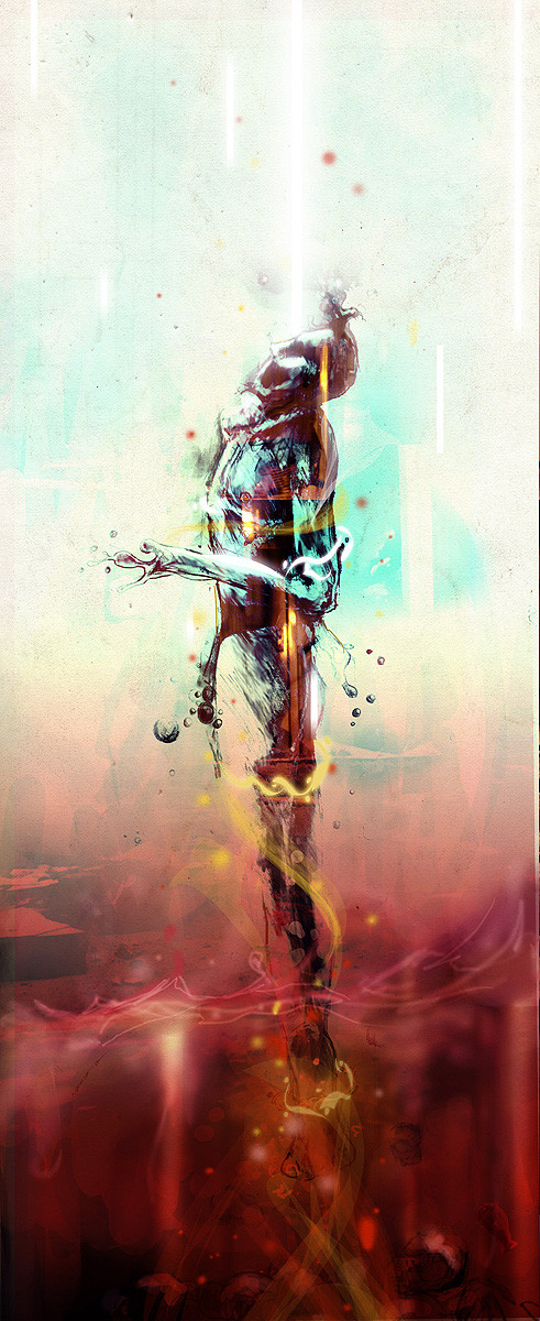
 Sick-Osiris — freefall
Published: 2008-04-06 15:45:06 +0000 UTC; Views: 8435; Favourites: 211; Downloads: 314
Redirect to original
Description
conceptual + experimentalRelated content


Comments: 45

hi! This Beautiful artwork has been featured in my best of 2008 news article...
check it out here:[link]
👍: 0 ⏩: 0

This is very impressive. I mostly like the top part but it is a great piece overall.
👍: 0 ⏩: 0

Love the concept and the feeling in this piece. Awesome work!
👍: 0 ⏩: 0

Congrats!!!
I've featured this creation in the April Visual Art Features.
Check it here : [link]
This feature is also in the news so more views for you : [link] .
Please check it to view other's art and fave the news article if you like it!
--

👍: 0 ⏩: 0

you put the sick in sick-osiris.Fukn excellent work. its always a challenge figuring out how you create your images. So my guess: Sketchbook, photoshop and texture?
👍: 0 ⏩: 1

correct a mundo! Thanks again!
👍: 0 ⏩: 0


That is absolutely amazing. I really can't find any words to describe how much I like it...it's that breathtaking for me.
This is absolutely awesome; keep up the great work
👍: 0 ⏩: 0


Love the look and the coloring on this, keep it up!
👍: 0 ⏩: 0

Nice work wong, but shouldn't you be too busy doing your GRAPHICS WORK for this frivolous nonsense!?!?!

👍: 0 ⏩: 0

this piece is ogeous. love your use of space and depth in this piece. seems like the dark red colour comes from nowhere, blends beautifully.
👍: 0 ⏩: 0

 (Smile)")

like it a lot, very different from your usual stuff
👍: 0 ⏩: 0


Lovely. Great depth and movement. Very easy to look at. Nice job!
👍: 0 ⏩: 0


Thaumastic, man. Seriously cool. There's such a weird feeling to it as well. The colours work very well together and the tall format is very eye-catching. How did you make it?
👍: 0 ⏩: 1
Thank You! I drew the original person in a sketchbook. Scanned it in to my PC. Opened it in Photoshop. Cut out the background and just began painting digitally and overlaying some little things. It's all about tweaking really.
👍: 0 ⏩: 1
Ah, very good. To look at it you wouldn't know the paint is digitally done; it's amazingly realistic. Great stuff, man.
So, all in all, what did you make of the a½ exhibition?
👍: 0 ⏩: 2
Thanks, man. That's very much appreciated: I'm flattered that you liked my piece so much and that you understood the idea behind it. That's made my day  (Wink)")
I'm glad you enjoyed the rest of it as well; we weren't entirely sure if everyone would have a piece or how it would go but I'm very pleased with the way everything turned out. The quality was very good for the people who were originally deemed The Worst Second Years Ever. I have a soft spot for Keith's Rat; it goes to show you can't take life too seriously ")
👍: 0 ⏩: 0
Thank You!
As for the State of Mind exhibition, I really enjoyed it. Your piece was my favourite. Conceptually great and it was just so simple and effective. Great stuff!
There was a few other standout pieces but overall the quality was quite good! What you make of it yourself ?
👍: 0 ⏩: 0


the colours are insane... i just love how youve dnoe the soft blurring of the red. its adds so much more to the image.
👍: 0 ⏩: 0


where did you get the idea for that? ")
👍: 0 ⏩: 0


Wow great work...almost like the persons trying to choose between heaven and hell
👍: 0 ⏩: 0


