HOME | DD
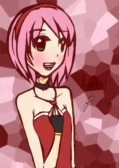
 silamy — Amy Rose :random drawing:
Published: 2009-06-13 01:38:06 +0000 UTC; Views: 2357; Favourites: 88; Downloads: 318
Redirect to original
Description
gimme your worst comments evr D:<Related content


Comments: 19

Overall


Vision
Originality
Technique
Impact
I think that this drawing has a high lack of color scheming. It's cute, but the colors are very...blended and plain. I understand that the theme is a rose color, but the girl looks too molded into the background. She I assume is the main part, not the background- so make it look like she is.
I think that the girl is very cool. But, I think she should stand out a little bit more. Give her that, shall we say, 'oomph'. Maybe by using some brighter colors on her somewhere.
I like the background that you have. It has a crinkly kind of look to it which is very interesting.
Good job e.deviantart.net/emoticons/b/b… " width="15" height="15" alt="
")
👍: 0 ⏩: 0


I can't say anything bad about it! It's a very nice drawing! >w<
👍: 0 ⏩: 0


The coloring is very nice, but i have to say, the body is a little on the long and skinny side, especialy in porportion to the head. and the hand is a little off, size and position wise,(the arm is kinda long too actually...) and i'm not sure what it is about the smile, but it's kinda weird to me :/ i just can't put my finger on why.
👍: 0 ⏩: 1

the lineart messed it up that's why |D
👍: 0 ⏩: 1
ah, i see, the picture is nice, i can tell you're improving on your human art.
👍: 0 ⏩: 0

Eeeeeeeewwww, Your drawing style is animu, I don't like animu. But I won't nit pick on you on that because that's not really constructive soooooo....
You give her a smile she still looks emotionless. Put more feeling and heart into your drawings woman >:U And her hand, the position is quite weird and her arm is way to long in porpotion to her body and her body is way to long in porpotion to her head, (and skinny by the way, but I think that's style for animu because like their head is wider than their body 0___o A reason why I don't like that style so much, it weirds me out, you know) But if your really in for a style where characters appear quite longer you should shorten up the upper part of the body then make the legs longer. But the coloring is good and not n00bish, so keep the coloring up........yaaaaaaa...
And there's my worst comment ever, I don't usually give critiscm especially to one here. Yaa........If I hate animu so much I should probably unwatch you.... I'll get to that after I post this.
tl;dr
👍: 0 ⏩: 0

Aww, I actually like this. The color scheme looks nice with the reddish-brown line art and you did an awesome job on her hair.
👍: 0 ⏩: 0


 (Smile)")

after all, I like it
the eyes turned out good, just the hand's a bit to small...... the rest ist very good
👍: 0 ⏩: 0


um......it stinks
nah, I can't lie, it's so cute >W<

👍: 0 ⏩: 0

KAAAAAAAAAAWWWWWWWWWWAAAAAAAAAAAAIIIIIIIIIII!!!
👍: 0 ⏩: 0
