HOME | DD
 silare — OpenOffice.org Dichromatic
Published: 2007-10-28 01:21:15 +0000 UTC; Views: 7139; Favourites: 18; Downloads: 2249
Redirect to original
Description
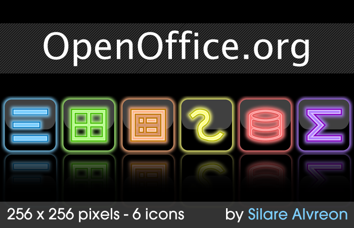
OpenOffice.org is an free and open source office suite that you can find at http://www.openoffice.org for download. Its interface is reminiscent to that of Office 2003, Office XP, and the like, as opposed to the Ribbon interface of Office 2007.I made this set last night after finishing off a Writer icon (shown at the left - the blue one) that I started working on in Computer Science after dying on Starcraft.
Starcraft sucks when you get Zergling Rushed. Badly.
Related content


Comments: 12

VERY nicely done.
I have an OLED VS that this would go well with.
Thanks!
👍: 0 ⏩: 0

It would also be fantastic if you could release some icon versions of these (as in .ico instead of .png) in order to change the start menu appearnce (well actually, my stacks on my dock). Thanks!
👍: 0 ⏩: 1

Hmm... Stacks should be able to change via PNG. I'll throw these in ConvertIcon this weekend though, and see what comes from it. I'm going to for my OpenOffice soon anyways.
👍: 0 ⏩: 2
and btw, to explain my question a little better, the stack icon could be changed as easily as any other dock icon but the files within the stack draw their image from the icon linked to the file (if im not mistaken). So I would actually be using your (wonderful) icons to change the appearance of the source Open Office programs, which in turn would effect those in the dock. But if I can bypass all that, let me know. Thanks for the effort and the quick response, they are both greatly appreciated.
👍: 0 ⏩: 0
Thanks, I appreciate the trouble.
👍: 0 ⏩: 0

Wonderful set. I'll be using these for sure. Thanks!
A perfect addition would be an icon in the same style to represent OpenOffice.org as a whole?
👍: 0 ⏩: 1
^_^ Glad to see you've enjoyed it.
I tried it several times... A white one. However, it always seemed out of place in comparison to the rest.
Maybe I'll release a single of it. Or invert it or do a special set of the OpenOffice icon itself in the spirit of this style.
👍: 0 ⏩: 0


These are nice and clear, good improvement over the yucky standard ones that I can never tell apart. Thanks
 (Smile)")
👍: 0 ⏩: 0

Oooh. Shiny, I love the colours!
*stares for hours*
")
👍: 0 ⏩: 0

Lizzie loves the color combo. :3
But she feels sorry for you being cremated on Starcraft.
(But it still makes her giggle in an evil way.)
")
👍: 0 ⏩: 0
