HOME | DD
 Silieth — The Exile Files - ch I, pg 10

Published: 2010-12-11 15:17:43 +0000 UTC; Views: 2928; Favourites: 27; Downloads: 19
Redirect to original
Description
Previous Page: [link]Even though I love KotOR, I decided not to keep on working on the comic, sorry
")
-----
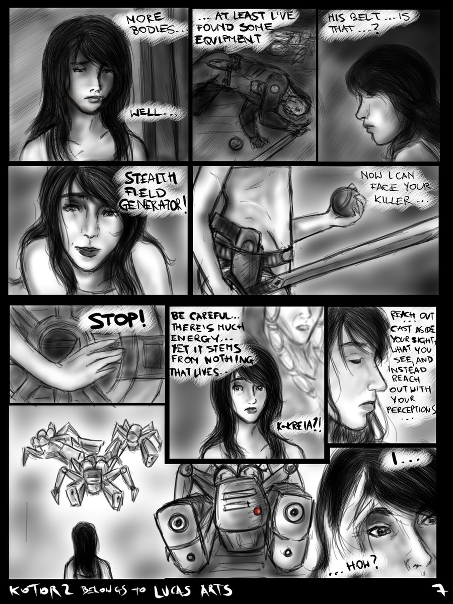
Remember when I said Atton looks okay here? I take it back
F*ck, he's just sooo hard for me to draw! T_T
Made in Photoshop. Bye SAI.
----
Thank you ever so much for all the nice comments and
 s, they really make me want to carry on with it!

I'm still learning

---------
10 pages done, 0 in progress, 0 sketched
---------------------
KotOR 2 (with all characters) belongs to Lucas Arts
This is only a fan comic.
I hope you'll enjoy it even if you haven't played the game
 (Smile)")
Related content


Comments: 53

...nothing XD
I decided to stop, or at least suspend working on it.
👍: 0 ⏩: 1

I know, on the third his face is too long.
👍: 0 ⏩: 0

Even if you feel not quite right about the face, you got his attire down extremely well at least to me and I have a fairly good memory of how his clothes look. For a starting outfit, his is snappy or enviable compared to running around in a one piece kolto tank suit.
👍: 0 ⏩: 1
If at least his clothes are okay, that's a part of success XD *trying to look at the bright side*
Isn't it? ")

👍: 0 ⏩: 1
Indeed... eventually you'll feel better about his face. I haven't really been that good at faces. I tend to color others work and as for my own I usually do characters who wear helmets or masks.
Yes... Atton's jacket is unique. Much better than Carth's from KOTOR. At least to me.
👍: 0 ⏩: 0

I love the drawing of the exile. The texture, the expression. Good job!
👍: 0 ⏩: 1

Pierwsze dwa panele pierwssza klasa. Trzeci... Oh well. Atton ma rozjechaną twarz, ale sama to wiesz, więc nie będę się powtarzać
W ramach konstruktywności: może bardziej komiksowa czcionka? [link] tutaj jest dużo
👍: 0 ⏩: 1
Tak mi go jakoś rozjechało
Dzięki wielkie (znów)!

")
👍: 0 ⏩: 1
Nauczysz
Wrzucasz czcionkę do C:/Windows/Fonts/ i powinno Ci automatycznie wczytać w PSie. Ewentualnie po zrestartowaniu kompa. Jeżeli nie - hmmm, nie wiem xDD (to oczywiście jeżeli masz windowsa...)
👍: 0 ⏩: 1
Aaa, dobra, mam nadzieję, że będzie jak mówisz
👍: 0 ⏩: 1


It's sooo nice to hear!
And thank you for another 

")
👍: 0 ⏩: 1

great yea yeah yeah/is fine but for the next do not give much Bemba (lips too big) to him it's just my opinion
👍: 0 ⏩: 1
Hmmm, you're probably right, his lower lip is too big. Thank you for pointing that out
👍: 0 ⏩: 1

YES!!! Another page!!!!! What do you mean? Atton looks wonderful!
👍: 0 ⏩: 1
Thanks to I fixed it, he didn't look well before XDD
But I'm really glad to hear you think he looks wonderful now
And thank you for the
👍: 0 ⏩: 1
Well I am glad you think my opinion matters.
No problem!!! Your artwork is SO amazing!!!!

👍: 0 ⏩: 1


You draw really well. I think Atton looks fine! In the second panel, I love his face!
I think in the third, his face is a bit too long though.
Anyway, awesome work! ♥
👍: 0 ⏩: 1
Thank you!
THANK YOU!

👍: 0 ⏩: 1
You're welcome! c:
Hehe~ It's always good to get help from other artists!
My pleasure! ♥
👍: 0 ⏩: 0

please draw the "alternative" atton introduction, when you complete both light and dark side storylines, just for the lulz
👍: 0 ⏩: 1
I've been so tempted to do so...

👍: 0 ⏩: 1
Give in!
Search your feelings, you know it to be true!
It is too meta to resist.
👍: 0 ⏩: 1
You are so right... *is breaking*
👍: 0 ⏩: 1
look on the bright side, sure you don't get a climactic duel on top of a building but atleast you don't get your arm chopped off.
Although, it does provide a good excuse to get a robotic arm, hmm...., this is a harder question than I thought.
👍: 0 ⏩: 0
please draw the "alternative" atton introduction, when you complete both light and dark side storylines, just for the lulz
👍: 0 ⏩: 0
No, it's not your imagination XDD I did it, but very fast, that's why there are those black lines on the 3rd panel. I think it looks a bit better now, thank you ever so much again!
👍: 0 ⏩: 1

XDD
It does look better
And no problem again!

👍: 0 ⏩: 0

Awwww, sweety, I think you did an awesome job! I lurves his expression!  (Wink)")
👍: 0 ⏩: 1

Atton is very hard to draw! Trust me. Now don't feel bad! He could look a lot worse... and this one looks really good so don't beat yourself up!
Just keep drawing at your own pace and if you feel that Atton doesn't look good then practice on him. Draw this for yourself not just us. Be comfortable with what you draw and we will all enjoy it.
👍: 0 ⏩: 1
I think he's been fixed a little XD
You know what Ally? I think you just said something I needed to hear quite badly

👍: 0 ⏩: 1
No problem. That's what I'm here for. ^-^
👍: 0 ⏩: 1

Chin up! Thats why there are more pages in the comic!
The first Atton drawing, actually is okay. Maybe you could harden his jaw a bit, make it a bit square: Like this: [link]
The second one, Try making his eyes a bit bigger, (Or is he squinting?), Make the cheek bone a bit higher, and more angular. and then you should have a pretty good Atton Rand!
Remember: References are your BEST friend
👍: 0 ⏩: 1
But I can't experiment trough them all XDD Not much, but always. Thanks
That is a disadvantage of beeing a complete n00b in using PS. I had to draw the contour again to make it more visible, and that's when his jaw became a little less manly...
Yes! Thet is it! The BLOODY CHEEKBONE! 
But yes, he is squinting, and on the 3rd panel - looking down.
Thanks again, I really appreciate your help
👍: 0 ⏩: 1
No prob
Well, you could always use Liquify to "Move" his jawbone. 
Well if you have a snipping tool, or you could press printscreen, and post it on Adobe, that way you can always look at the Ref
Oh okay...
No prob! Thats what I am here for!
👍: 0 ⏩: 1
I could, sure. But you should mind one thing - I'm usually TOO LAZY to fix my mistakes, even if they are an epic fail.*hides* Though the liquify won't be necessary if I'll just sample the color of his skin and paint it right.
I've been clicking around when I started using it, but learned nothing of use, some tools are just too complicated for my weak mind XDD
👍: 0 ⏩: 1
So am I ")
Okay, It sounds as if it could work...
👍: 0 ⏩: 0

He looks good up top, and he's okay on the bottom. His eyes are fine, at least.
Still awesome, and I still love it!
👍: 0 ⏩: 1
I tried to fix that, with ~Shaendry1 great help, I guess he looks a bit better now
I'm soooo glad!
👍: 0 ⏩: 0
| Next =>