HOME | DD
 silif-art — Byleth
#fireemblem #fanart #nintendofanart #byleth #fireemblemheroes #bylethfireemblem #fireeemblemthreehouses
Published: 2019-09-03 14:29:07 +0000 UTC; Views: 2657; Favourites: 119; Downloads: 0
Redirect to original
Description
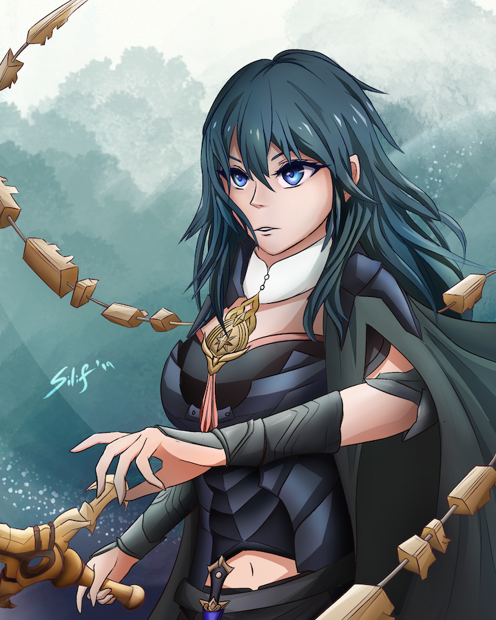
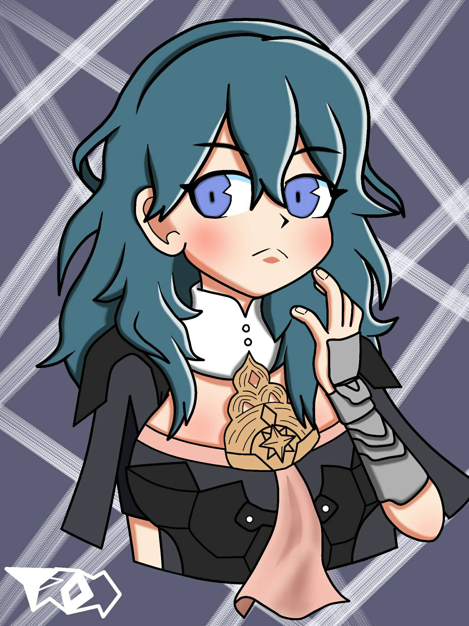
She's done she's done This took too long but I'm so so happy with how it came out!!Related content


Comments: 16

I’m from ProjectComment
What drew me to your piece was the colours and the composition. I really like that the character takes up most of the space and that there’s a weapon(?) curling around her and off the page. It’s quite dynamic. There’s movement in your piece, the hair and the cloak, and the pose doesn’t look stiff either! The characters outfit is really nice, I like how you gave her armour a subtle shine and the chest piece is a really lovely touch that ties together her dark armour and gold embellished weapons. You are very good with choosing colours, you chose blues and greens for her clothing and hair which work together, those working with the skin tone, and the gold create an appealing work of art. Nothing clashes and I’m not overwhelmed by too many different hues.
To improve I think a little more explanation on what the weapon/ curling around her is? Perhaps just enlarging the canvas a bit on the left to add more if the weapon in a way of visually explaining what her armoury consists of. For the weapon itself, it would be nice to be blurred out to make it look like it’s moving- on Procreate they have a “motion blur” tool, on photoshop and other digital programs I’m sure there are tutorials if there’s not any tool for it. The hand that’s holding the hilt of the weapon, if feel, needs to look like it’s gripping it, her hold looks too loose for what must be heavy to wield. Her mouth looks like it’s a little too low. For face proportions the mouth needs to be in the middle of the nose and chin, and to me the mouth looks as if it’s a little below that halfway line.
Besides all that it’s a beautiful piece of the character, a very wonderful portrait that shows her off , I’d like to see more of the other characters.
👍: 0 ⏩: 0

Hiya! I'm here from ProjectComment . I chose your piece because the colour palette you chose is amazing. It really makes the piece pop. Also, your style, especially the way you shade, reminds me a lot of mine, so ideally we will both learn from this comment lol
I think the pose you chose is really cool. It looks very dynamic, even though there's not much movement happening. You did especially well on the hands!
One thing that would really bring this piece to the next level would be some less neutral lighting. It's cool that you picked a light source and mostly stuck to it, and the hues you used for shading, especially for the skin, are very nice. However, the lighting, combined with the abstract background, give very little sense of place. It kind of feels like a photo studio setting: very pretty and well-done in terms of technique, but a bit nondescript. I think going for some more dramatic or tinted lighting would look stunning - something like "the setting sun hits her from the side" or similar.
One thing I noticed only after looking at the piece for some time: her left upper arm looks quite short. The construction underneath seems solid, but I think the way her coat parts does not work here because you didn't consider the shape of the foreshortened arm and the fabric doesn't follow that curve, and that suggests a very short arm instead of a foreshortened arm. Her neck also looks fairly thick, and looking at your other art, that is probably not a stylistic choice. I think you may have forgotten a line to separate the inside of her collar from her neck there.
One last thing to consider: I like the look of her windswept hair, but some of the strands look quite stiff: they do bend, but because they mostly just follow one curve and are then pretty much straight, they feel "stiffer" than hair. Adding a little more twist or different curve radiuses, or even some flyaway hair would look amazing!
Good job on the lineart, btw: all the metal parts are very detailed and symmetrical, and I think that's really hard to pull off! For some extra pizzazz, you could colour your lineart - but that's a stylistic choice, so do what feels right for you  (Smile)")
👍: 0 ⏩: 1

Thanks so much for your comment! I hear ya on lighting — definitely something I want to try next time/in the future, but I got a bit overwhelmed with this and went for that "studioesque" lighting, as you noted 
As for the hair, I wanted to emulate the kind of flat/stiff look that Byleth's hair has in-game, but with my attempt to put some movement into it, I might have slipped into uncanny valley there. I'll definitely be drawing her again sometime in the future, so I'll keep that in mind; as for the rest of your comments, they were all very helpful!

👍: 0 ⏩: 1
I'm glad you had some use for my comments ;u; yeah, I can definitely relate to being overwhelmed by drawing lighting haha
Ah, that explains the hair ")
👍: 0 ⏩: 0

Yayyy Blyeth! i love this game.
Im from project comment. Heres a few notes to hopefully help you:
-think you need to practice faces on their own a little. The eye on the right seems aligned a little odd. Like a bit up at the corner. And the ear is a smidge too low down. Maybe mostly focus on getting the alignment of the features right. Something I struggle with too.
-it feels odd for her to be holding her sword so lightly with one finger loose and little grip. If she was fighting she could probably throw her sword on accident
-I feel like the shading could use some blending. Looks a little flat. I suggest looking up videos on shading or on drawings looking flat or reference speedpaints!
-I would maybe suggest putting the watermark lower down or a slightly duller color cause its just kinda distracting
-Feel like it might look better if the hair was all being blown to the right. Something about it seems a little off so maybe that would help
Lastly just a question. Whats floating around her?
Overall mostly nitpicking. Great piece hope that helps!
👍: 0 ⏩: 1
Hiya, thanks for your comment! As for facial features, I actually spend a lot of time defining and placing. I use modeling tools and flip my canvas about a billion times, so the eye tilt/alignment and feature placement is definitively stylistic choices — as is my shading
👍: 0 ⏩: 1
Ah okay. Good luck with you art~
👍: 0 ⏩: 0


Loving the angle of both her and the weapons! Very dramatic! I also love the color palette, all the cool blues and greys help the warmer gold and brown really stand out!
👍: 0 ⏩: 1

