HOME | DD
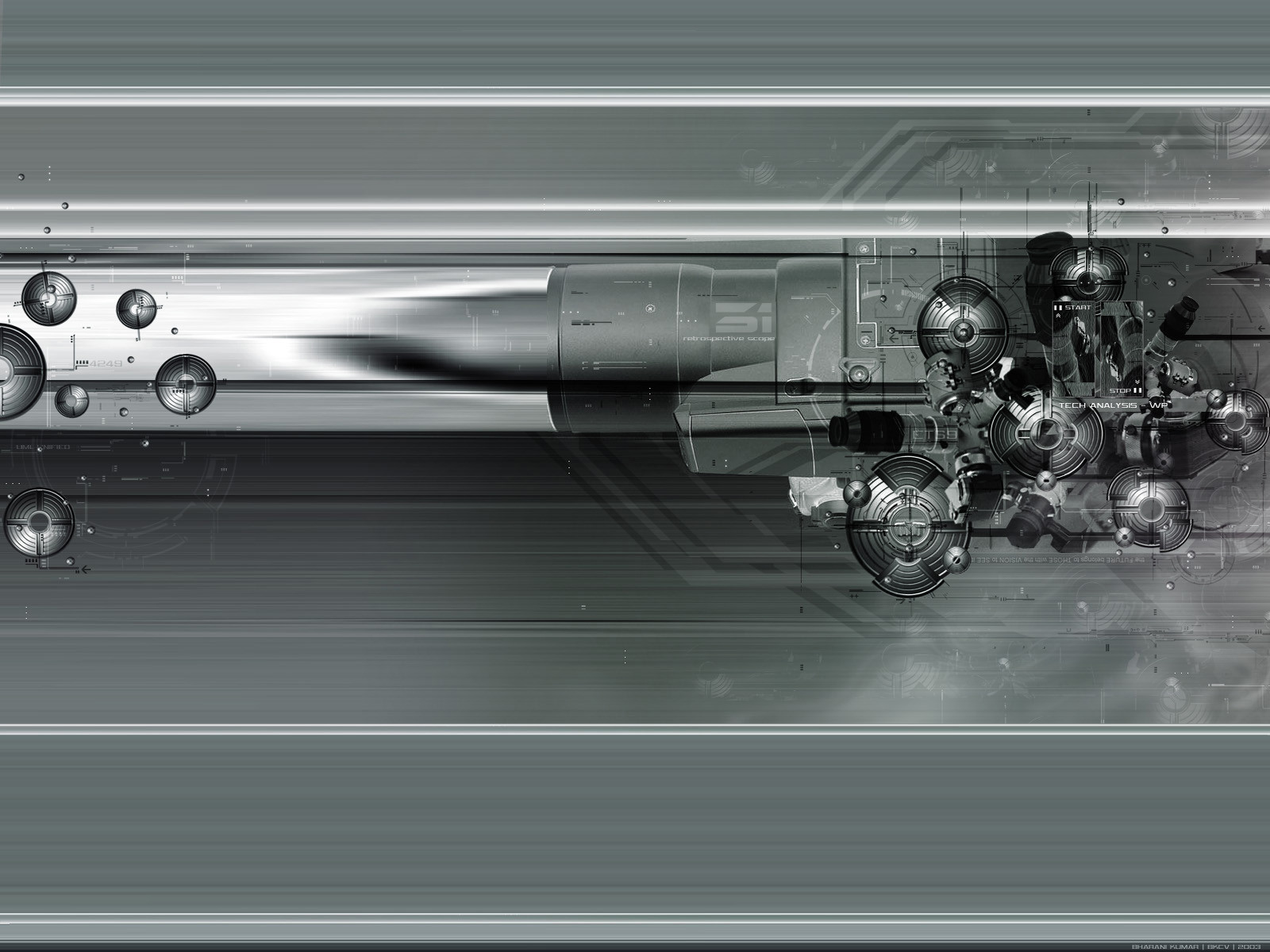
 silvatrez — Tech Analysis WP
Published: 2003-10-08 16:04:05 +0000 UTC; Views: 48874; Favourites: 347; Downloads: 46296
Redirect to original
Description
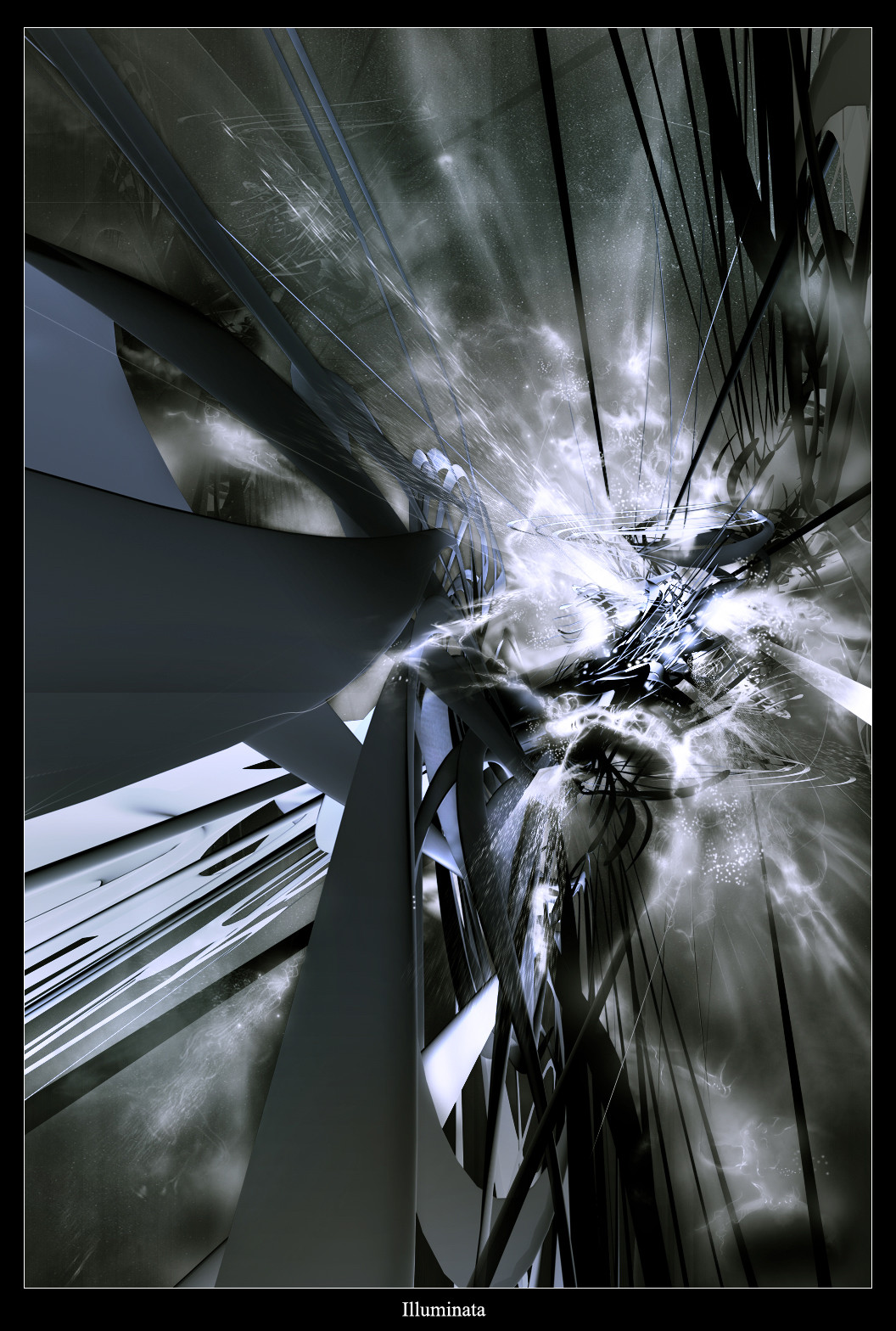
Tech Analysis Wp version...Thanks.....
Related content


Comments: 280


I like the realism you were able to create despite it being a digital work over all its a great piece it has all the end touches and intricacies. The only criticism i would offer would be the repition of the tiered circles they seem to be too common across the image. In the end i give this piece a 9/10
👍: 0 ⏩: 1

your comment made my day dude....its highly appreciated!
 (Wink)")
👍: 0 ⏩: 0


 (Smile)")

this is amazing, i love how you strenghtened the sence of movement with the fading secondary colors, the orbs of tech are awesome, but my favorite part is the rocket booster thing, this is great, easily fav'd
👍: 0 ⏩: 0


I have always had a love for tech & mech mixes.
However this one caught my eye for more that just that.
I like the simple colour scheme used. I also like how the piece has elements that remind me of many things {like: "The Matrix", Propulsion, The Air Force, Anime, to name a few...}.
This piece has lots of views and 
👍: 0 ⏩: 1
Liked it so much it's now on my desktop... Thanks again...
👍: 0 ⏩: 0

")


Hey silvatrex,
Great work - I think your hard metal work rox. Cool business card by the way
SI_OZ

👍: 0 ⏩: 1


i like sex and grapefruit, but this gets close to that..
👍: 0 ⏩: 1


This contains many fine details. I really enjoy how the many elements come together to for the composition. I also like how the center looks like the side of a jet turbine. Great work on this.
👍: 0 ⏩: 1


i like the whole mechanical theme and the greyish colors awesome work
👍: 0 ⏩: 0


cool, the circle/buttons looks nice, but im not sure if the streched / motion blured background are that nice. it looks a little to simpel. And the cicles dont get the light frome the same angle?
some of them is lighter on the right and some on the left, that does not make sense, it feels like a bad collage.
👍: 0 ⏩: 0


why can't I learn to do those things for my new modeling site?
")
👍: 0 ⏩: 0


but dont think its very suitable for wallpaper... just my opinion... hope you dont take it too heart
👍: 0 ⏩: 0

Aaaahh lovely silver and grey tones, and excellent mechanical feel to it all! This could be the engines of the spaceship in your picture 'Armada-The Final Journey'!
But this is now officially my new WP.
")
👍: 0 ⏩: 0


Your artwork is beutiful, amazing, and well crafted. Im enjoying having it as the background on my desktop, thank you for that pleasure.
👍: 0 ⏩: 0

Very nice very nice. Another one to go on my imagebgmenu for my current fluxbox menu configuration. Great work. I only select the best and this is one of them. Cheers!
👍: 0 ⏩: 0

| Next =>