HOME | DD
 silverjow — Experiment

Published: 2014-12-02 18:08:01 +0000 UTC; Views: 112711; Favourites: 1135; Downloads: 1696
Redirect to original
Description
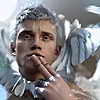
Art-style experiment, which one do you prefer?silverjow.tumblr.com/
www.facebook.com/artofsilverjo…
Related content


Comments: 141

👍: 0 ⏩: 0

👍: 0 ⏩: 0


Both are great. Left is more painterly/realistic, Right more graphic/designed. I think it comes down to a matter of personal preference.
So, my preference is for the one on the right.
I like the graphic clarity and immediacy of the image, as well as the colour palette - also cleaner, brighter. It's 'faster' to look at and understand. It becomes an 'icon' for an Ideal, less of a 'trying to be the real thing' (which could be achieved through other means - photomorph, for instance) As a symbol, it leaves more to the imagination, always hotter.
One of the things I have always liked about your work IS that crisp, clean, clarity. There's a confidence and assurance to your line-work, forms, composition and modelling that makes any piece Fun and Engaging - and Hot. Stylistically It's 'you' - immediately recognizable.
In either case, keep up the great work!
Thanks for asking (and hey - Five stars across-the-board)
👍: 0 ⏩: 0

Overall

Vision
Originality
Impact
Left one has more realistic depth and feel, like it better than the right. It looks more artistic and therefor should take more talent. the right seems more cartoon like and therefor doesn't capture the point of the work. (in my opinion) also, the left seems more amazing and less believable than the right. the right one probably also looks like it took more time (did it?)
More words because i couldnt think of anything else to say so blah blah blah blah a a a a a a a a a a a a a a a a a
👍: 0 ⏩: 0


No preference because each answers to different timing. The left one is appropriate for depiction of thought or dream. The right one is for reality. However if it is for a moment to remember in reality, the left one is more appropriate, in my opinion.
👍: 0 ⏩: 0

Omg! I really love the left style is... wow, awesome : )
👍: 0 ⏩: 0


He look like super hero XD, both style is awesome! ^^
👍: 0 ⏩: 0

I prefer the left one. The shading is nicer for me.
👍: 0 ⏩: 0


Honestly I like them both equally and would have an incredibly rough time trying to decide what style of art I would want to get from you! They both hit a note that the other doesn't and neither is "better" than the other. The one of the left is indeed more realistic, and I have a particular fondness for realistic art. The softer lines, the coloring, it all really brings out a portrait type vibe and you feel as if you were looking at the man and drawing it. That said I also thoroughly enjoy the right and its more "cartoon like" look, it gives it a more light hearted vibe and the vibrant coloring is really something I love in my commissions. I know this doesn't help much..but honestly I think they are both amazing!
👍: 0 ⏩: 0


I feel like the one on the right is very reminiscent of Patrick Brown's stuff, while the one on the left is much more your own thing. Go with the left style, man. Blaze your own trail.
👍: 0 ⏩: 0


They are both really good, but I think I prefer the one on the right. With your art style I like that crisp clean look
👍: 0 ⏩: 0

I think both the best. Just both has different style.
👍: 0 ⏩: 0


I wonder what it'd look like if you overlaid the shading styles?
👍: 0 ⏩: 0

Both are great but i prefer the left, looks more realistic. also for some reason the guys face is better in the left one...maybe it looks softer?
👍: 0 ⏩: 0

Both are great but I prefer the one on the left. It has more character and the face has more personality. Rendering on the other is too polished for me and the styling perhaps too similar to what we see in comic books etc. One one the left is softer, more honest and reveals more about your own personality. Just an observation...
👍: 0 ⏩: 0


The right. It's more shinier and more your original style.
👍: 0 ⏩: 0

Which do YOU prefer?! lol That's a more important question! Either would sell! I'm curious why you ask... ?
👍: 0 ⏩: 0


Both have their merits, and honestly I love both styles. Too difficult to choose
👍: 0 ⏩: 0


The images are both fantastic. I like the coloring more the the one on the right, but the one on the left is more realistic.
👍: 0 ⏩: 0


Cool portrait, i like the sexy angel concept, i really do! congratulations!
👍: 0 ⏩: 0

The one on the left looks more like 'art'. but the one on the right looks like a cell-shaded model.
👍: 0 ⏩: 0


omg both are really awesome! you're an amazing artist ! but I choise one, i'm going to say the first one
👍: 0 ⏩: 0

Both are beautiful. I like the left very slightly better.
👍: 0 ⏩: 0

i love them both, but I like the one on the right a little more
👍: 0 ⏩: 0

I'm partial to the version on the left. It looks romantic but I love both versions!
👍: 0 ⏩: 0

I personally love the right version. Geez, your work is just amazing!!! I wish I could have your talent.
👍: 0 ⏩: 0

ALSO, follow up question, which one took longer to color? The one on the left or right?
👍: 0 ⏩: 0
See, ok, how do you do the one on the left? Really, I'm serious--can you make a tutorial? I can draw the one on the right, and color it that way--but I cannot for the life of me figure out that smooth soft look, like the one on the left (which is the way I WANT it to look like)
What program do you use also?
o.o; please make a tutorial, I begs of you
👍: 0 ⏩: 0

Oops!! I love both version... mmm but i prefer the more digital version, are amaizing!!
👍: 0 ⏩: 0

+1 vote for the one on the left. Not that the right side isn't awesome too, but I like the left better.
👍: 0 ⏩: 0


Both look great. Right is so clean and smooth but I prefer Left because it's more realistic.
👍: 0 ⏩: 0

Both look good, the one in the left looks more realistic, the little detalils in the skin, hair and his undies make him look great and the one in the right has a cartoon feel in my oppinion, even tho the edges are sharper i like the illumination there. But as i said before both look good, and beauty is in the eye of the beholder, just depend on how you like your men  (Wink)")
👍: 0 ⏩: 0
| Next =>