HOME | DD
 silverjow — Experiment
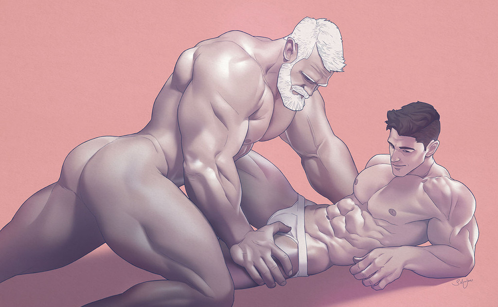

Published: 2014-12-02 18:08:01 +0000 UTC; Views: 109774; Favourites: 1145; Downloads: 1691
Redirect to original
Description
Art-style experiment, which one do you prefer?silverjow.tumblr.com/
www.facebook.com/artofsilverjo…
Related content


Comments: 140

I like both for different reasons.
The digital painting is a lot more detailed. It has more colors, less flat and has more depth. It's a bit rough but that's what I like about it too. I really wanna try this style too for a long time, but I always fail at my attempt.
Your original style is more cartoonish but it's smoother and more polished. The colors are more vibrant.
I say, do both.
👍: 0 ⏩: 0

I really like both...
But I prefer the first drawing!!!
I LOVE colours and shadows, amazing <3
👍: 0 ⏩: 0

Both are great but I do prefer the 2nd one (right) better
👍: 0 ⏩: 0

It's very hard to say, both of them look incredible. I'm sorry but I can't decide, both are very great.
I'll just say that no matter what style you choose, I'll support it either way.
👍: 0 ⏩: 0


I can't choose either! I like both of them equally well for different reasons. I like the subtler shading of the one on the left and I also like the boldness of the one on the right.
👍: 0 ⏩: 0


The arms look thicker than the thighs and the legs look a bit stubby. Other than I prefer the right slightly better, although the left one looks so realistic
👍: 0 ⏩: 0

Both are great but I do prefer the 2nd one (right) better
👍: 0 ⏩: 0

I think that the style on the left is beautiful, realistic, well done but a bit "mainstream" :S while the style on the right represents more your way of draw, in the colors as in the measurements
👍: 0 ⏩: 0


both are pretty awsome but the one to the right seems better since it looks cleaner with the style of drawing
👍: 0 ⏩: 0

GRRRRR !!! As usual both are amazing... Well, I prefer the body on the right measurements are better with this style... BUT... I prefer the face on the left ^^'
👍: 0 ⏩: 0

Both are really great and each one have some advantages and disadvantages.
But I slightly prefer the left one. It look more realistic.
👍: 0 ⏩: 0


Ooooo, this is a tough one. The one on the left gives off a nice aged painting feel to it, but the colors and contrast on the right are stronger and more precise.
Both are beautiful, but I'm gonna say the left is preferred.
👍: 0 ⏩: 0

The one on the left draws me more than the one on the right. Maybe you could use the left's art style for commissions?
👍: 0 ⏩: 0

i love them both
they both are just awesome ^_^
👍: 0 ⏩: 0


left one
both are awesome but i guess the left one sets the scene better
the right one feels more cartoony too
👍: 0 ⏩: 0


Both versions are great. The flat and the realistic colors and shading look both very well made. But! Since your style is more cartoony, if I had to choose, I would stay with the second option.
Of course, each style looks great, and each one can be used to comunicate a certain idea. If you feel to represent an idea that's closer to reality, with touches of classissism, take the realistic shading. As for the more easygoing, modern artwork, take the flat shading
👍: 0 ⏩: 0


painterly >>>>>>>>>>> cartoony
always and forever
👍: 0 ⏩: 0

I can't choose just one! Both are great. Choose the one you like the best.
👍: 0 ⏩: 0

still prefer the one on the right while I think there's more work on the one on the left...
👍: 0 ⏩: 0

I like the one on the left. The shading and flesh tones are more complex and realistic.
👍: 0 ⏩: 0


Each style has its appeal. Certainly the more traditional approach demonstrates a higher level of artistic maturity in the conventional understanding of these things. BUT, the more cartoonish approach also has some very well developed skills as well. There are some scaling differences between the two depictions of the model that almost suggests twin brothers, and this alone fires up my libido with fevered visions of twincest... In any even, I vote on the more cartoonish approach for three reasons: 1) slightly larger nipples being appropriate to the scale of the pecs, 2) the cranium is more pleasingly shaped, and 3) the clean modeling of the planes of the face and body. Truth is though, I'd buy them both, but I'd hope you'd reverse one of the images to allow a symmetrical pairing on the wall
")
👍: 0 ⏩: 0

Both, The one of the left looks more realistic, but the one of the right even if it has a cartoonish look, It has a really good texture
👍: 0 ⏩: 0


I love both!!!
But if I have to choose I would say the left one,
I love your art!!!
👍: 0 ⏩: 0


I'm going to half to go with right. It's more consistent with your other work. But both are quite nice.
👍: 0 ⏩: 0

They are both very beautiful, but I am a sucker for the style on the left. Simply amazing!

👍: 0 ⏩: 0

Both styles are lovely. I suggest you to use them to your own convenience according to what you want to draw.
👍: 0 ⏩: 0

Both version have something , in my opinion second one is better  (Smile)")
Rly nice
👍: 0 ⏩: 0
<= Prev |