HOME | DD
 silverjow — Experiment

Published: 2014-12-02 18:08:01 +0000 UTC; Views: 109784; Favourites: 1144; Downloads: 1691
Redirect to original
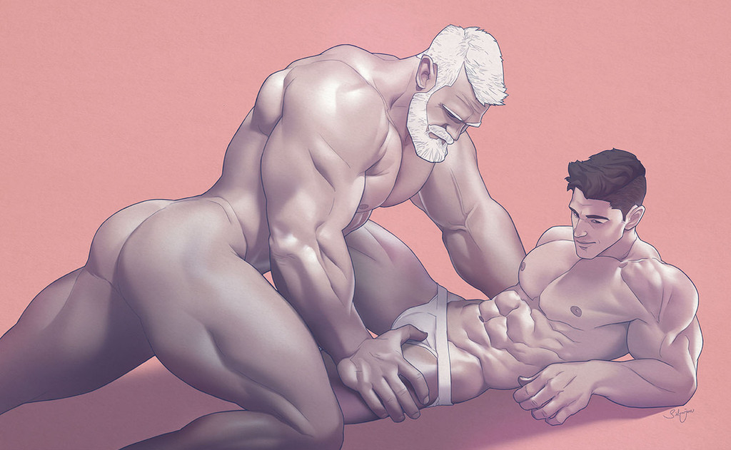
Description
Art-style experiment, which one do you prefer?silverjow.tumblr.com/
www.facebook.com/artofsilverjo…
Related content


Comments: 140

The right...for that type of character design, I think the sharper, more stylized shading works better.
Both are lovely though!
👍: 0 ⏩: 0

like the left...the right? nope the left....naw the right.....ok....BOTH!
👍: 0 ⏩: 0

I prefer also the one on the right, the circle in the background adds also more deep.
I like the sheepish look too  (Smile)")
👍: 0 ⏩: 0

Personally I prefer the one on the right, everything is more defined, clearer & angular, giving him a more masculine yet cartoonish look.
But I wouldn't say no to either of them! hehehe
👍: 0 ⏩: 0


I have to choose? The one on the right.
Of course, I'll change my mind in about 5 min.
👍: 0 ⏩: 0

WOW just WOW hit me with a rock for my silly skills! That's pretty good job. And you know, I love your style. Yes, it has some individual look and clear lineas and form. But on your question I would say LEFT! But I would say it becouse I love when art also looks more emotive, more detailed and when it has that juicy colors in shades ~____~ oh left one looks so warm. Also in his face expression I can see tension. In right one no tension it's like plastic. Hope you understand what I wanted to say.
👍: 0 ⏩: 0

Though I love both, I'll go for the left one because of softer colours and warmer skin facture.
👍: 0 ⏩: 0

It's hard to choose, because both styles are excellent. The right one gives off this very cartoon & comic-style look to it, while the one on the left has this very soft & expressionist vibe. It's a difficult choice, but I seem to really like the left one a bit more. Either way, both are wonderful.
👍: 0 ⏩: 0

The right one, because I like that kind of style, but both are excellent.
👍: 0 ⏩: 0

They are both amazing looking in different styles and I actually prefer the more graphic on on the right!
👍: 0 ⏩: 0

I don't know why I love exaggerated hands so much but I do.
👍: 0 ⏩: 0

I like the depth on the left one better; BOTH AMAZING!
👍: 0 ⏩: 0


Well, as far as consistency goes the exaggerated proportions certainly fit(and are easier to digest on) the right one, but I kinda like the shading on the left.
👍: 0 ⏩: 0


He looks more defined and handsome on the left side and more manly on the right side. I cant decide... I like... both... maybe the left one a little more... I bet it was much more work to make all these lights and shadows...
👍: 0 ⏩: 0

Very nicely done. Each work in your gallery speaks volumes. I can't decide which one appeals more. Each one elicits a different response. Regardless, Satan has designs on him. Soon, this angel will find himself the guest of Satan who has no time for modesty. Very erotic.
👍: 0 ⏩: 0


I like the one on the left, personally. I like seeing brush strokes, and there's something a little softer about the facial expression. There's also more variation in the light focus, which I think works nicely.
👍: 0 ⏩: 0

They're both amazing. And they have that great smile.
👍: 0 ⏩: 0


Beautiful art! i want redraw it on wall in my room)
👍: 0 ⏩: 0


I really like the first one (left). He looks more artistic, "organic".
the second one is cool, but feels like plastic
As usual, it's just a matter of taste
")
")
👍: 0 ⏩: 0


Oh wow! Both versions are nice.
I like the style of the second one, as it it my favourite type of drawings.
👍: 0 ⏩: 0


The base drawing is already excellent. On the left his hair and modeling of shoulders and chest are great. On the right I love the super clean and strong lines and the shiny fabric of his shorts.
And he's just yummy...
👍: 0 ⏩: 0

I like both quite equally, the one one the right is quite crisp and saturated while the one of the left is nicely shaded and good in a realism direction <3
Hope this makes sense haha

👍: 0 ⏩: 0

I like the style on the left better, but I think that's how it pertains to this /particular/ piece. Imagining a few of your other pieces in that style doesn't seem to work as well for them as it does for this one, as the shiny-surface look rather compliments pieces that push realism nicely. This piece is fairly straightforward, which is why I think the realistic shading works so well.
👍: 0 ⏩: 0

Ovbioulsy the left one marks a huge change in your style. Is really good. The right one is your usual draing which is also awesome. If you ask me you should save the style of left one for jobs you really wanna blow everybody's mind and the right for everyday stuff
👍: 0 ⏩: 0

both really nice, but I like the left one a bit more ^^
👍: 0 ⏩: 0

I like them both~ but i doo feel the left one is a bit more realistic. the right one looks like one of those homo-erotic plastic Action figures xD. Not that it woud be a bad one~
👍: 0 ⏩: 0


BOTH are amazing (-ly sexy).
Which one consumed more time?
")
👍: 0 ⏩: 0

As much as I love the left one. I think that the right one stands out more.
👍: 0 ⏩: 0

Both are cool
Maybe it's just me, but I think you made the left one less cartoony?
Unlike the right one that has quite sharp curve, you made the left one has smoother curve.
I might prefer left one used with less cartoony style, I think
👍: 0 ⏩: 0

You may use the first one for a more expensive commission or very important pictures, and the second for casual works. Great job on both
👍: 0 ⏩: 0

I enjoy them both but the left one is amazinggggggg
👍: 0 ⏩: 0

Both look great but I prefer the right. Love your original style.
👍: 0 ⏩: 0

I personally love both. each boasts it's own unique artistic flavor that sates my palate for different reasons
👍: 0 ⏩: 0

Left looks more realistic, it adds texture. If I wear to run my hand across his body, it would feel like skin.
Right pops more. Definitely more animated.
👍: 0 ⏩: 0

| Next =>