HOME | DD
 silvermoonnw — Night Rider

Published: 2005-08-23 22:20:30 +0000 UTC; Views: 3626; Favourites: 82; Downloads: 345
Redirect to original
Description
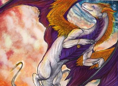
Edit: 9/19/05Reworked the human a bit, I know it still sucks though. Coloring is pretty much finished.
*******************************************************************************************
I am posting this as a deviation because I am looking for constructive critism on the forepaws and the pose in general. Be as critical as you like, I have a thick skin.
Edit: I fixed a few of the things that were mentioned and lengthened the wing-fingers. Just ran out of paper, but this is going to be digitally colored and I will be able to add them back in at a later time. Forepaws have been giving me alot of grief, but I nicked the thumb off the right paw and curled the fingers more on the left. I also fixed the right hind leg as was suggested.
Edit 8/25: I reworked the riders face and body as much as I could without restarting the whole drawing. I also extended the wings digitally in photoshop, as that is where I will be coloring this. I want to thank those who left critiques, as they helped a great deal and I believe I will be turning here in the future for it again.
Related content


Comments: 25


I was wondering, would I be able to use the dragons head for the avatar of my dragon group profile?
By the way, I love the pic., very beautiful!

👍: 0 ⏩: 1

No, this was a commission. You would have to contact the person it was done for and get permission from them.
👍: 0 ⏩: 1
Ok, thanks anyway. I'm not gonna bother them.
👍: 0 ⏩: 0

1. The digits on the dragon's left hand appear longer than the ones on his right.
2. I see the wings are a big improvement now, and other than the lack of membrame between the right 'thumb' and the rest of the wing, I see nothing wrong there.
3. The right heel still looks a bit wierd to me, probably because the small claw there seems too short compared to the other foot.
4. I think that rather than completely removing the thumb, you should make a little clawed stub there, like you find in lions' paws. It would make sense, since he's got something similar on his hind legs. Alligators and crocodiles have 5 digits on their front feet but only 4 in the back, so you don't necessarily have to worry about the numbers being equal, like in humans.
5. And about the reins: remember that in horses, the mouth ends at the tip of the snout. But in this dragon, the mouth extends all the way back halfway through his head. So pulling back on the reigns will not necessarily force the snout down. Personally, I like it the way it is because it makes it look like the dragon's fighting back some  (Smile)")
6. As for the rider's face: the nose is kinda big and the ear too high, but who am I to judge? I couldn't draw people like that to save my life, which is why I stick to dragons and animals.
It seems like you have a lot of people giving helpful critique here and I've been trying to get some myself lately. If anyone here knows anything about anything realistic please critique this... I've had it up forever and have hardly any comments [link] Thank you so much to all who look.
👍: 0 ⏩: 0

The changes you made to the front paws really made a huge difference! I just adore this piece.
👍: 0 ⏩: 0

I think it is very good....It looks like you have gotten the critique from others. I hope you and the baby are doing well. It is nice to see more of your art online
👍: 0 ⏩: 0

1. The raised forepaw: I think it's because the fingers look too close together that's making it look a bit wierd. I actually like it that way, more so the padding on it is strange. I think his palm needs to be rounded and refined.
2. Refering to the guy: I think his leg is short. His thigh looks like it's longer than the lower part, which also affects the length of his foot.
3. I think it'd be more interesting if the dragon's eye looked back at the guy, but I don't necessarily know what's going on here.
4. The wing that's more outward looks like it has more webbing then the closer wing - specifically on his 3rd wing-finger of the closer wing. The webbing ends at the second joint in the finger, while on the other wing it evidently ends at the end of the finger. I see that you ran out of space, but you need to pull that webbing out more.
5. That forth finger on the wing looks like it goes into the wrist. I think it should be turned outward and joining more into the palm.
6. You need to buff-up that elbow in his wing, it kind of vanished underneath the muscle and tweaking, I think, so it looks like there is none which isn't very proper.
I see a bunch of people commenting on the guy's face. I'll leave it alone. How big is this paper? The bigger the paper, the easier to draw a face it is. I draw nice faces, but the more I scale them down, the crappier they look. I went through everything else in your gallery, because >_> I saved it to my 'Dragons' folder and it plays as part of my screensaver, and I think you need to put some time aside to draw human faces. I don't mean that as offence, I just think it'd be just better for everything in general even if you might not like drawing faces that much. If the same amount of skill is put into the whole picture, than it just looks much nicer.
Don't flame me for what I said, I don't mean it as offence. That's what happened the last time I said more than 'awesome'.
👍: 0 ⏩: 1
Between you and Keir, I've gotten the two best critiques here, and no, I do not flame people for being critical. That's what helps me learn. I can't stand the "Oh wow" comments, they annoy me. I know I have to work on faces, they've been plaguing me for a while, and trust me, they're better now than they used to be. But I will take your suggestion and work on faces and such, as I know that I need it. What I really want to do is take a figure drawing class, but at the moment, funds aren't exactly conducive to that.
👍: 0 ⏩: 1
This site is rather inexpensive. [link] It's the only accurate tutorial site I found on the internet about human faces that uses the same type of material as they do in a schools to teach. I hope that helps for the time being, at least.
👍: 0 ⏩: 0

Hmm, the forepaws/arms look a little too... human, despite the lack of thumbs. Perhaps if you study the muscle patterns of a few different creatures and try to emulate them, it would look better (or worse. Just throwing out ideas here. Whee.)
The far hind leg looks a little bit wonky- it'll probably work itself out with shading, but I thought I'd point out the issue. I think it's a combination of ankle and knee anatomy.
I suggest moving the dragon's head so the neck is more arched, i.e. pointing the snout down instead of up. That's what reins are supposed to do, anyway
As for the rider, something about the shape of his head looks a bit off. He needs some more forehead, and the nose is too straight and curls inward too much. Try looking at three-quarter profile photos for reference on facial anatomy
Whew. Enough critique. Time for squee-ing.
I looove the pose and the wings and the face and the belly and the tail and and and. Eee! I can't wait to see the finished product. It's looking wonderful.
")
👍: 0 ⏩: 0

I suggest trying out cat-like front paws ^_^
they seem to work really well for me anyways ^_^;;
👍: 0 ⏩: 0


ohhh
The forepaws seem a little...I dunno. But I do love the feet! I can't seem to draw dragon feeet at all..*sigh*
That pose is awsome, as I can never seem to come up with those, either 
👍: 0 ⏩: 0

Yeah, bigger wings, and then I think his left forepaw would look more dramatic if it were stretched out rather than curled. It would fit his facial expression better if it looked like he were trying to claw something from the air. Hmm... the elbow of his nearer wing looks a little too far out considering the dimensions of his wing, though if you lengthen the fingers to match better with the proportions, that will probably disappear. Although the palm part of the wing looks far too big at the moment, that same fix will probably make it look normal-sized as well.
👍: 0 ⏩: 0

The tongue of the dragon seems to be going out to the right rather than following the general direction of the head of the beast. It arms seems to be different lengths, but that might be me. I don't like the look of the "hand" of the wing. It seems abit strectched out, too far, you know. The tail seems to narrow, then widen out again before the end of it.
Hey, you did say to be critical.
Otherwise, well done! 
👍: 0 ⏩: 0

I think the end of the wing if a little...well little, and the stucture looks odd but all in all it's great, I didin't spot them at first glance though. I would love to see the finished product
👍: 0 ⏩: 0

I love his face and the strap around his chest. I also like the pose and how you got it to look like the rider's pulling back on the reins and the dragon's head is being jerked along with them. Great pose too.
1. wings should have more surface area to better accomidate his size and weight for flight.
2. his left foot seems to have a heel while his right doesn't.
3. his right hand appears bigger/longer than his left.
4. the curled fingers on his left hand don't look quite natural, I would suggest curling the pinkie more.
👍: 0 ⏩: 0

The forepaws look much better now.
👍: 0 ⏩: 0

")

Very lovely! The open mouth is a lovely touch, I have such a hard time drawin open mouthed dragons.
The only things I spot that look odd, is the wing arm seems a bit big, or the wing fingers seem a bit short. And the hind leg farther from the view, between the knee and ankle seems off.
👍: 0 ⏩: 0

Ooo. Very nice. I'd love to see the final product.
👍: 0 ⏩: 0